IBM | The Weather Company
Role: Lead Product Designer
Desktop Photo Modules
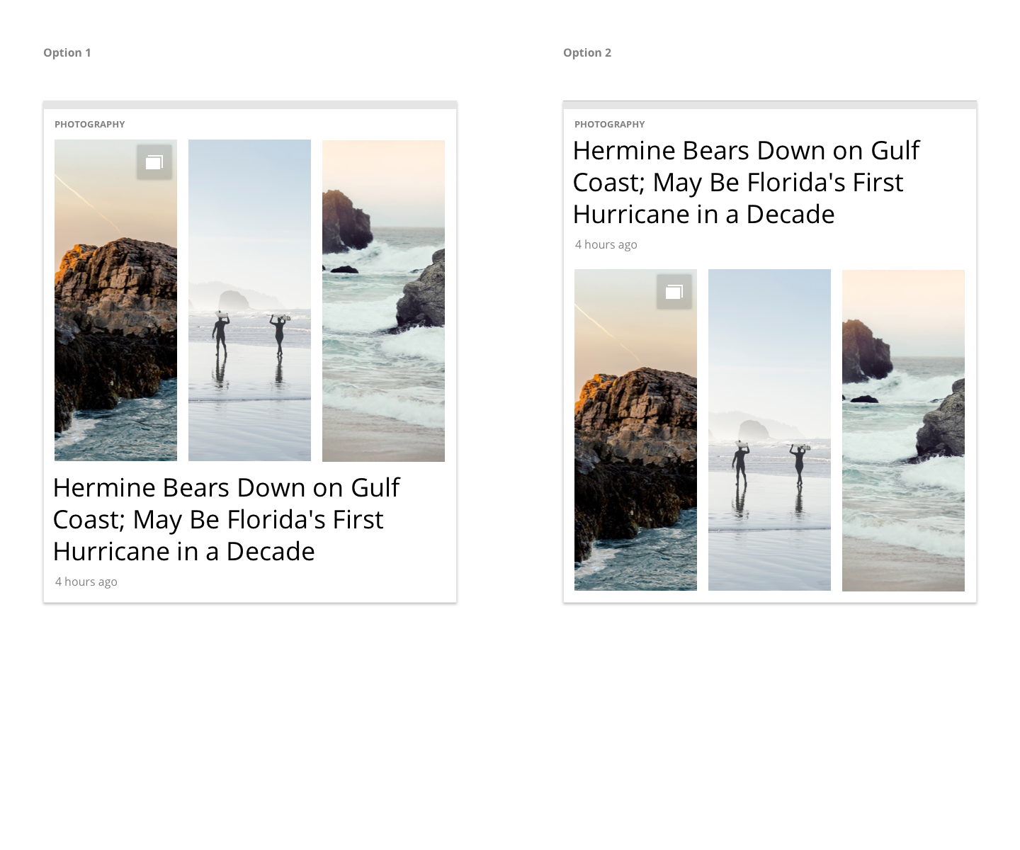
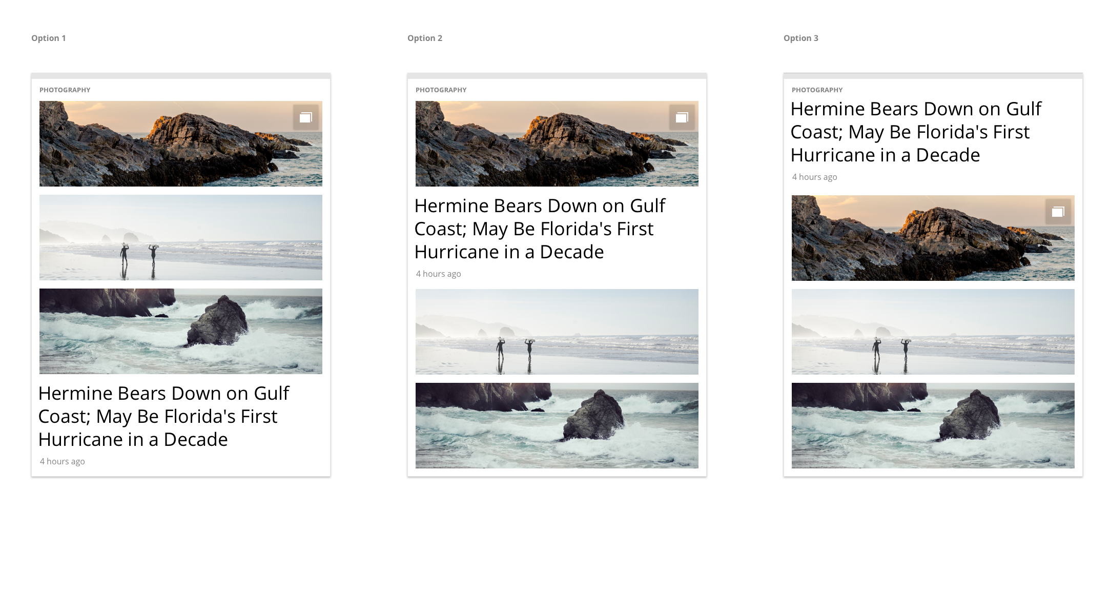
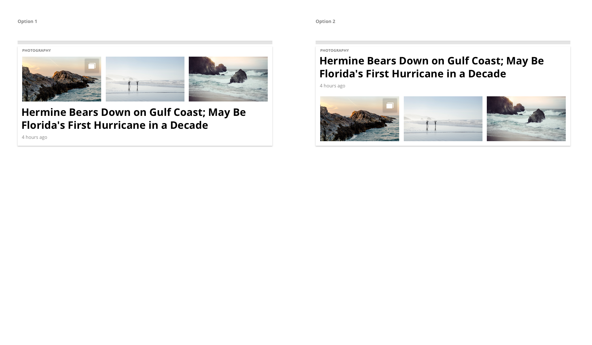
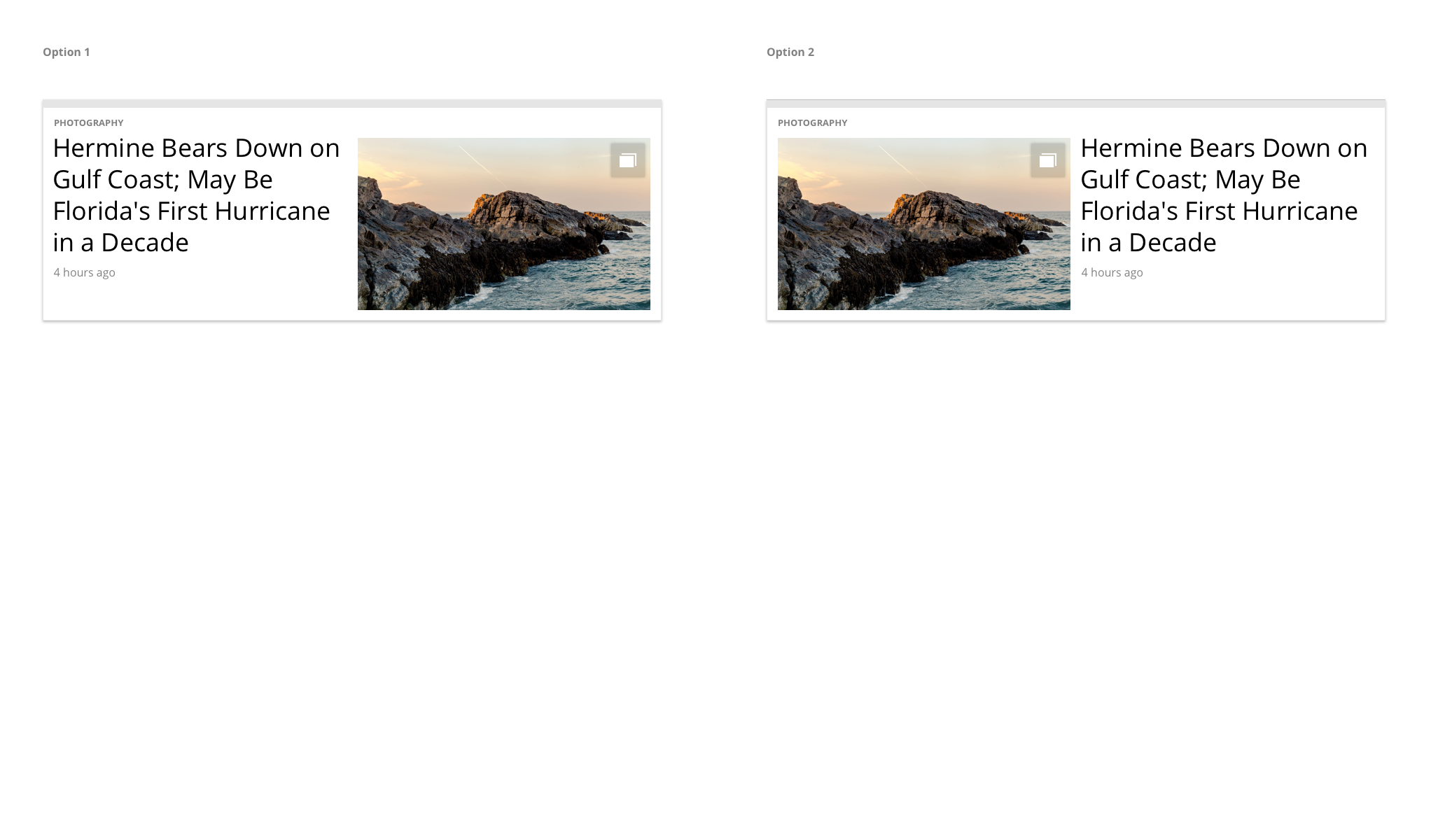
Photo Gallery Dynamic Matrix
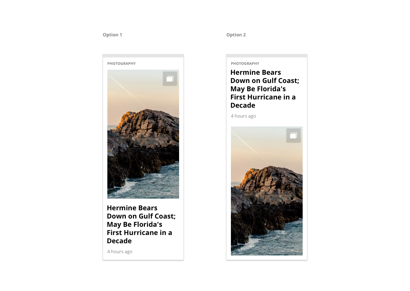
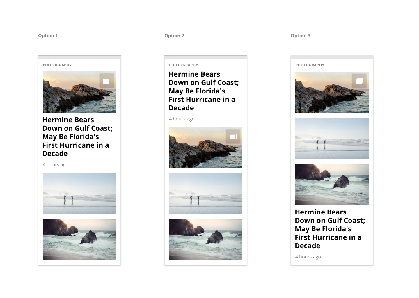
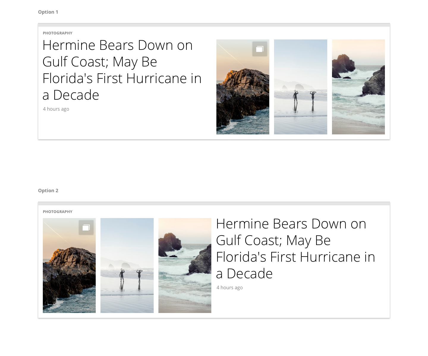
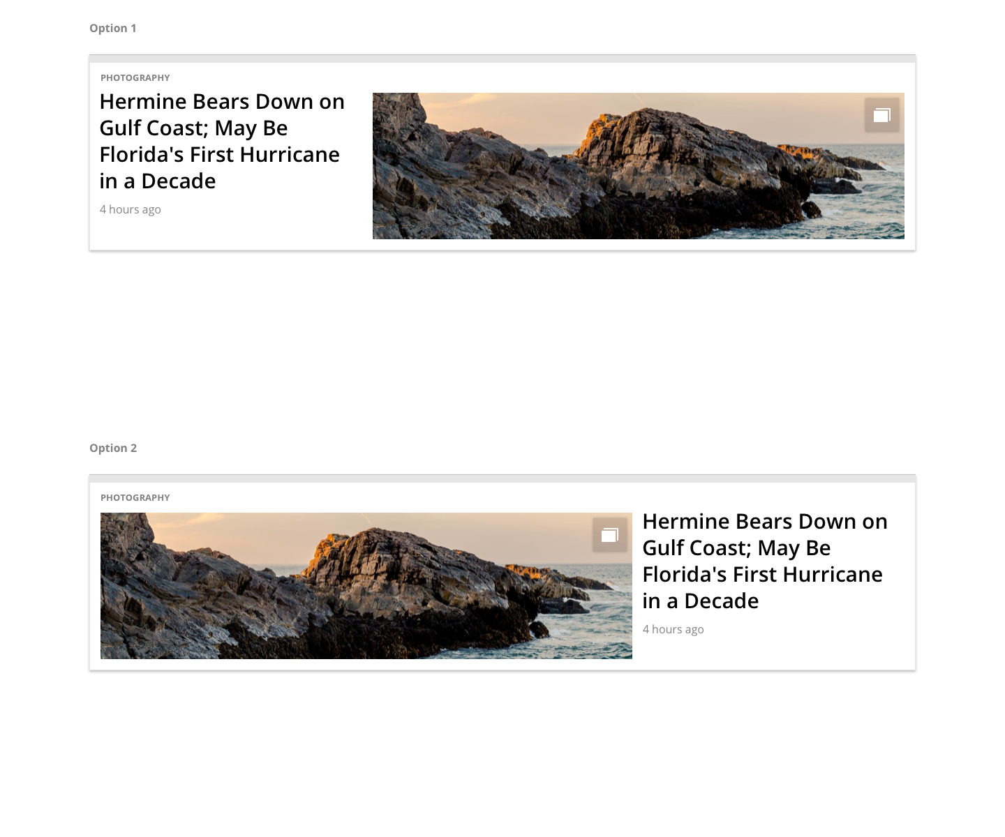
These were created for use on a flexible, modularized desktop landing experience where the media modules would encourage a seamless flow between content and advertising. The Golden Ratio was utilized to create aesthetically pleasing arrangements for the various module formatting.
This was done for videos…
And articles as well.
Immersive Photo Gallery
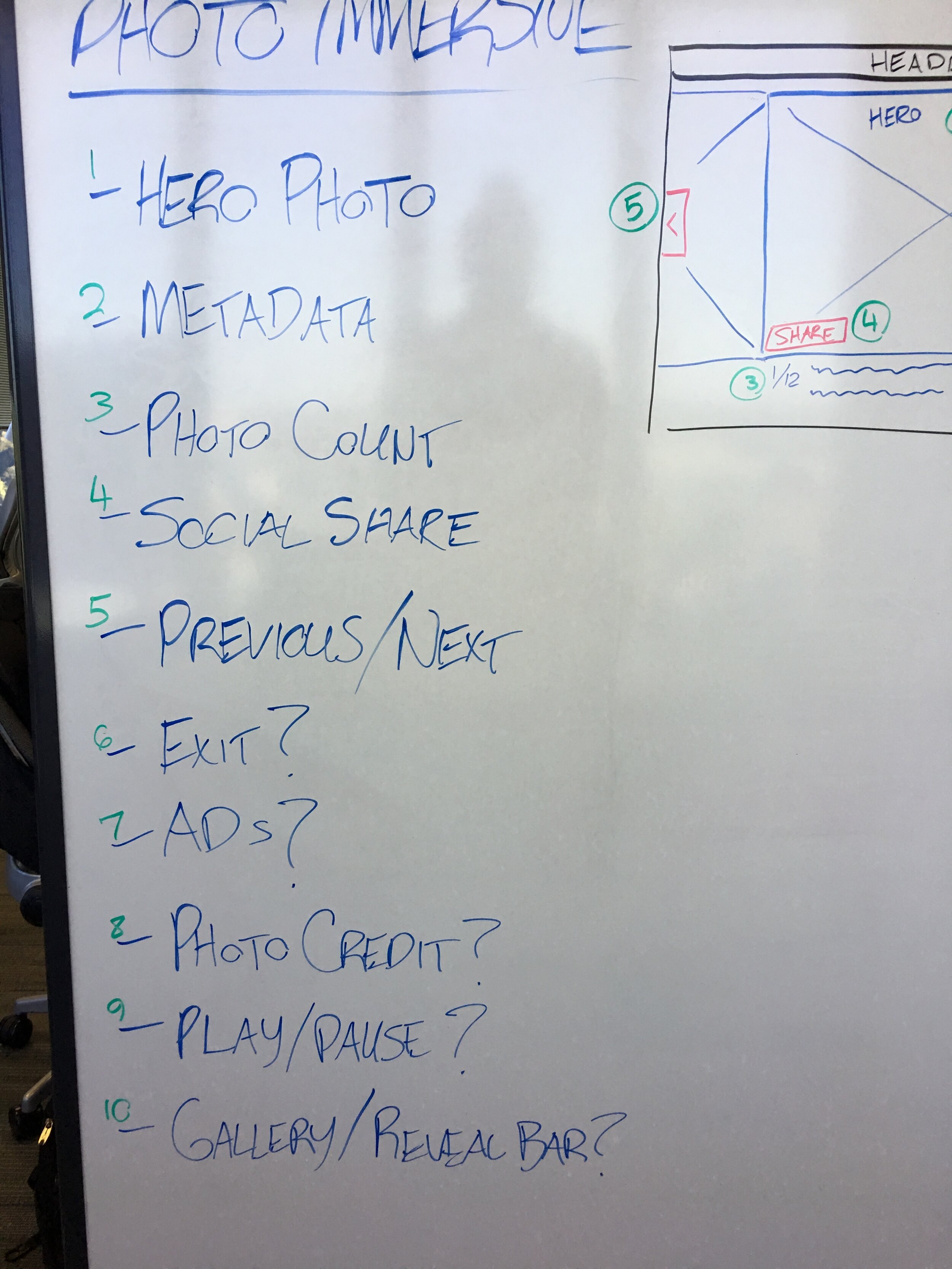
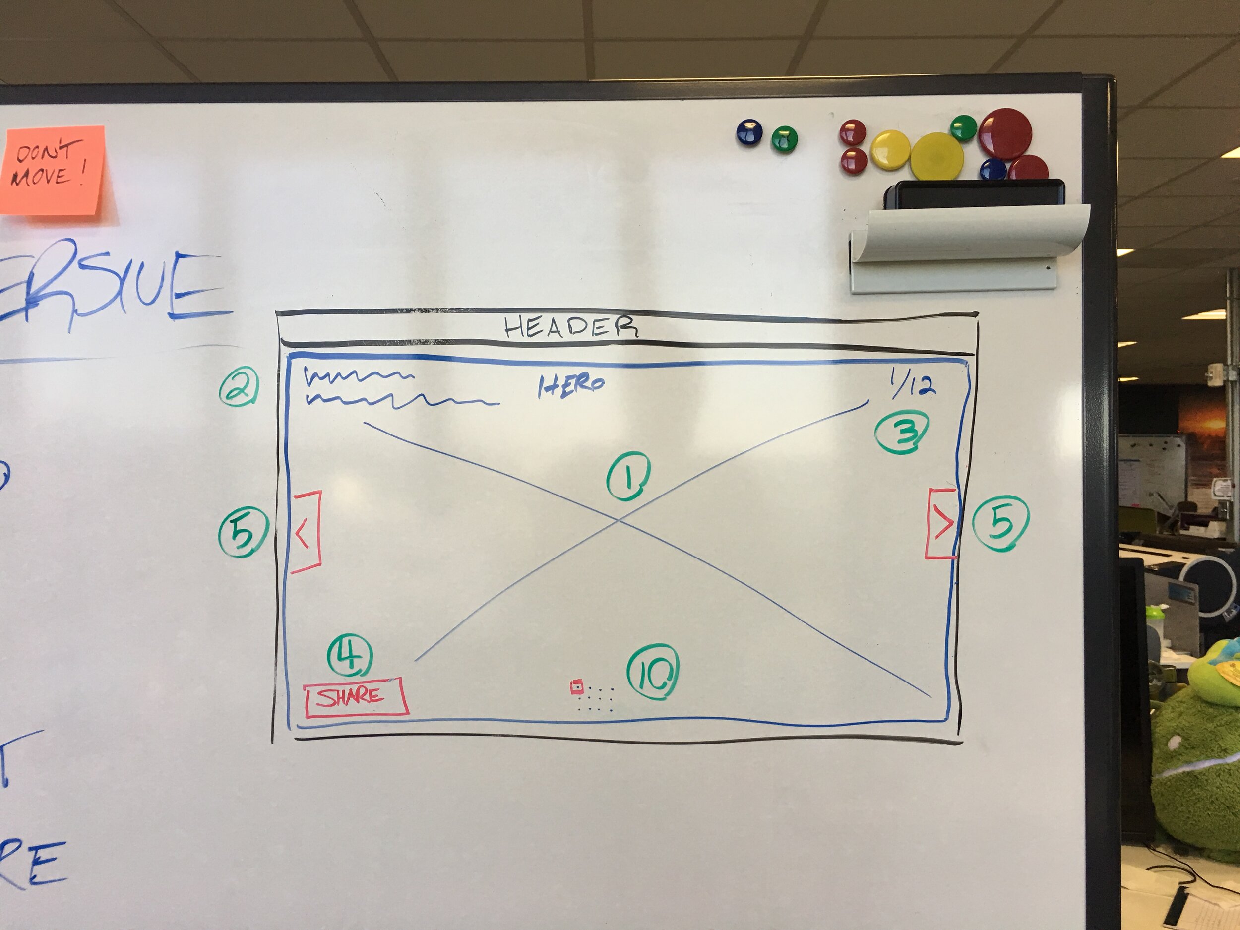
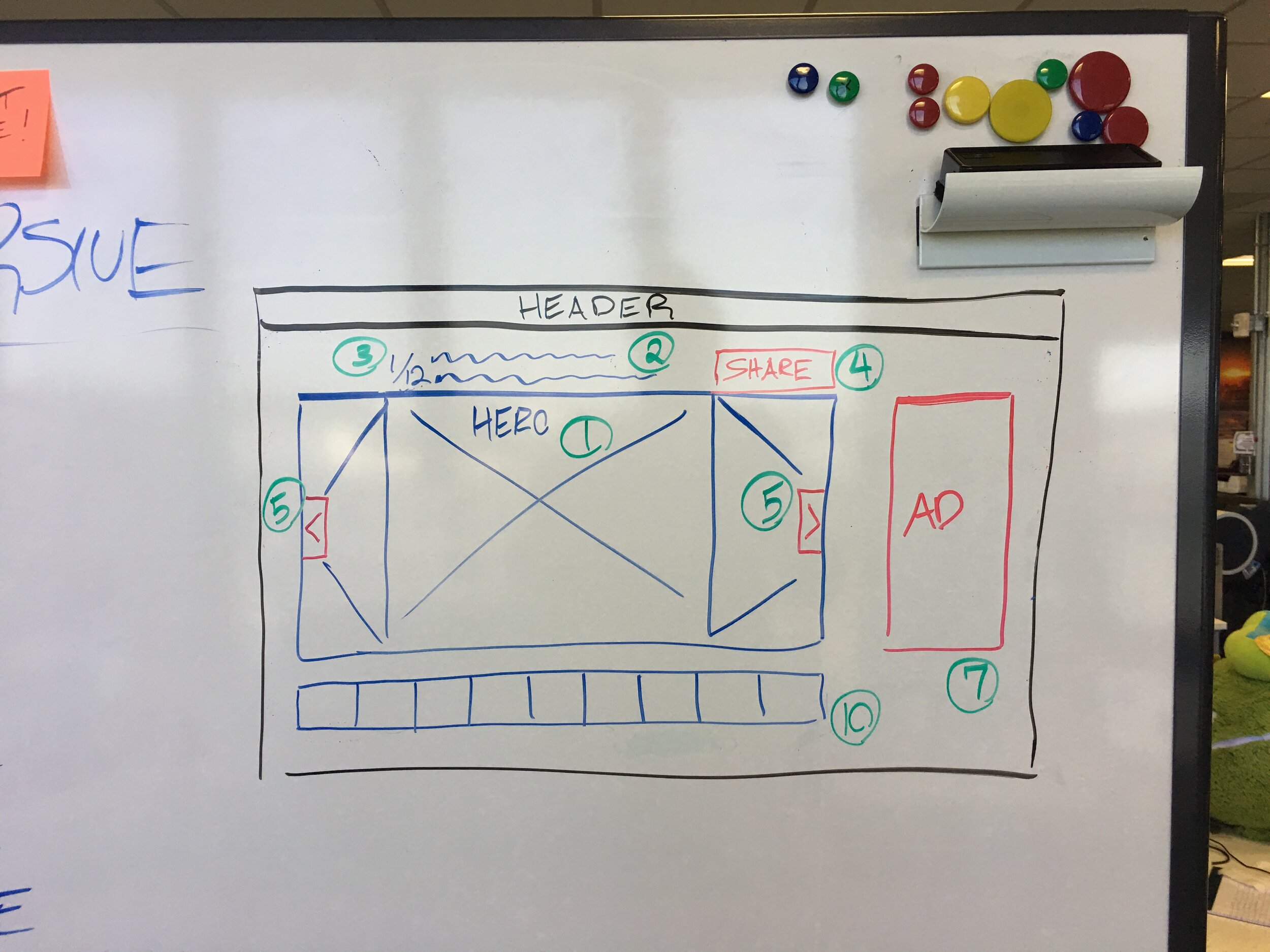
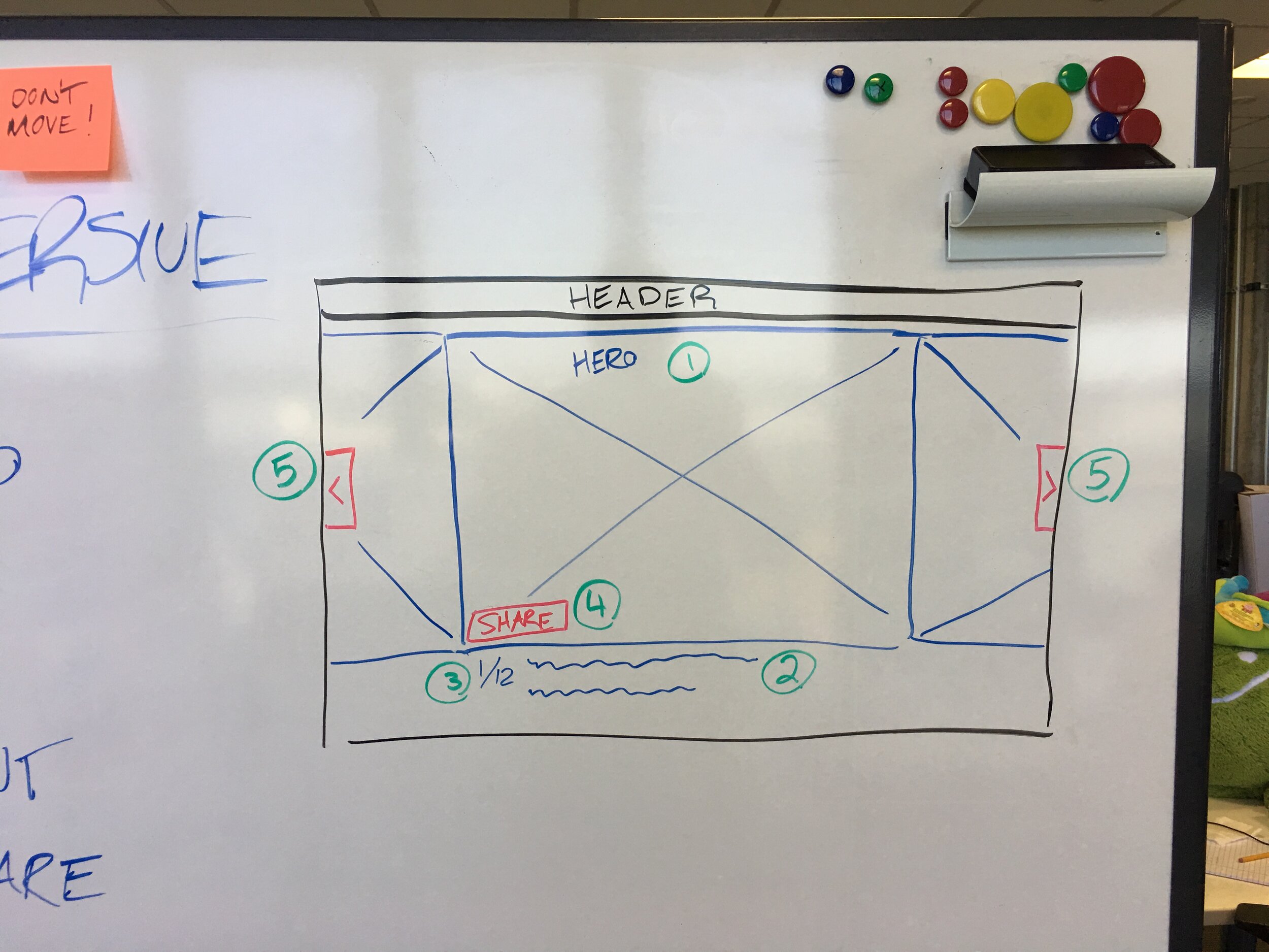
Immersive Photo Sketches
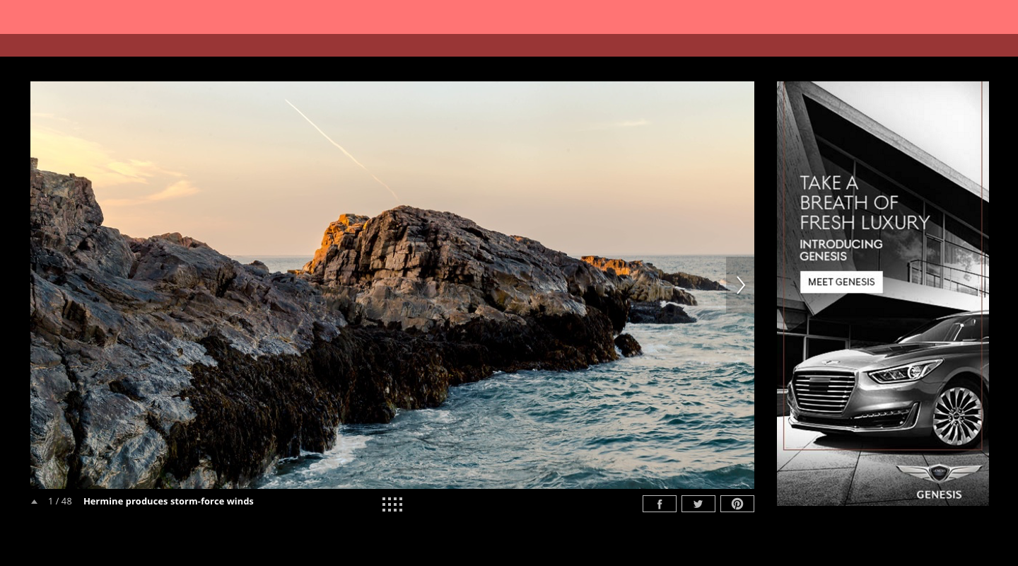
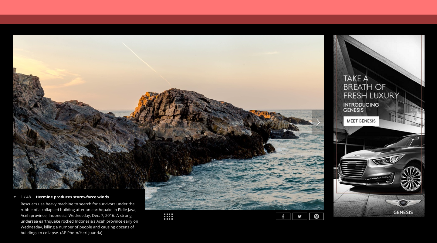
Immersive Photo Desktop Finals
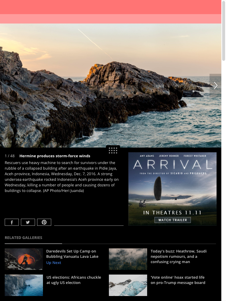
Immersive Photo Tablet Finals
Article Content Page
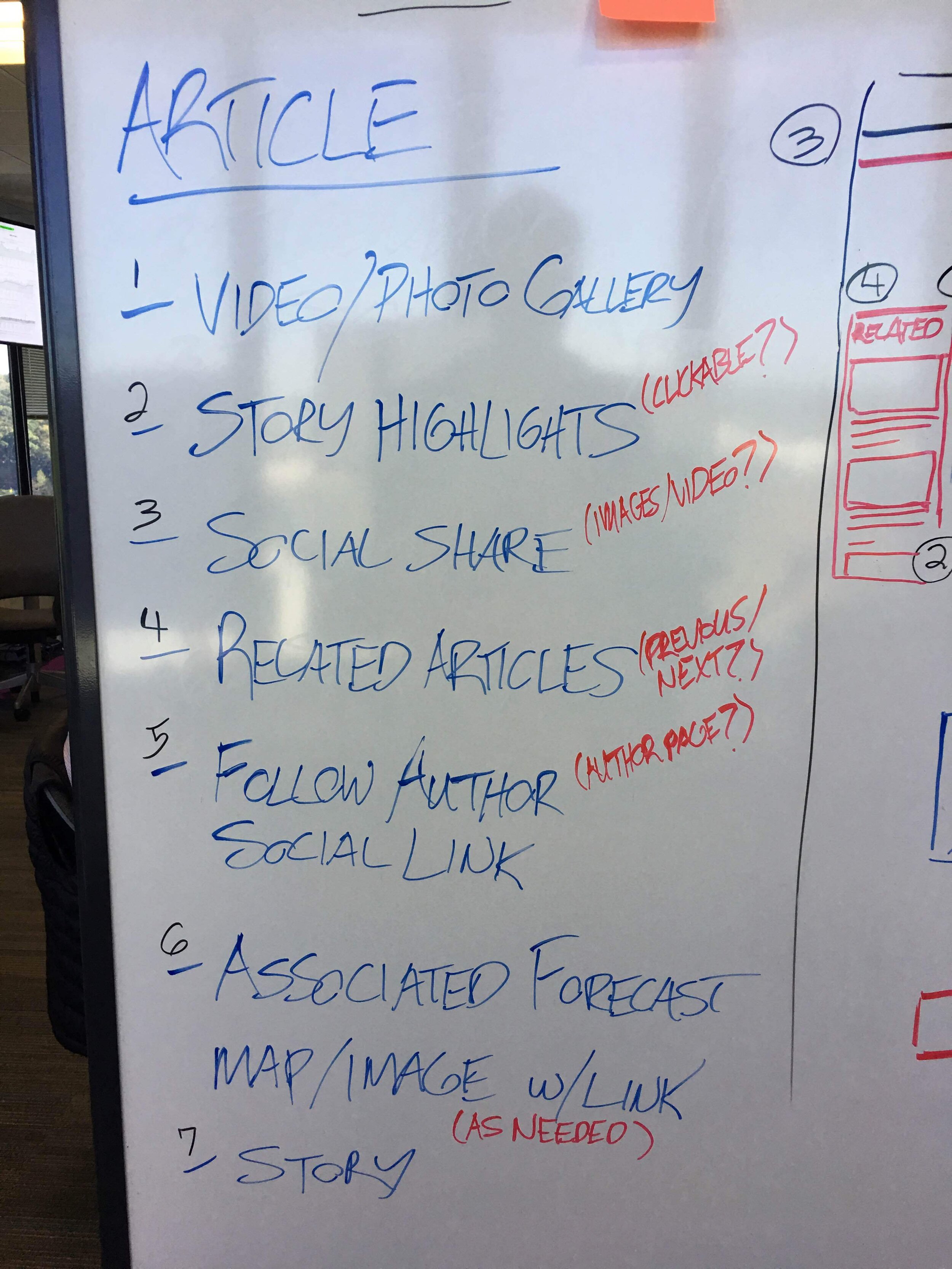
Article Sketches
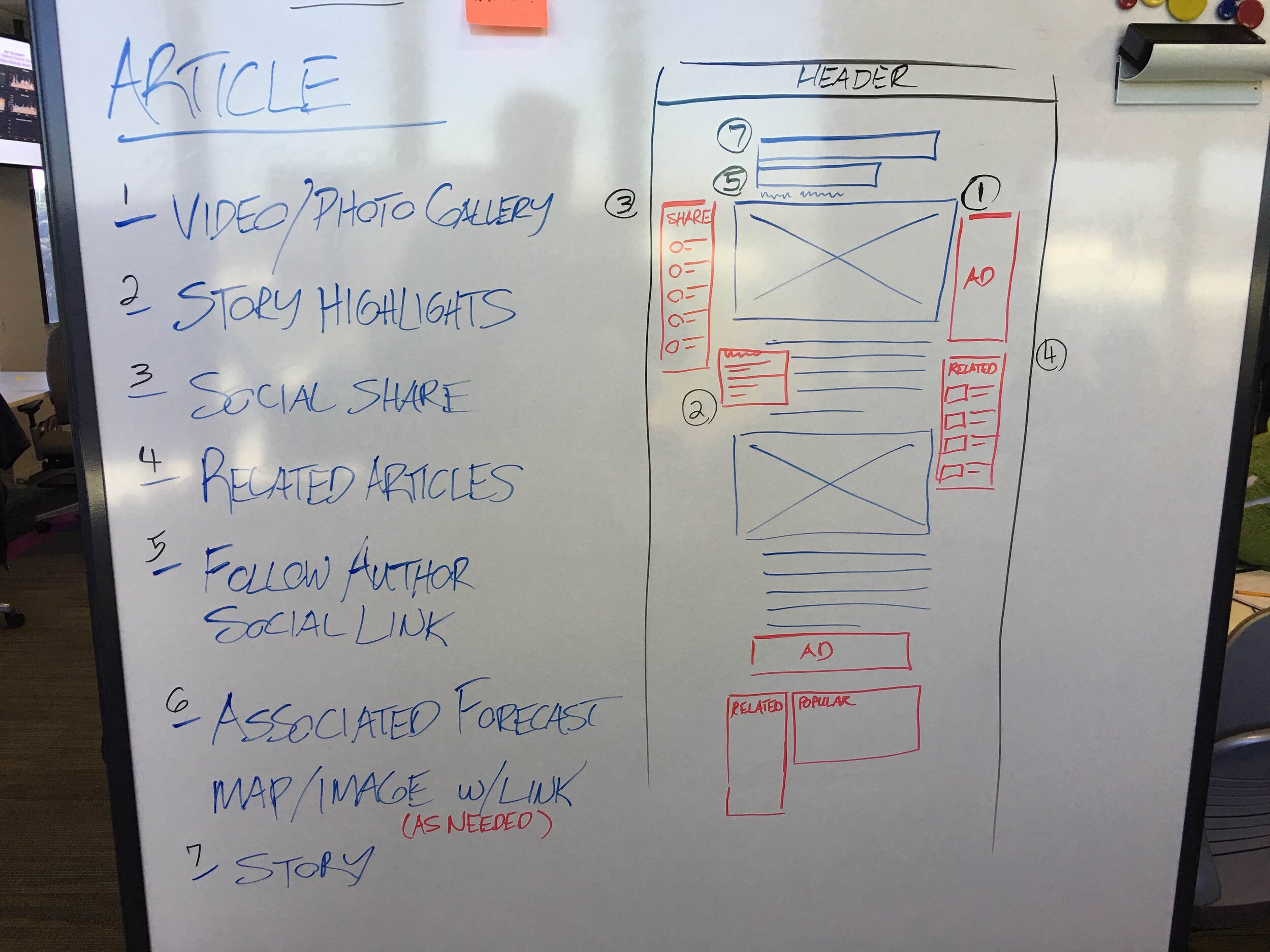
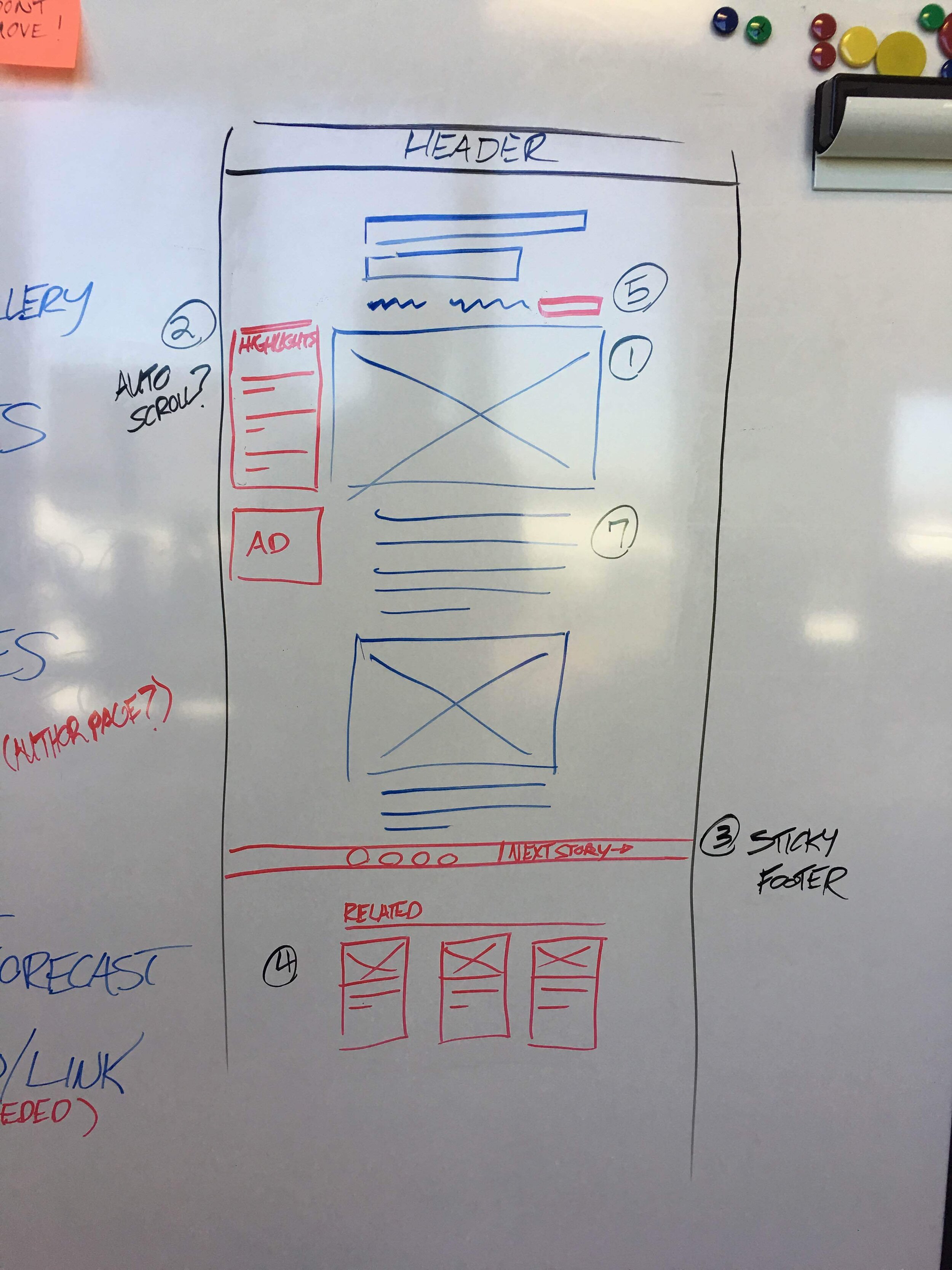
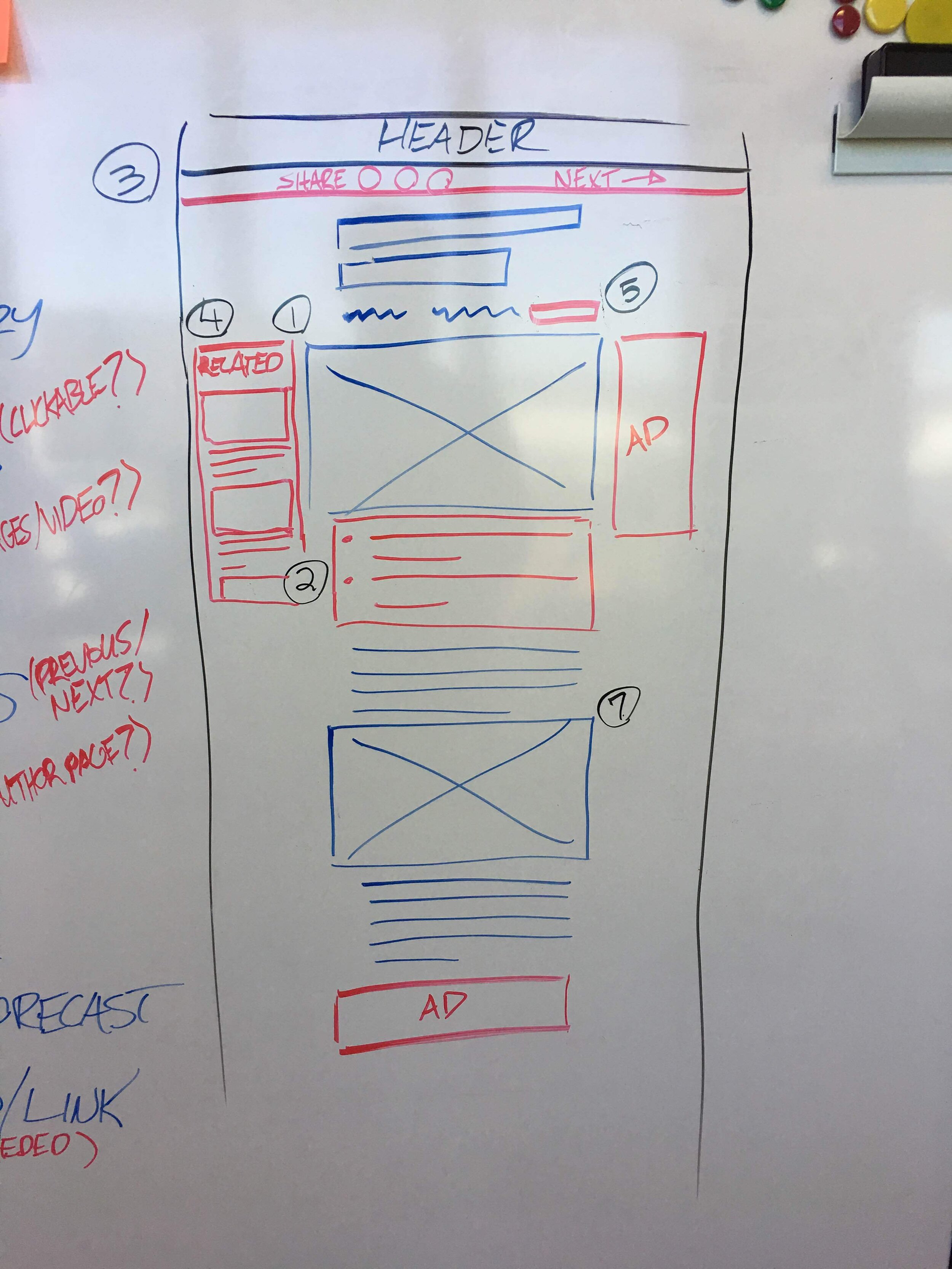
Article Desktop Finals
Article Tablet Finals
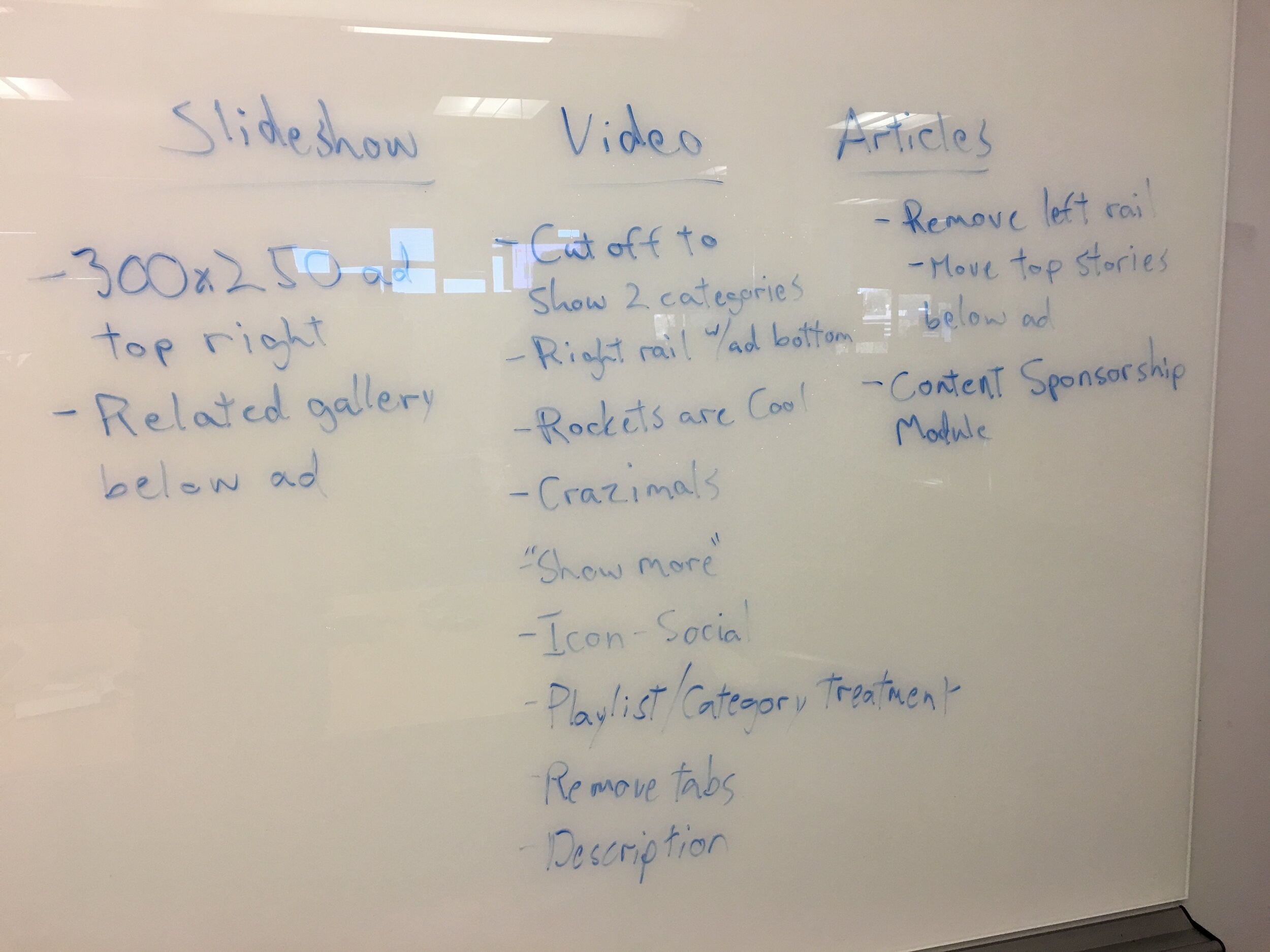
Video Gallery Whiteboard Sketches
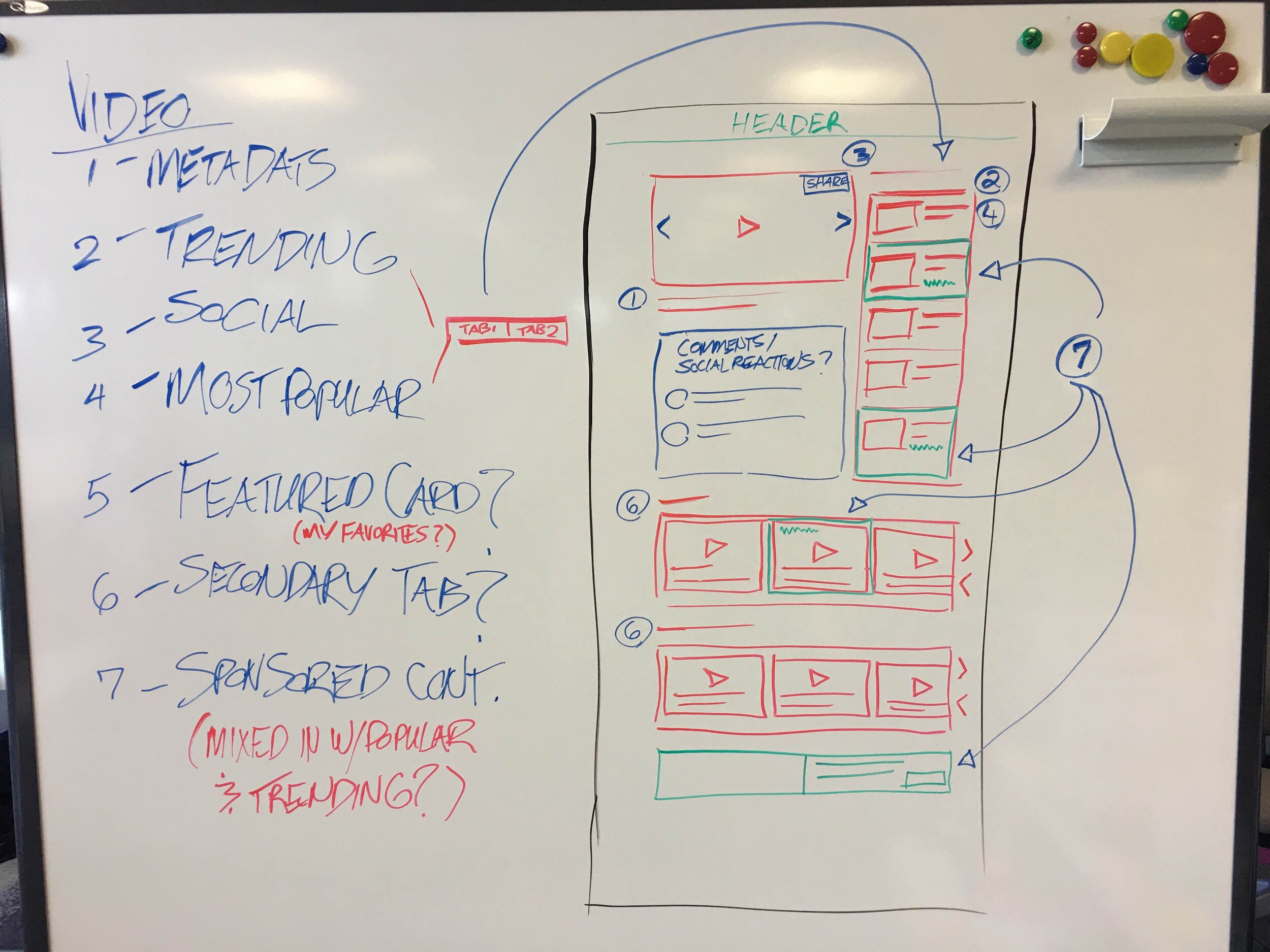
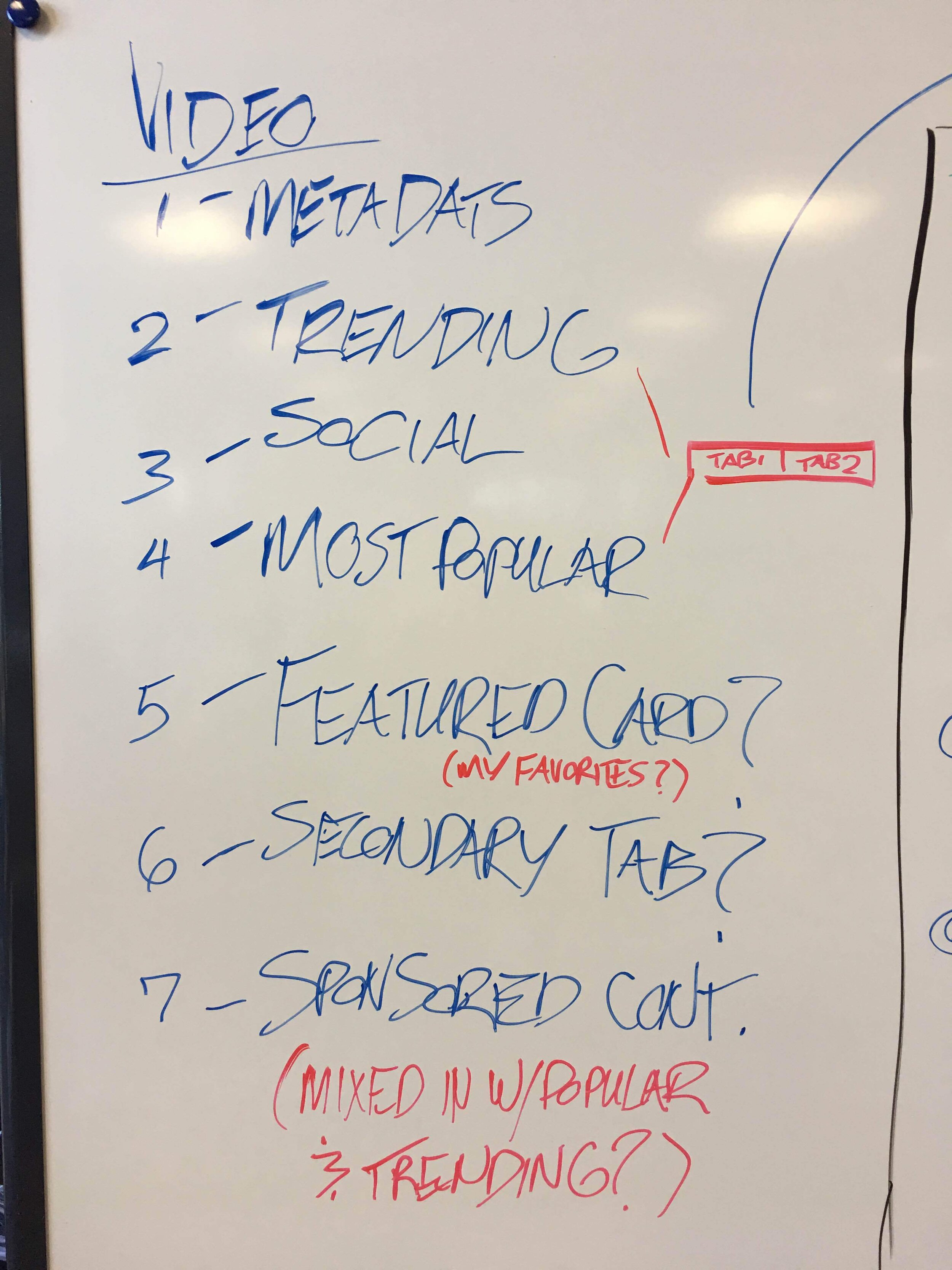
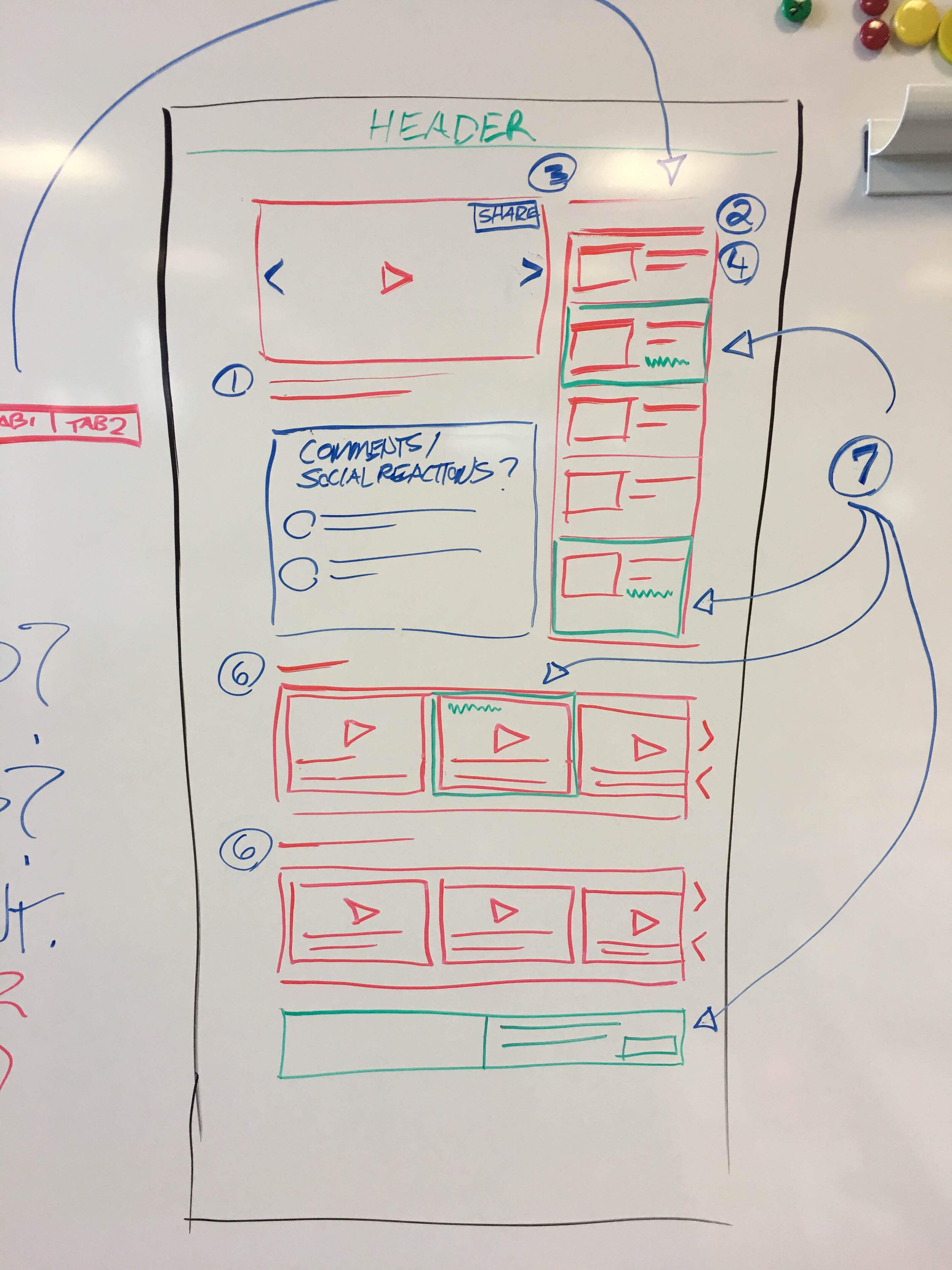
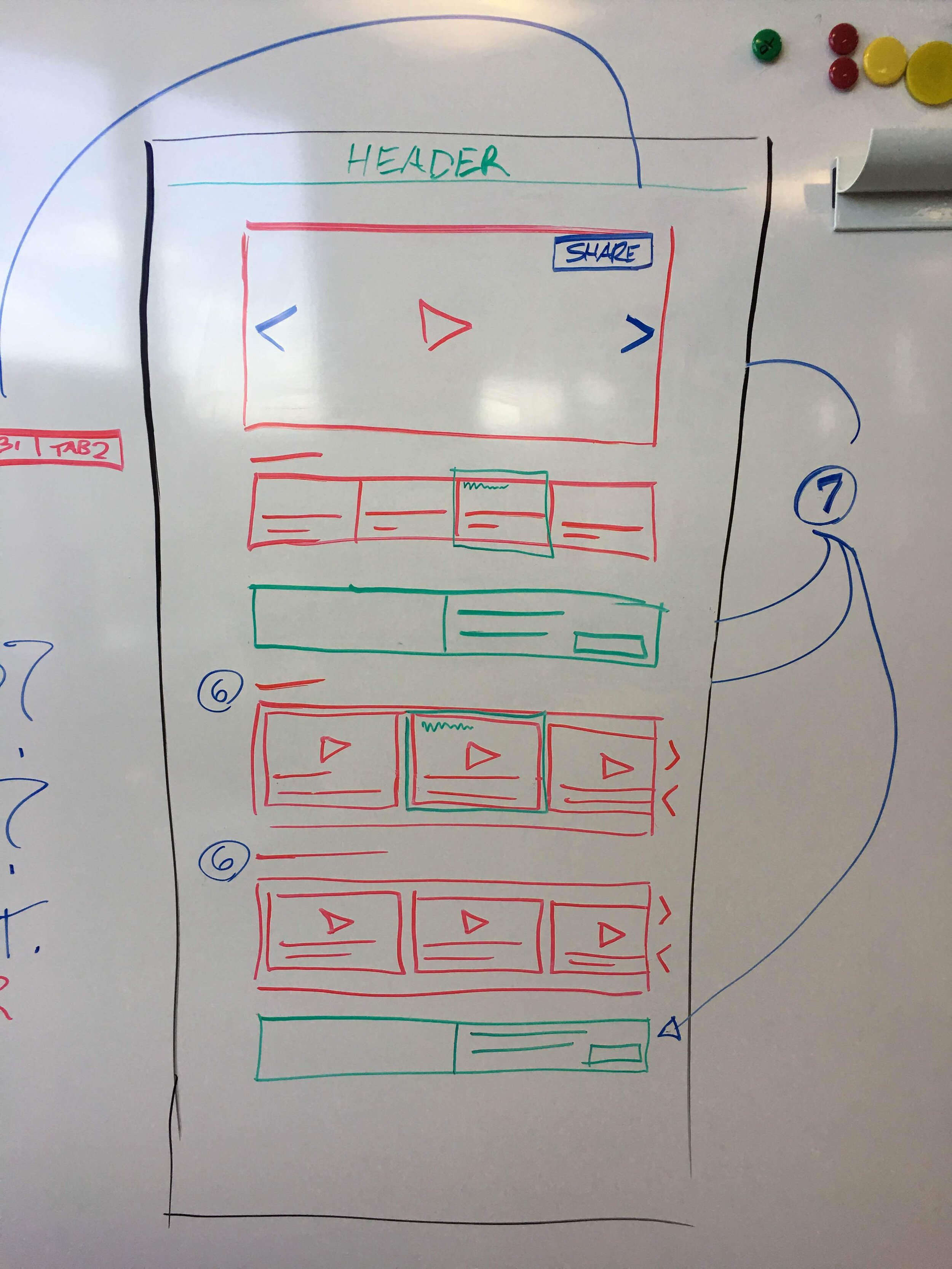
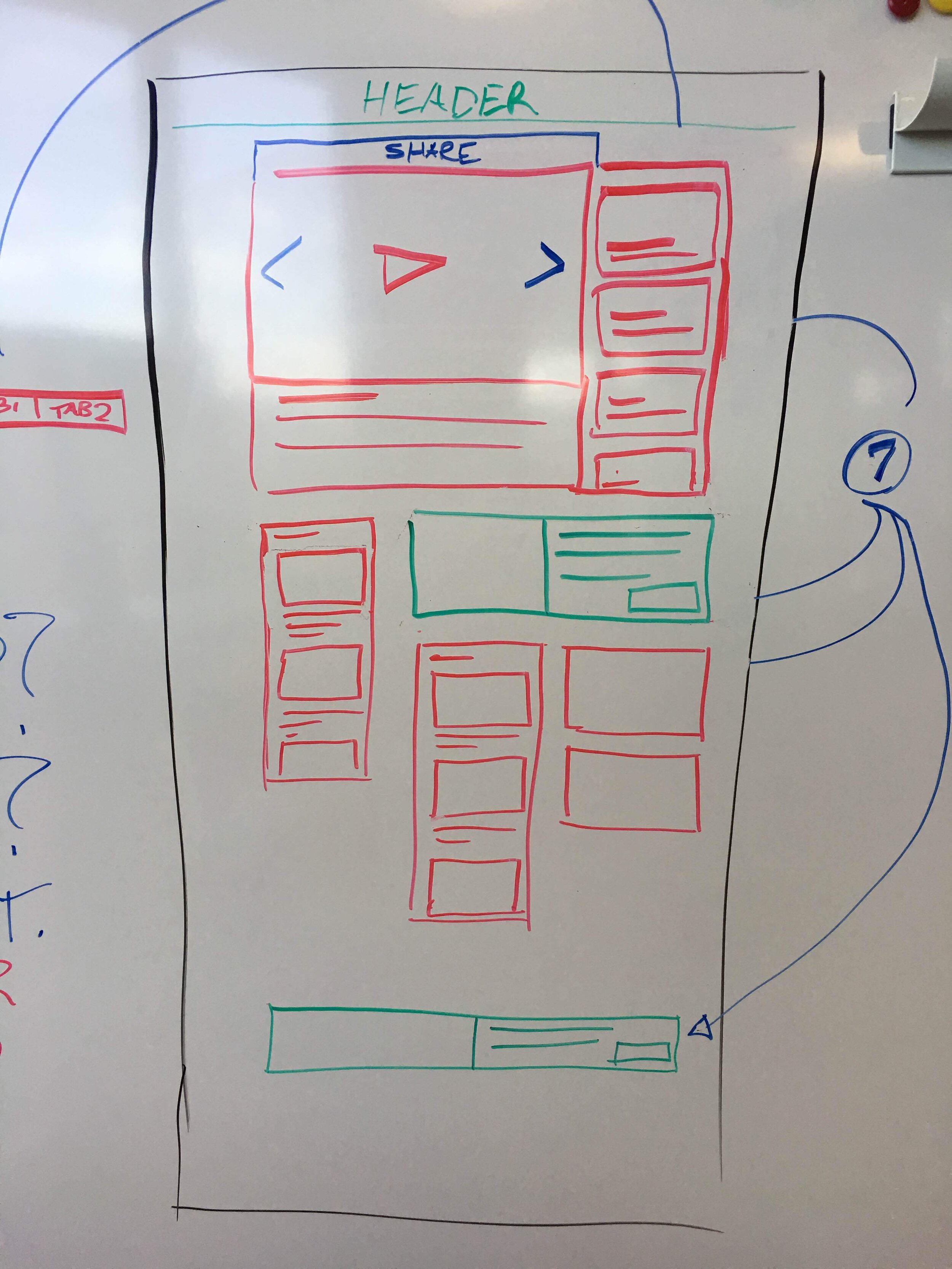
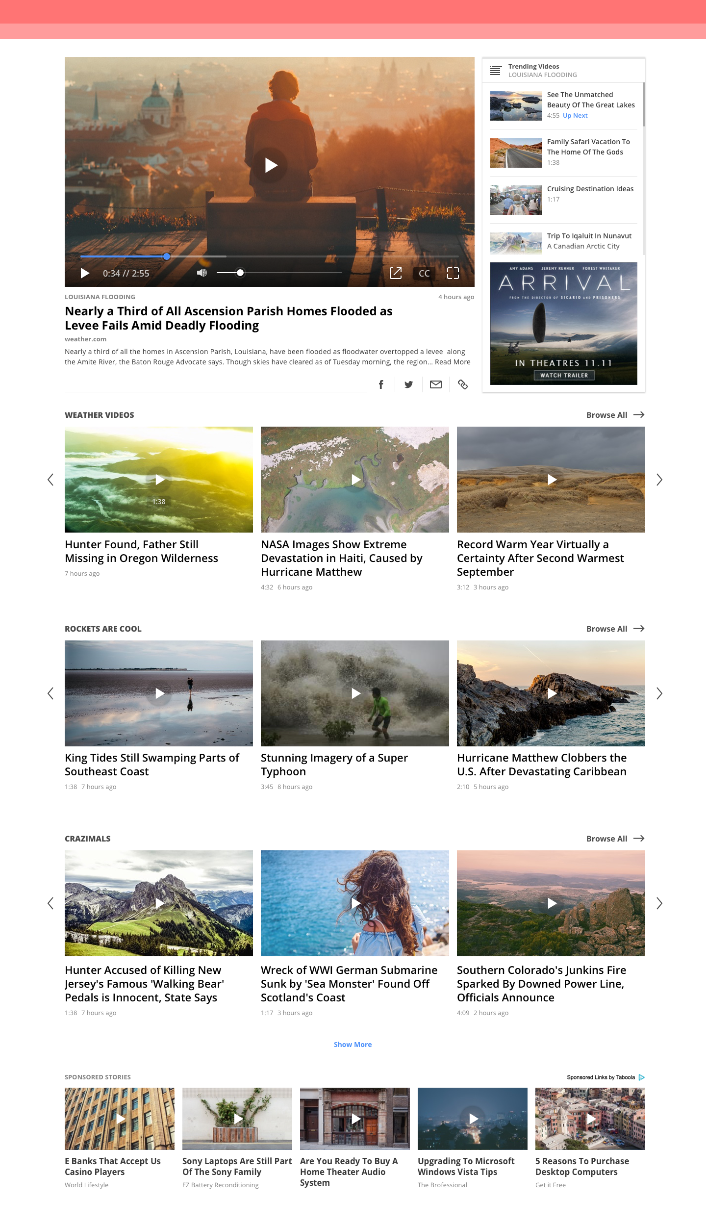
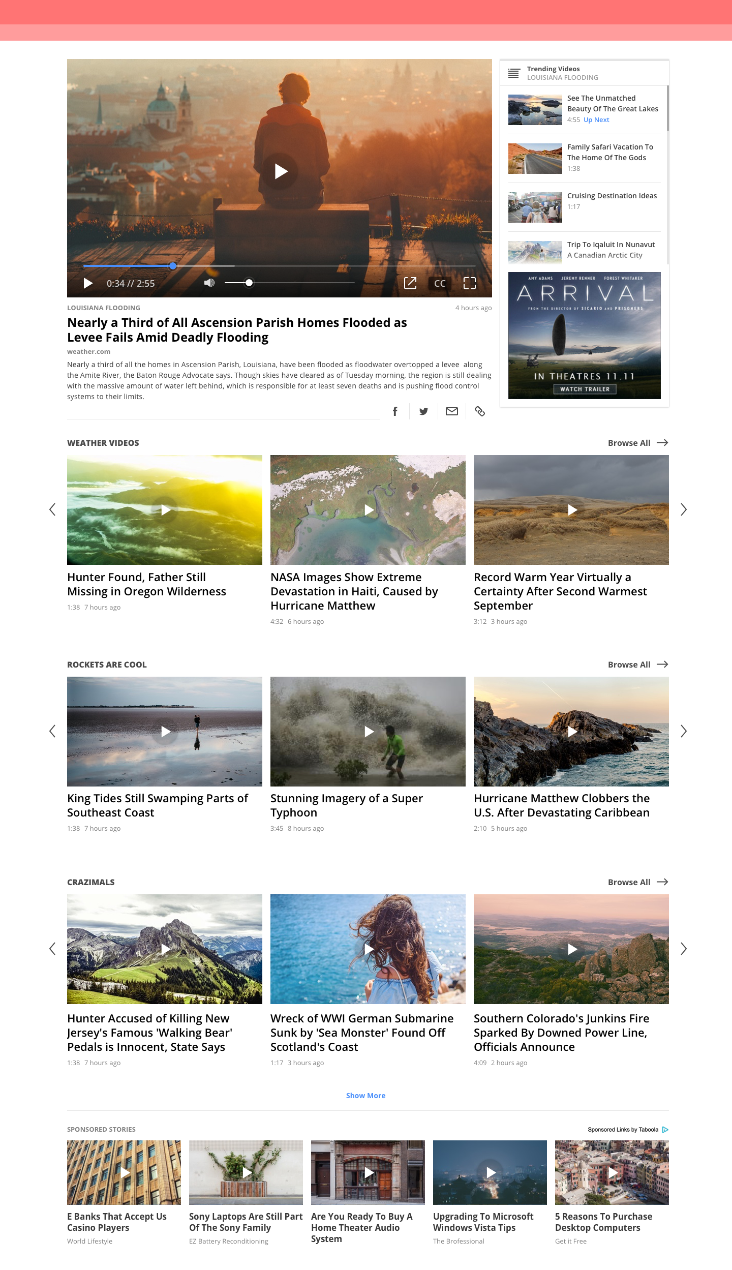
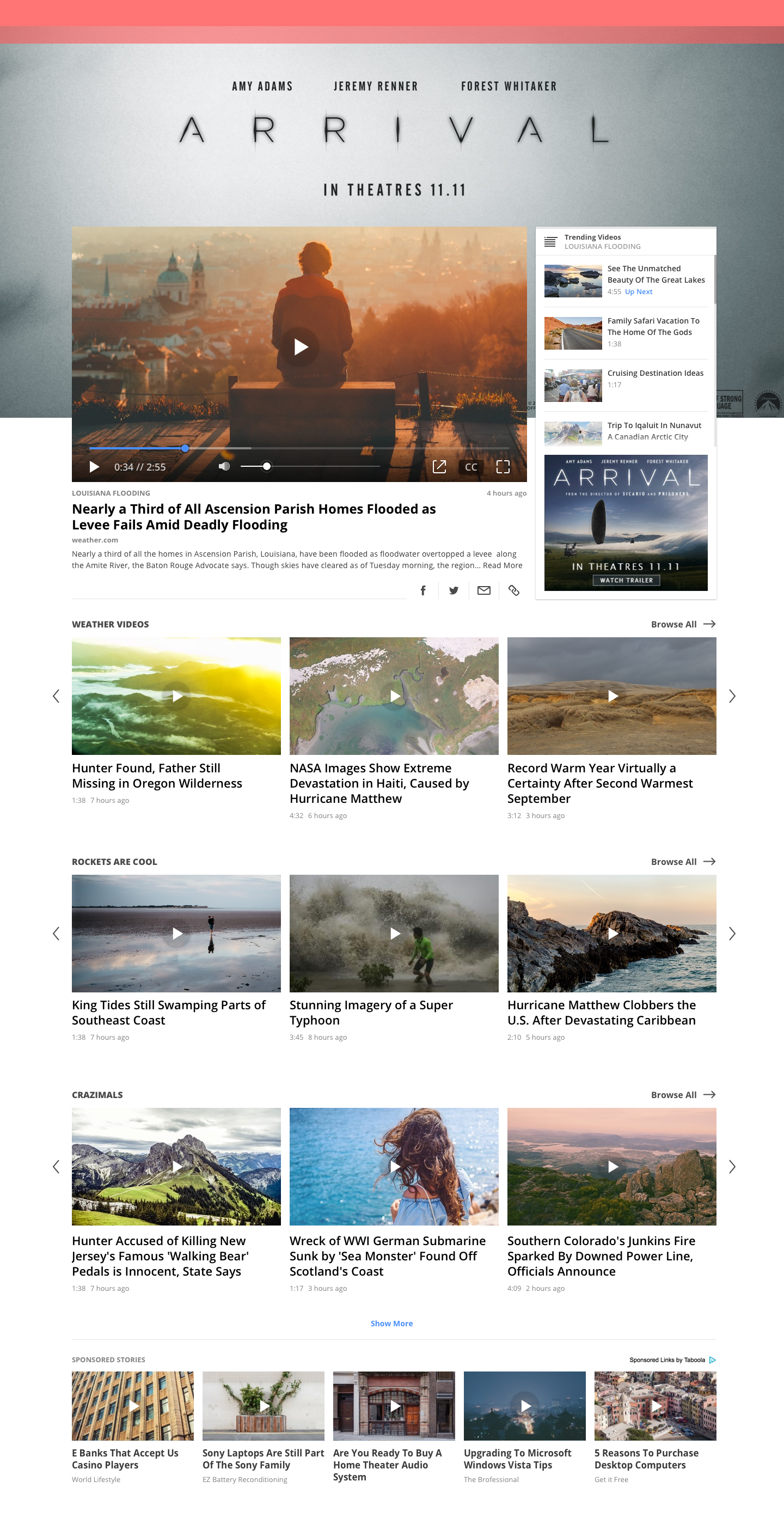
Video Gallery Desktop Finals
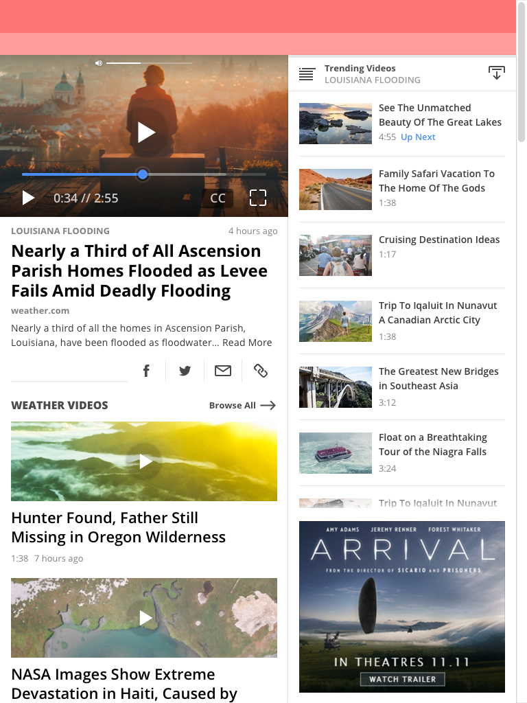
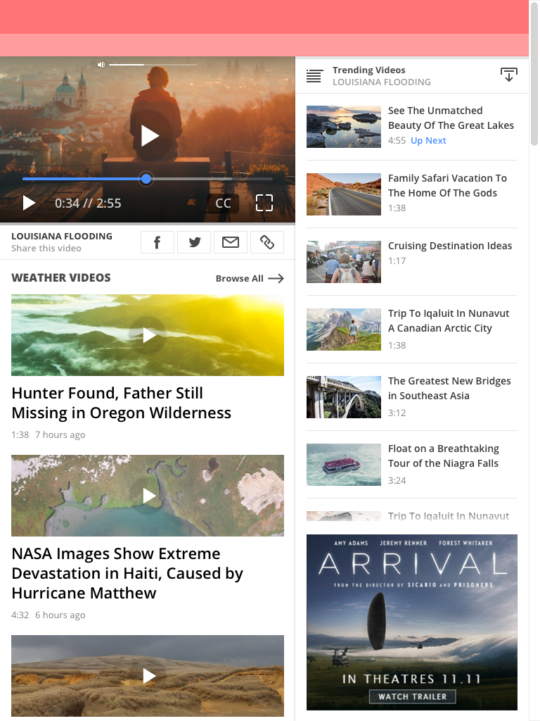
Video Gallery Tablet Finals
Android Notification Panels
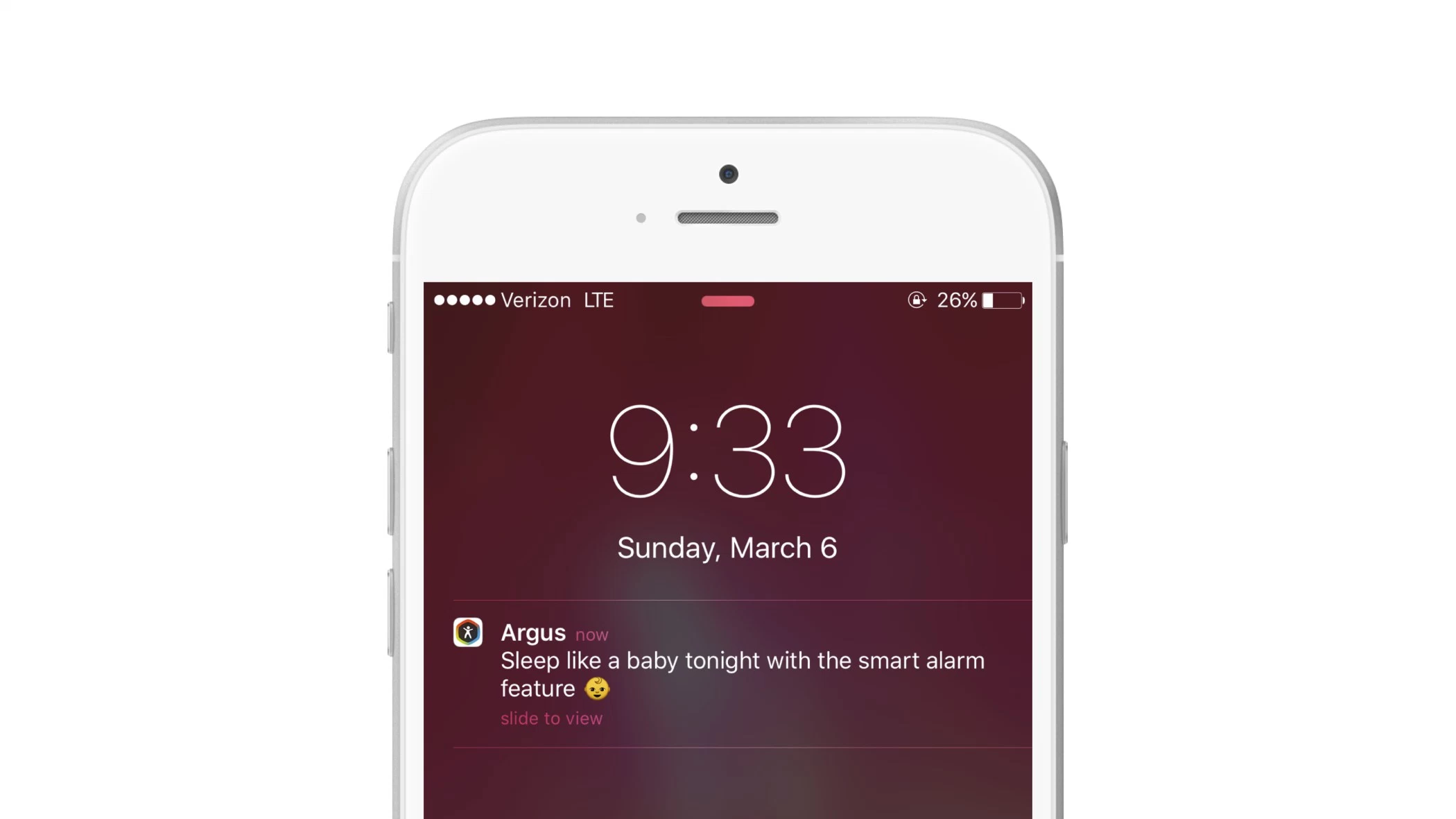
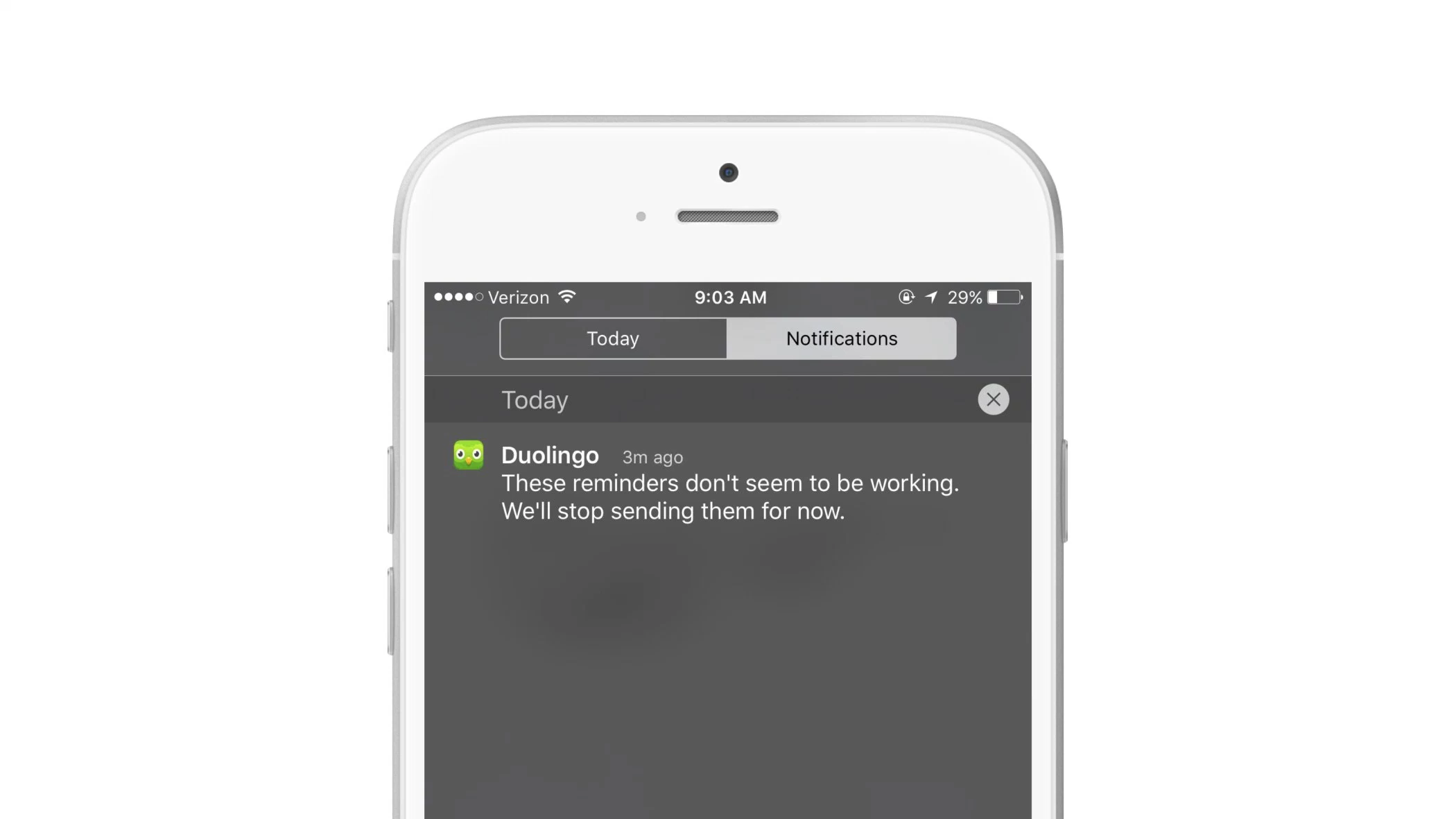
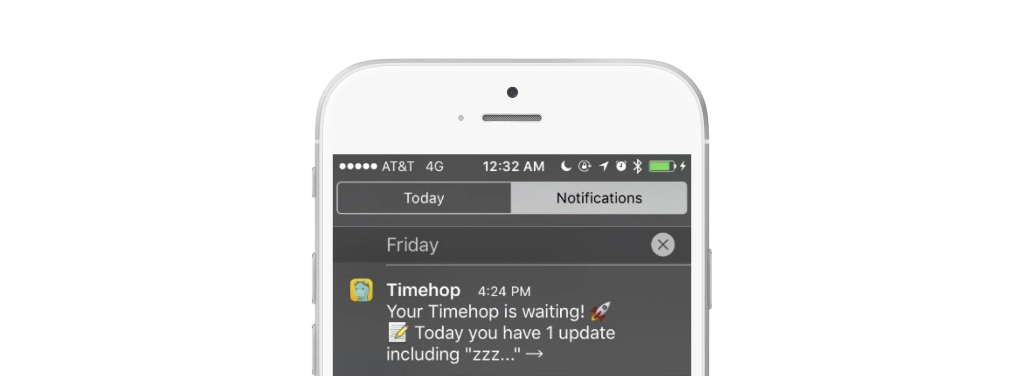
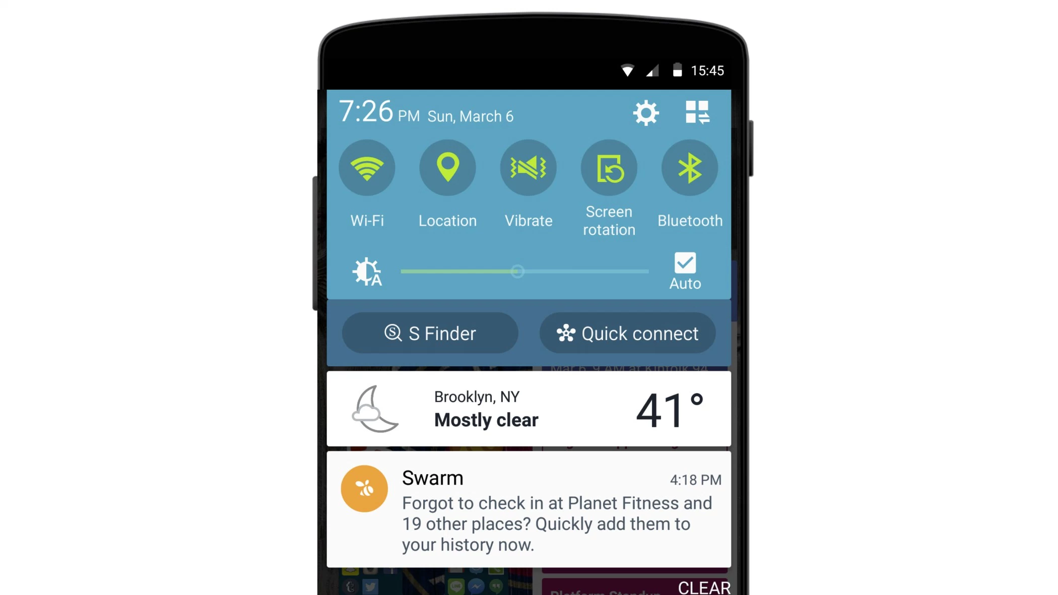
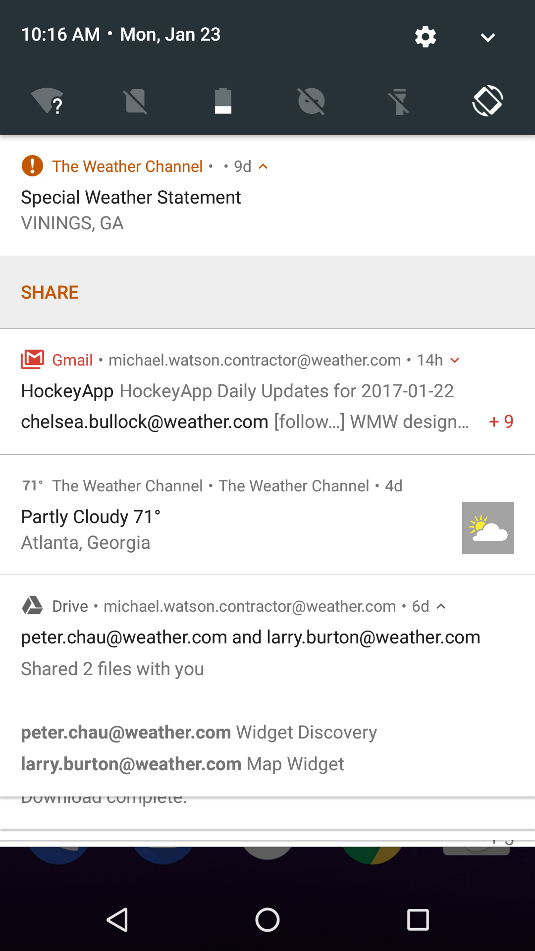
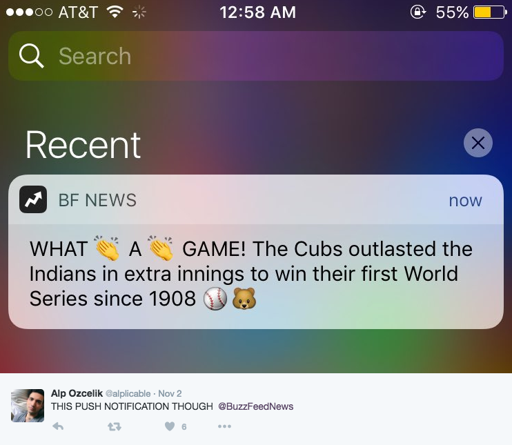
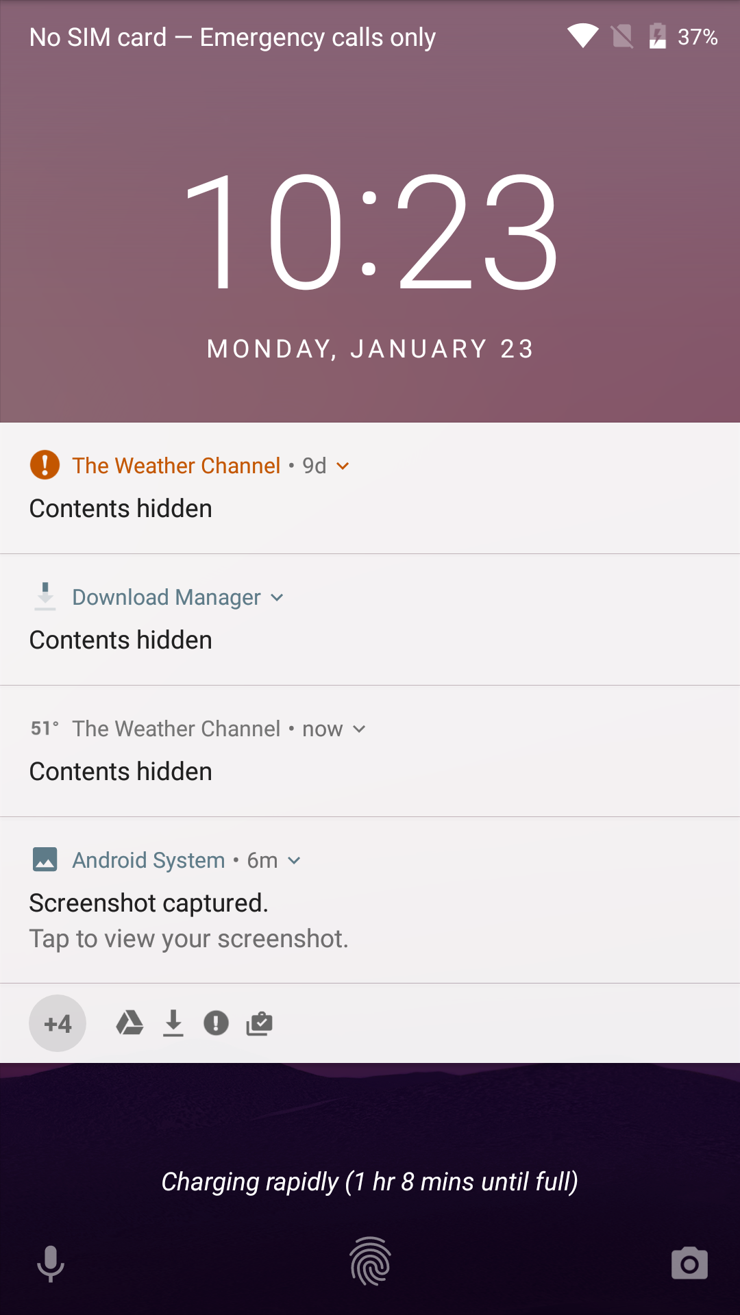
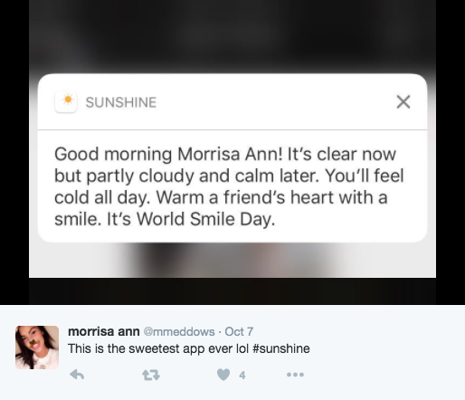
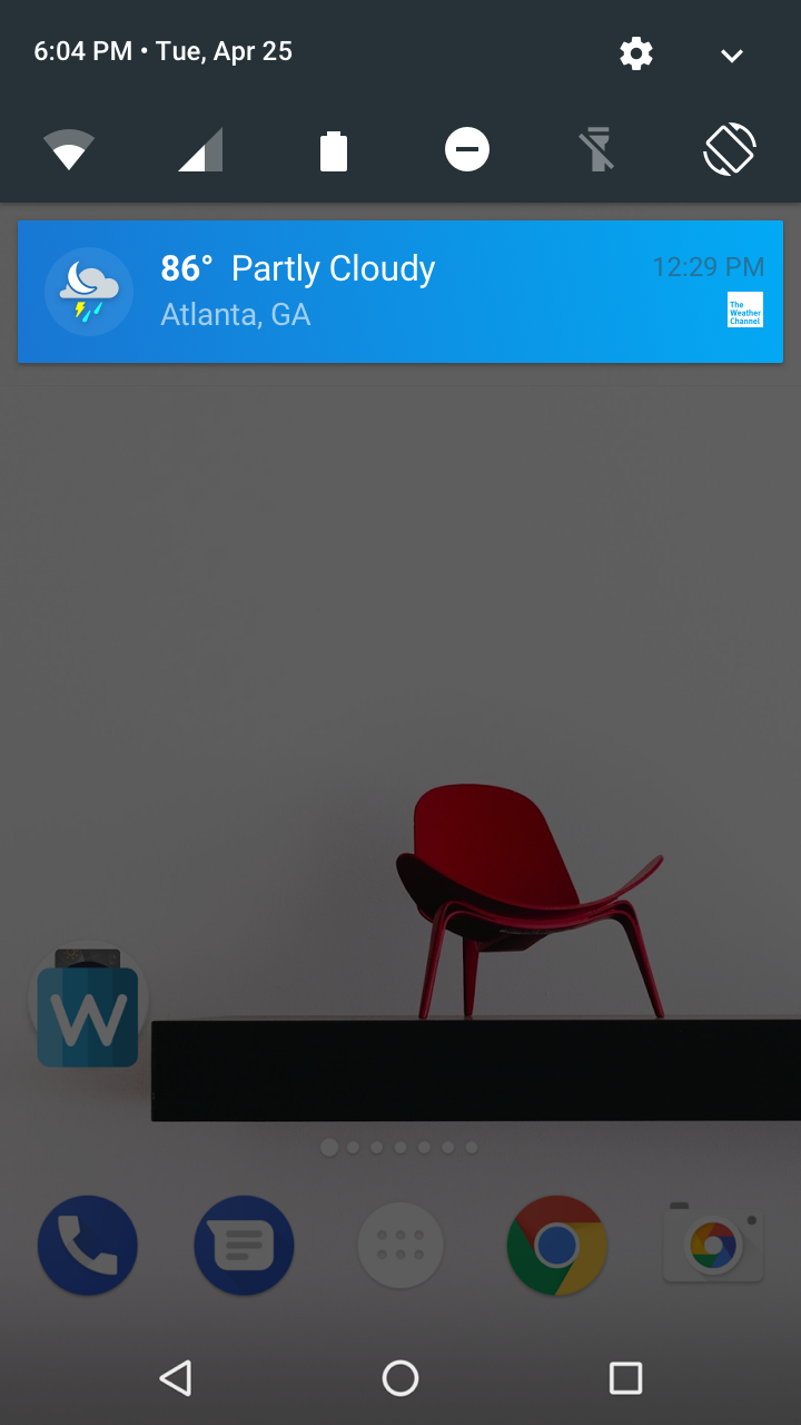
For the notifications project there was a relevant business need to engage users more precisely through Android and iOS native notification panels. For many users the notification panel is their main entry point into the application. This is an area where the user could easily become inundated with multiple messages throughout the day, and so we needed to ask important UX and UI questions around ideas like: Why would a user want to see our messages? How dense should those updates be? How often does a user need to see notification updates? Should they be able to personalize notifications? What are best practices around notifications for other applications? How do our notifications reflect against other popular notifications? What have our competitors been doing? And others. For notifications and the following project on Widgets, there is a delicate balance that needs to be struck between showing not enough useful information, and too much useful information so that the user is encouraged to open the main application and continue on their journey of weather exploration.
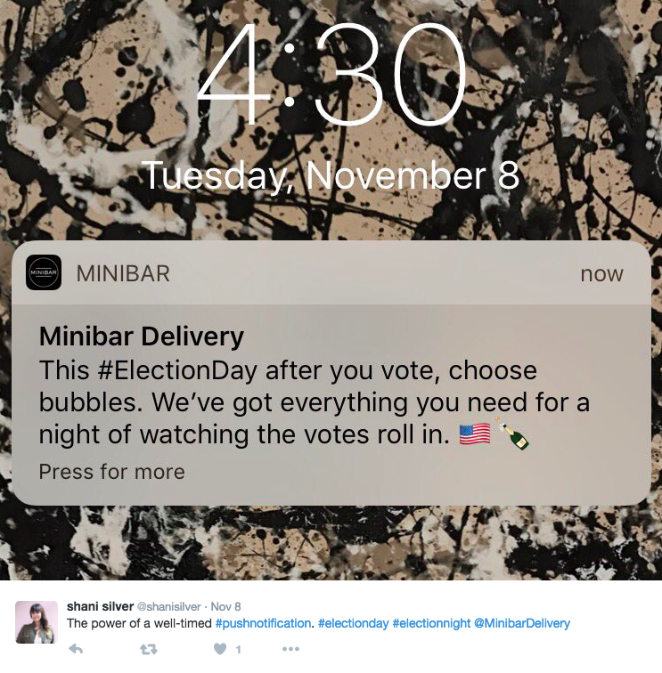
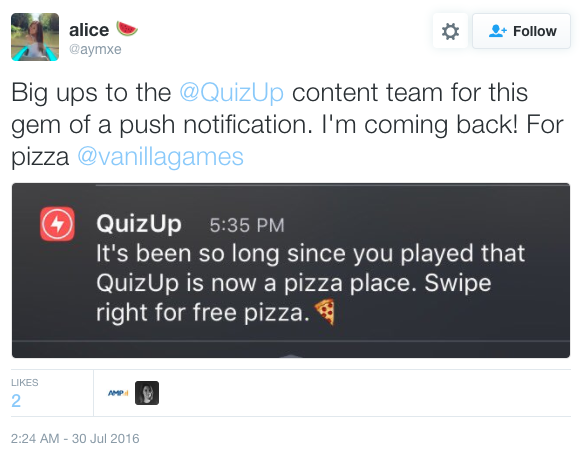
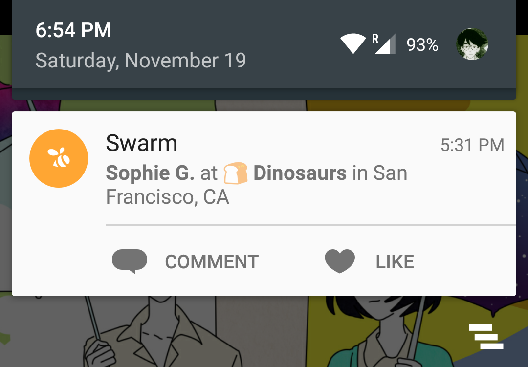
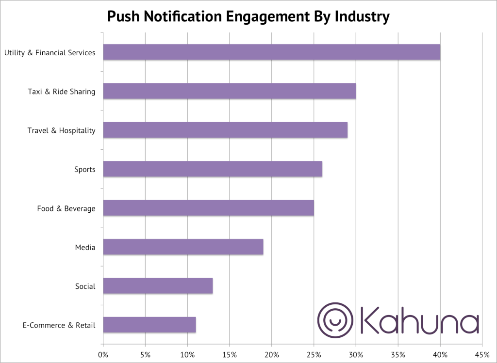
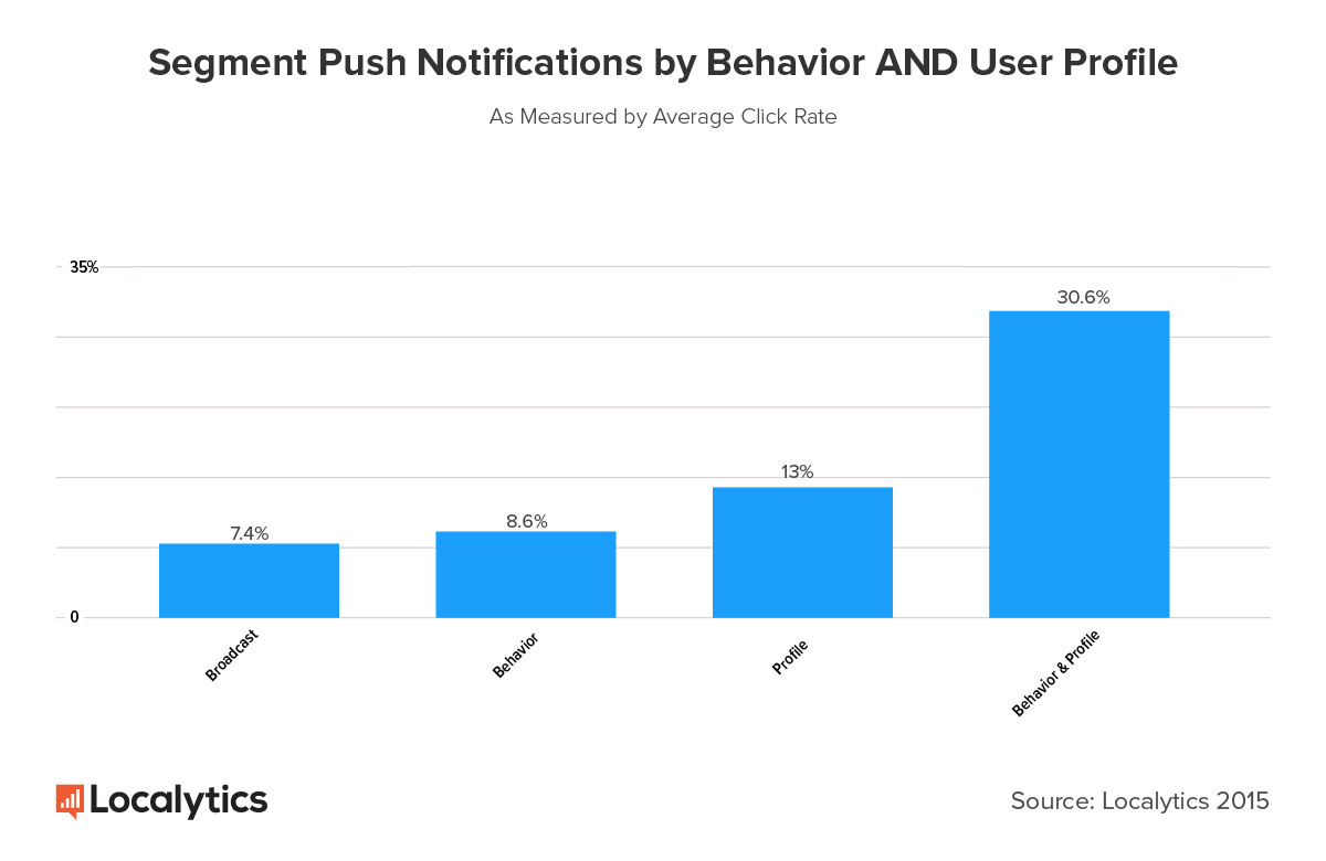
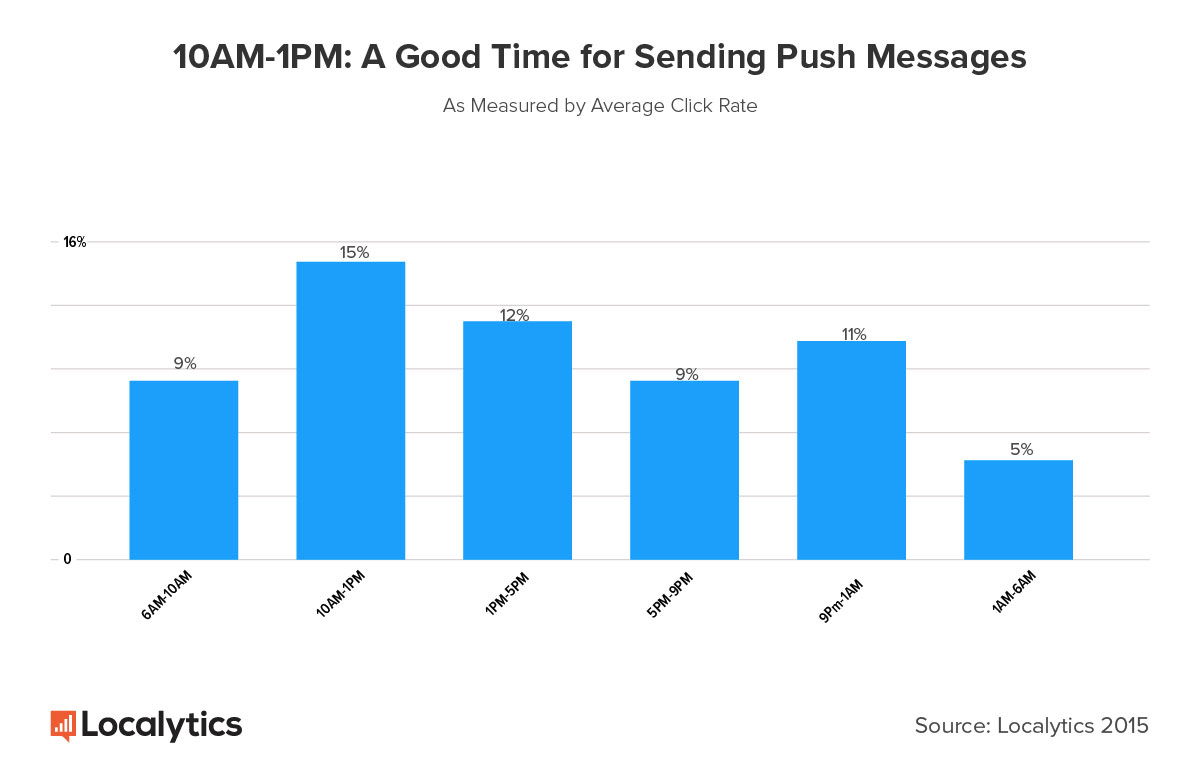
We laid the groundwork with research on notifications.
This was done to get a grasp on the industry standards and best practices.
Notification Research
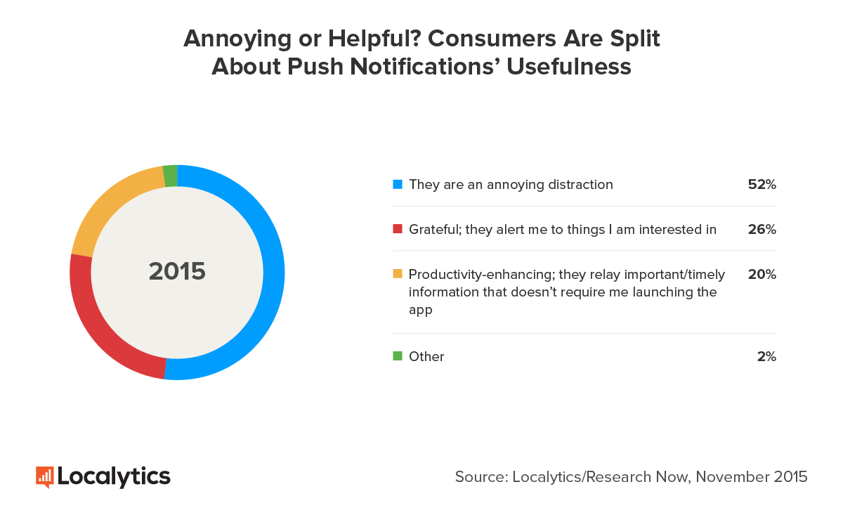
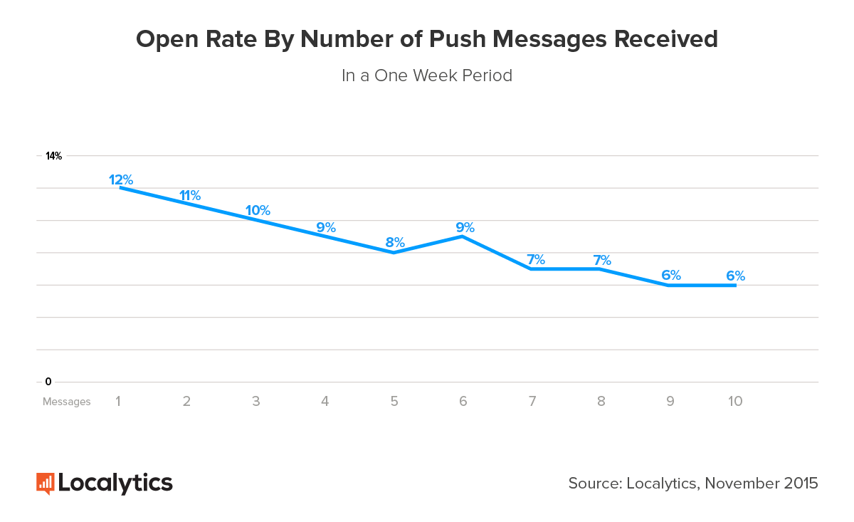
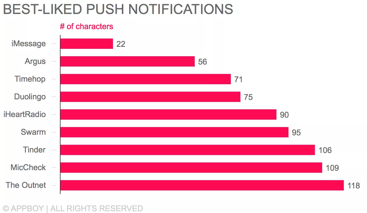
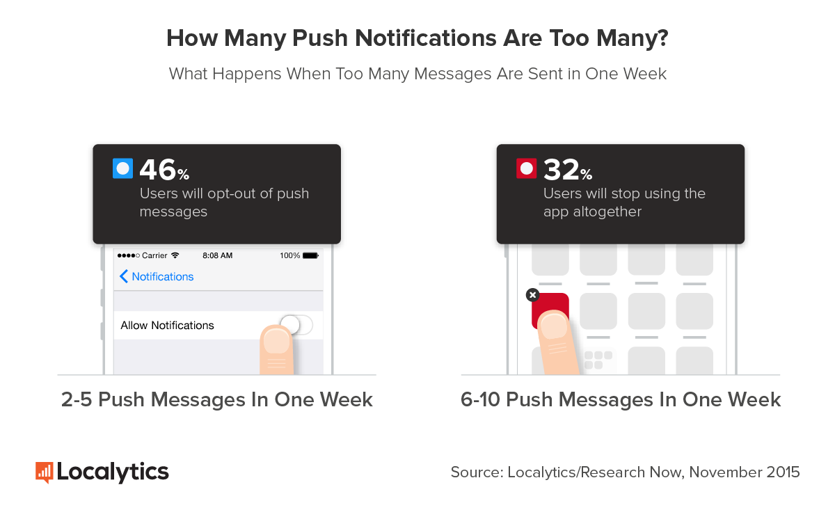
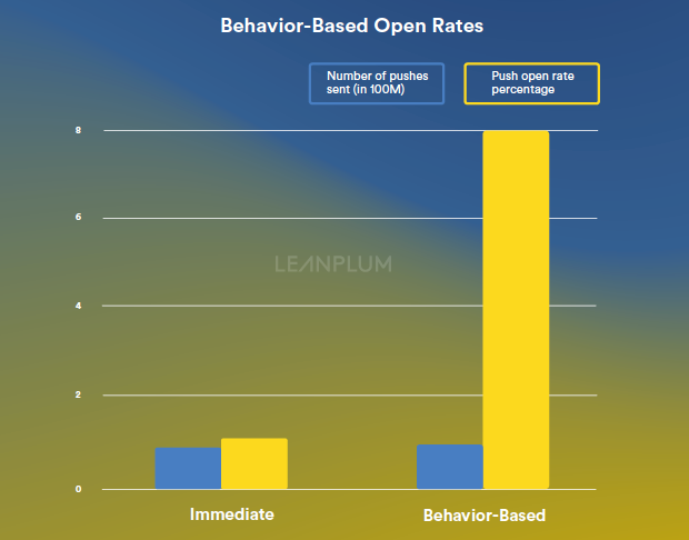
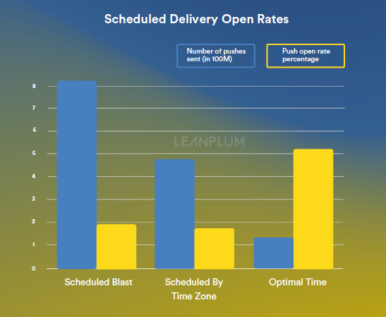
References were gathered from popular applications.
Notification References
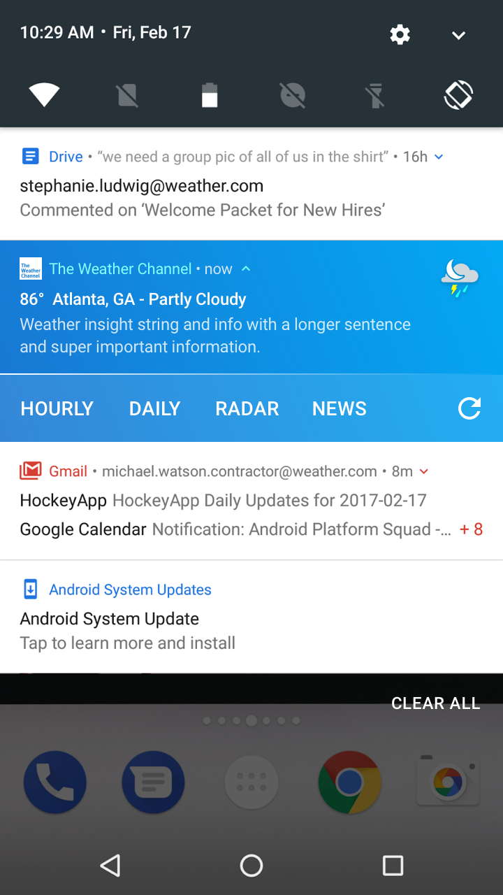
This project encompassed designs for both Android M, and N.
Android M Compositions Research
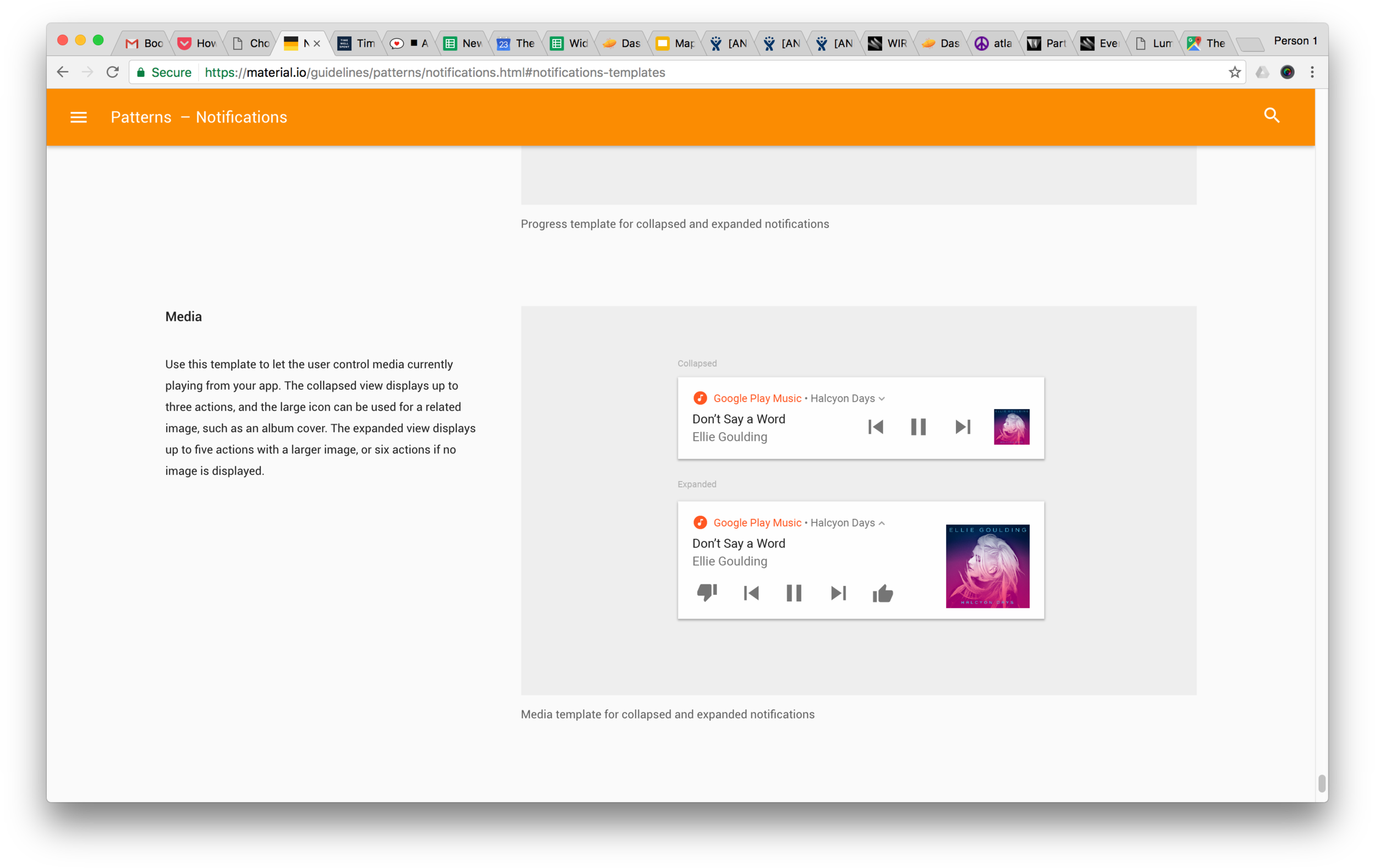
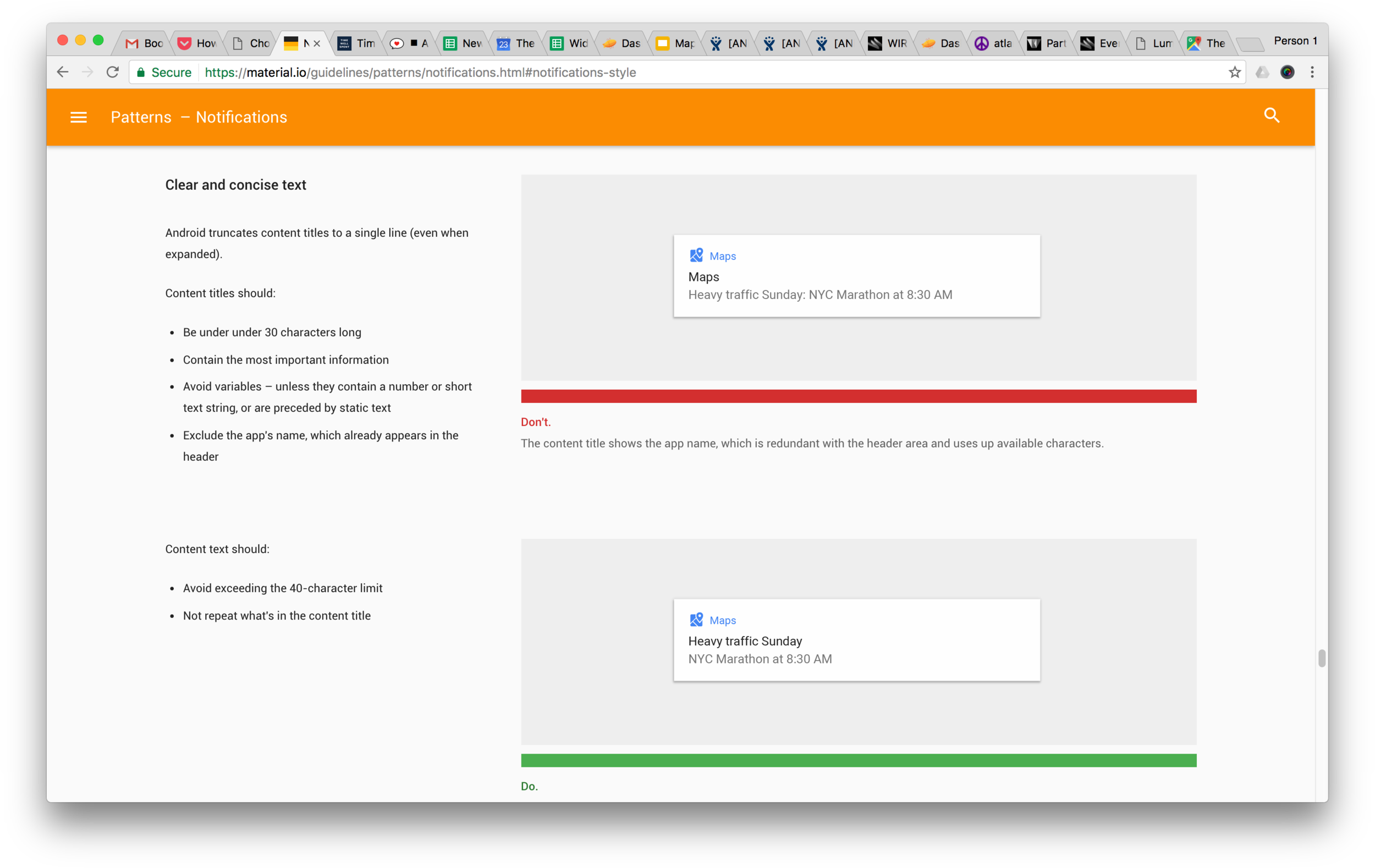
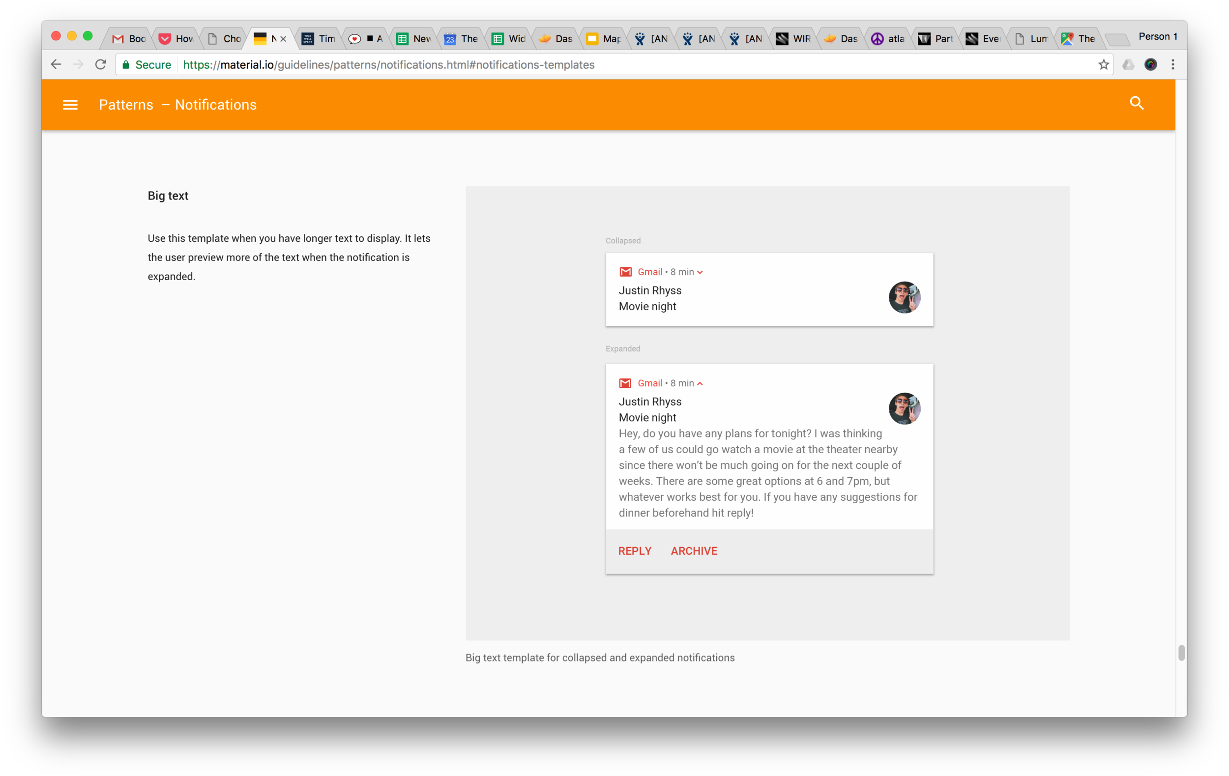
Android M Composition Research
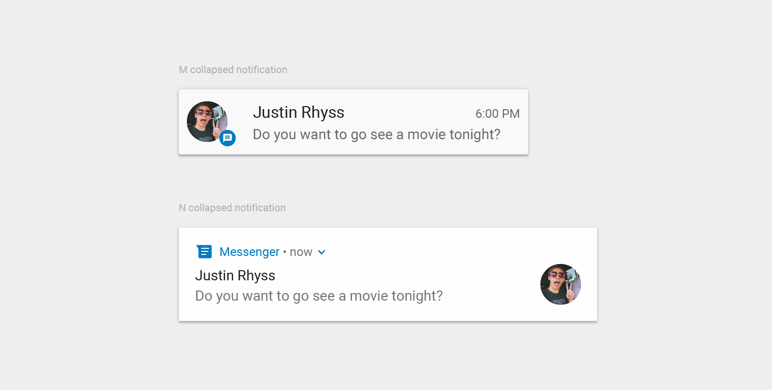
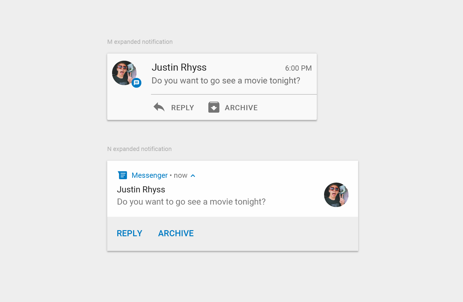
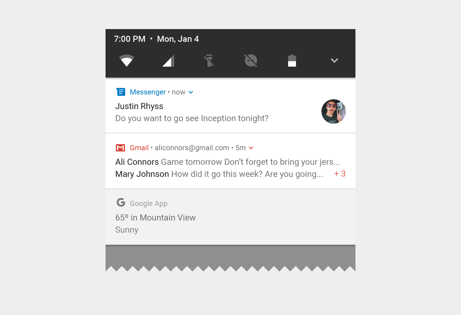

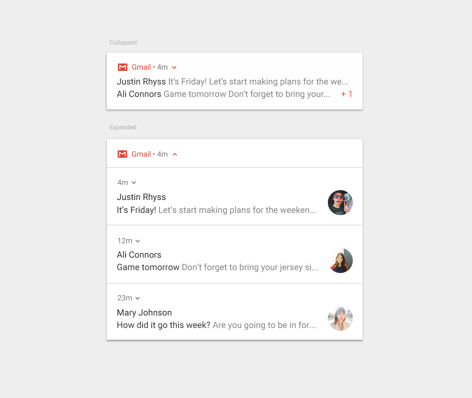
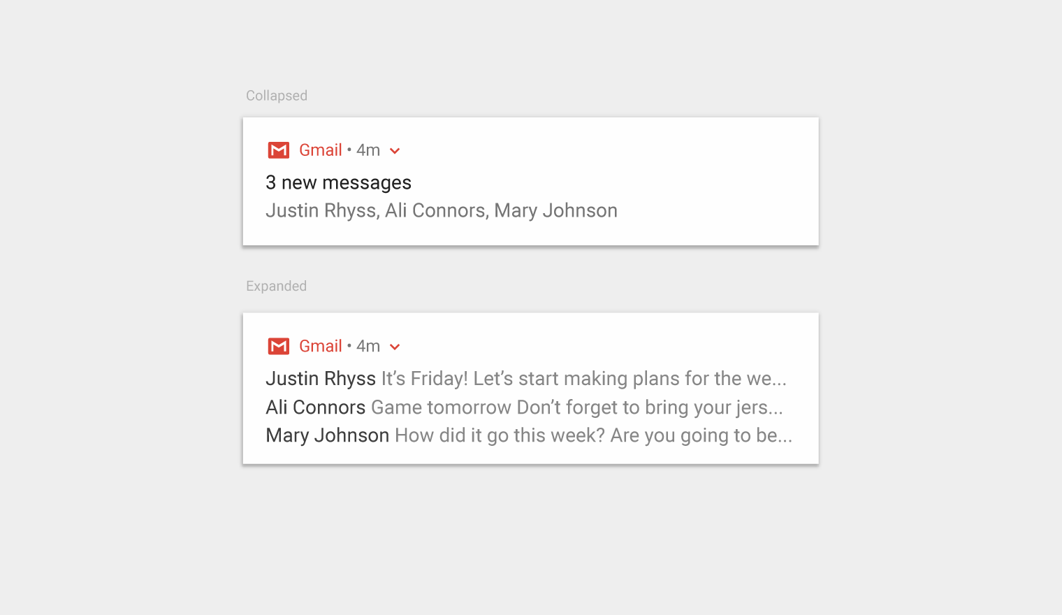

We had a good idea of how we currently stacked up against the competition.
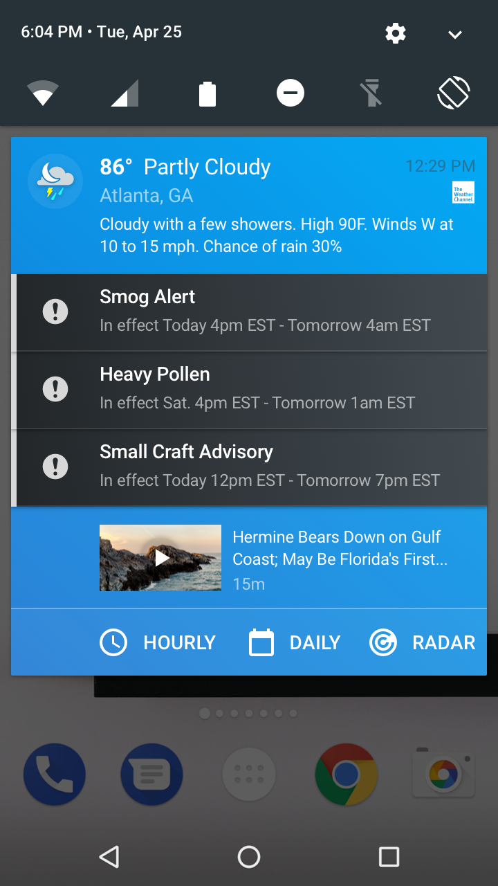
But we thought that idea could be made better through the positioning of enhanced previews, expandable and collapsable notification designs, more prominent alert integration and an updated, consistent look and feel that was following the theme update for our native Android App.
The quality gap here is apparent.
We needed to make a better effort in brand distinction and fit/finish of the TWC notifications.
Quality Gap Adjustment Concept
At the very early stages, there was a concept for how Watson could be integrated into notifications.
Unfortunately the idea was never fully fleshed out, but you can take a look at the early user flow below. Smart notifications and smart assistants may still be the future for how and when you interact with your personal applications. They allow for a much more robust offering on what type of information is available to the user, and remove limitations for how data is presented and ultimately consumed.
Watson User Flow Concept
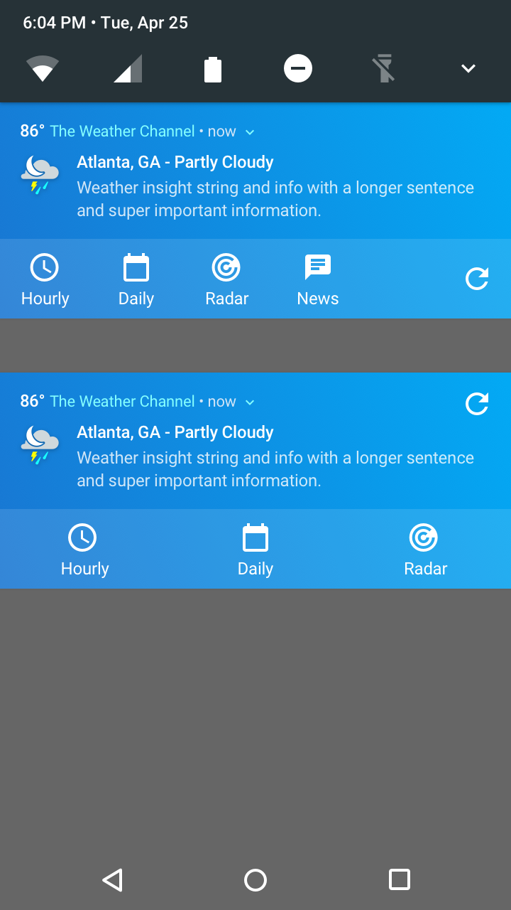
Actions needed to be placed in accordance with usability guidelines.
For Android this is typical, but it meant that there was a maximum number of options the user would have for selecting a quick-path into the application. We ended up with placements for our most popular visitation on the site, but future variations may have allowed for customization of this feature and the notifications in general.
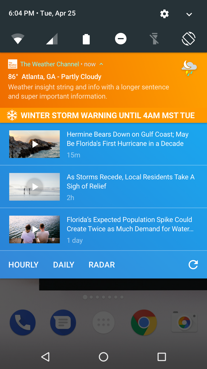
The inclusion of direct media was a focus for Notification enhancements.
This was going to be a differentiator between the TWC product offering, and our other direct competitors. We had the ability to offer weather + alternative modes of consumption to the user, so why not promote it at a high level?
Media Inclusion Concepts
Action Placement Concepts
Temperature Styling Concepts
Logo Placement Concepts
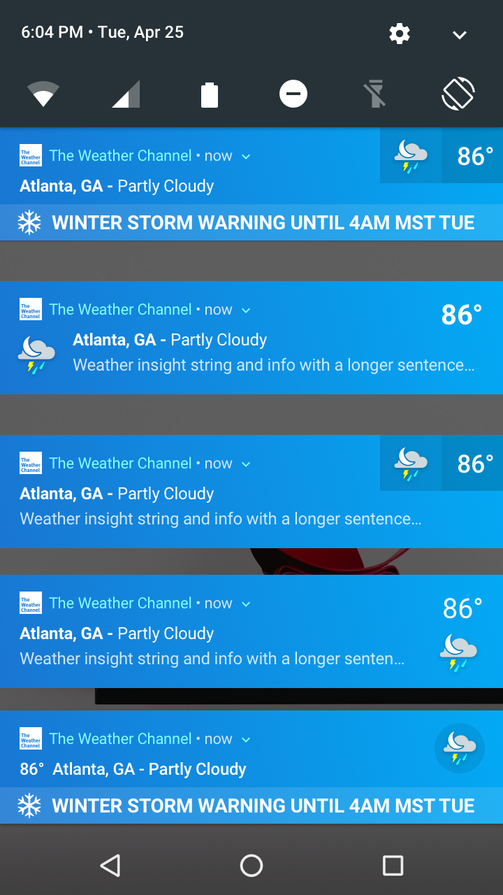
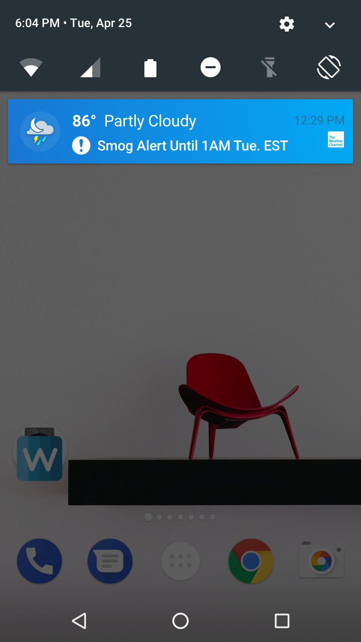
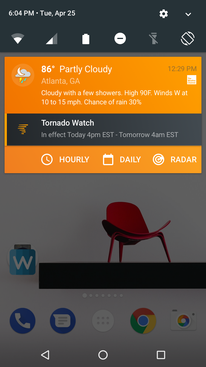
Alerts fell on a priority scale for Android.
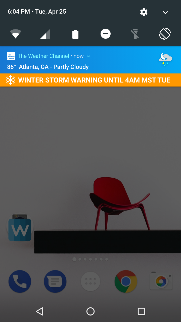
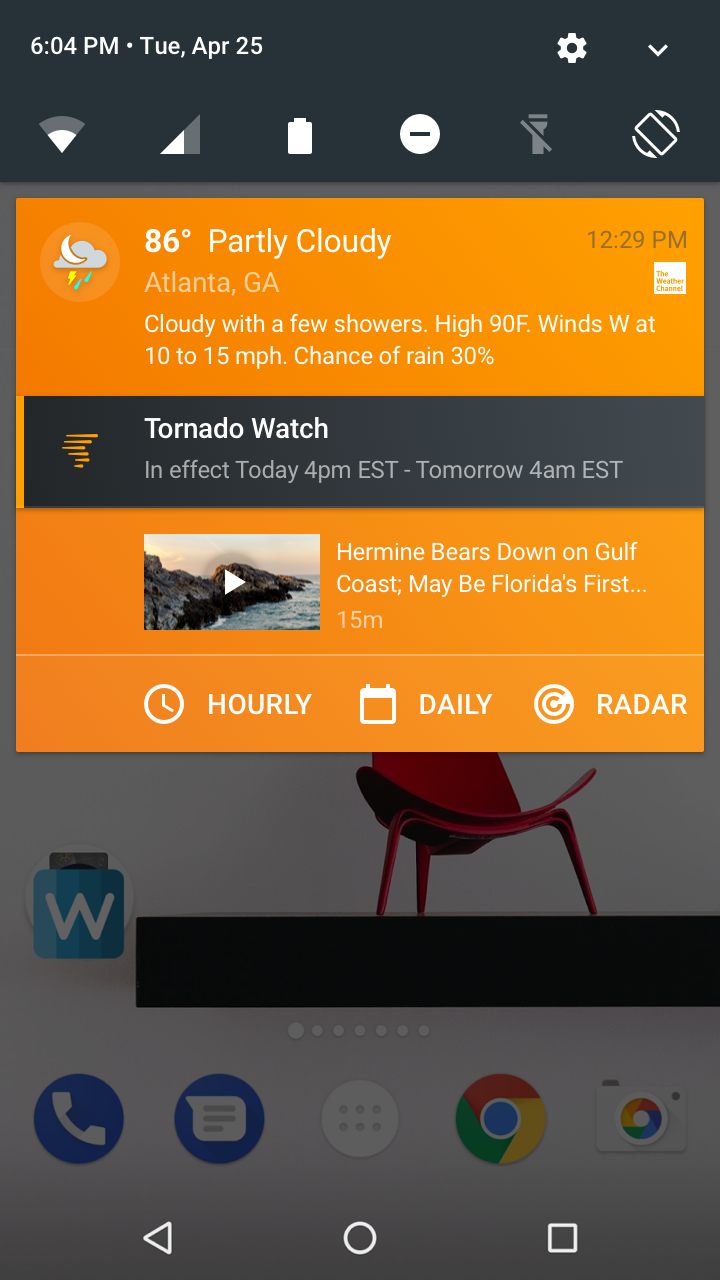
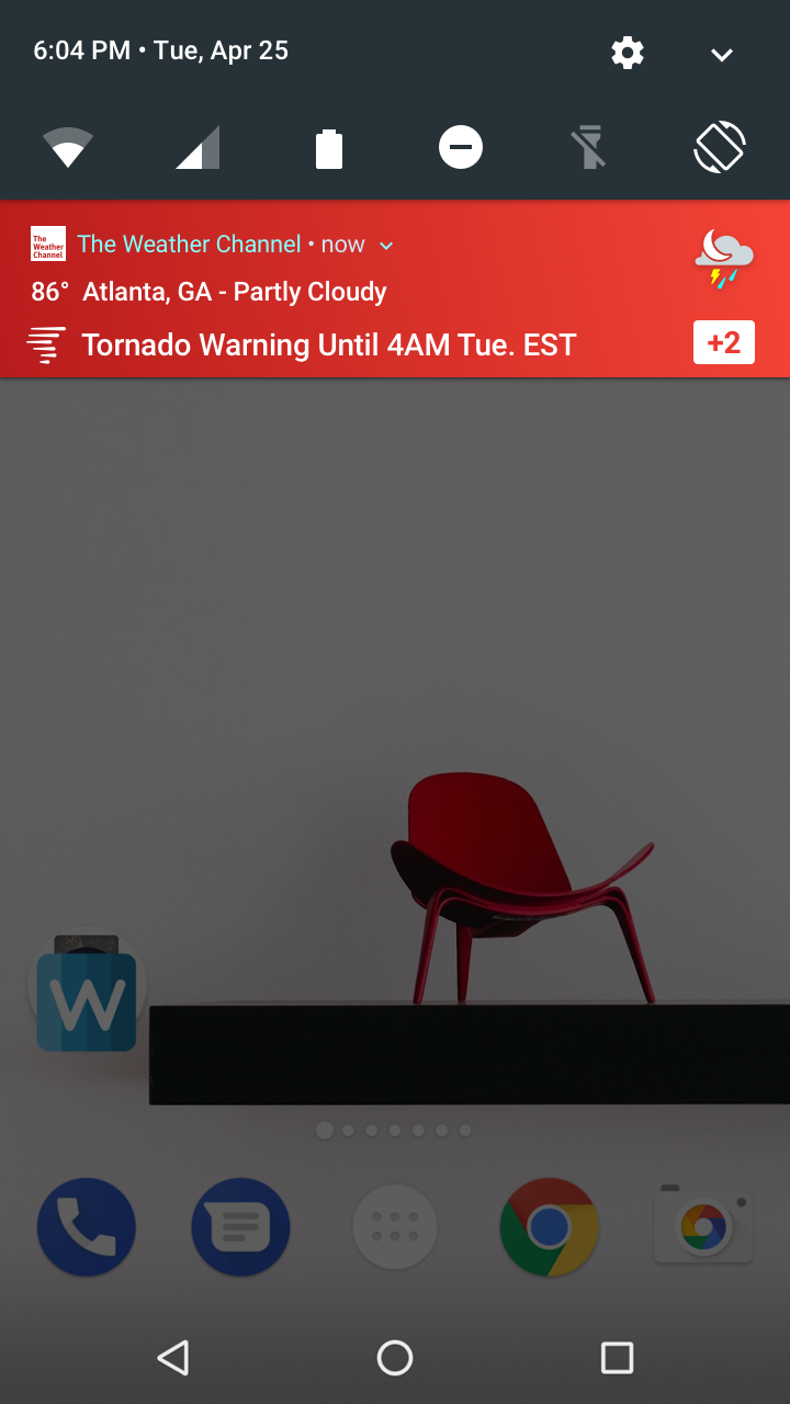
This meant that we needed to adhere to assigning which alerts would be associated with which hierarchical level on the scale. The best strategy here was to go with a combined alert/unified ongoing notification so that in the event an alert was taking place, there would be no overlap of notifications for the user, and our associated content would rise higher in the list.
Alert Styling Concepts
Combined Alert Refinement Concepts
Color Variation Concepts
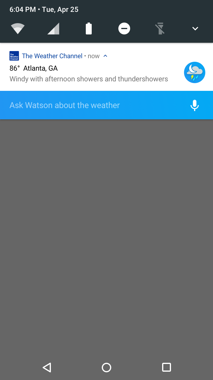
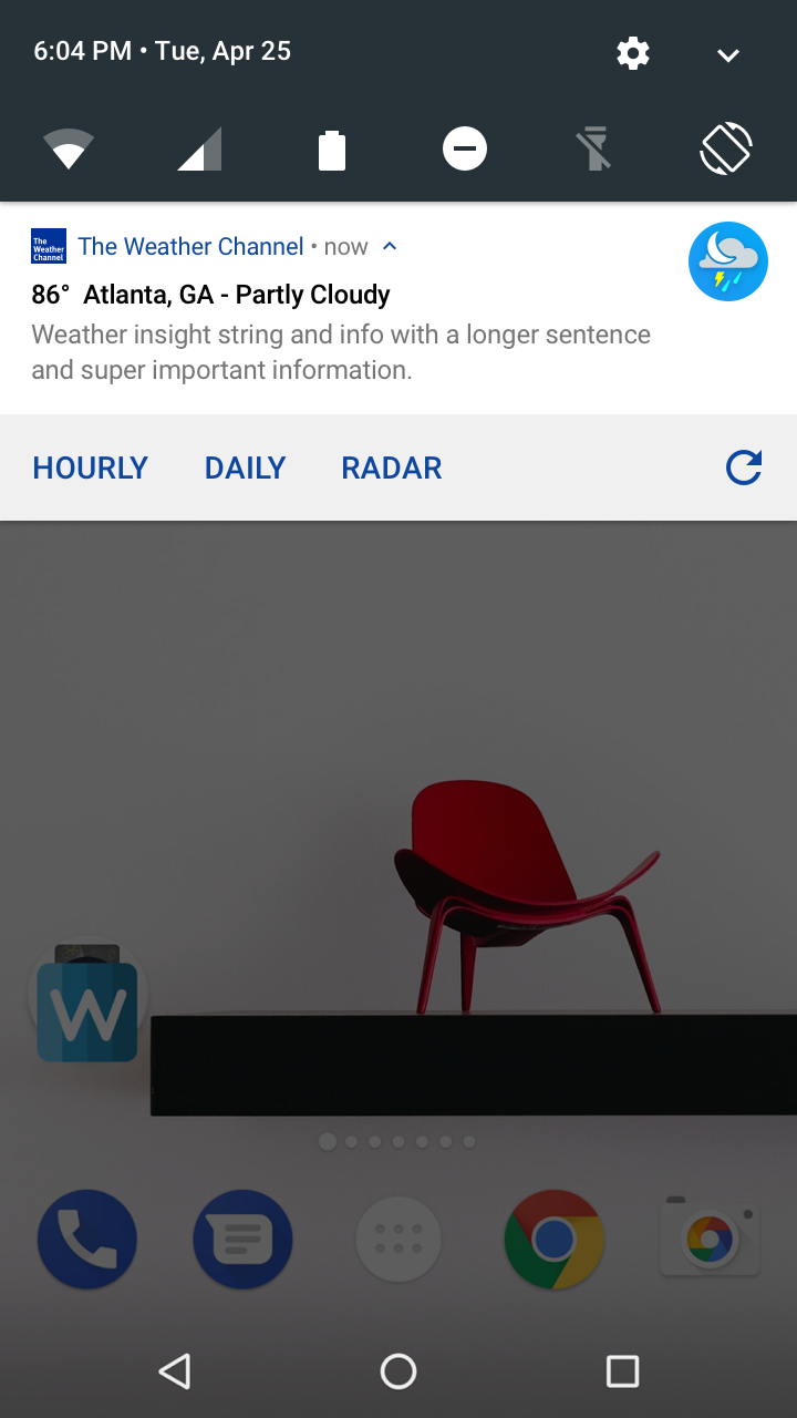
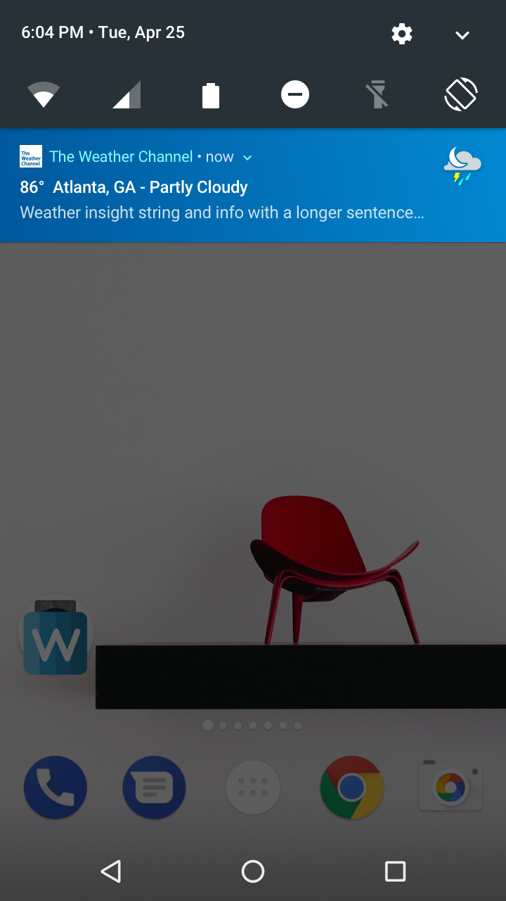
Finally, screens were refined and crafted for both the Android M and N OS variations.
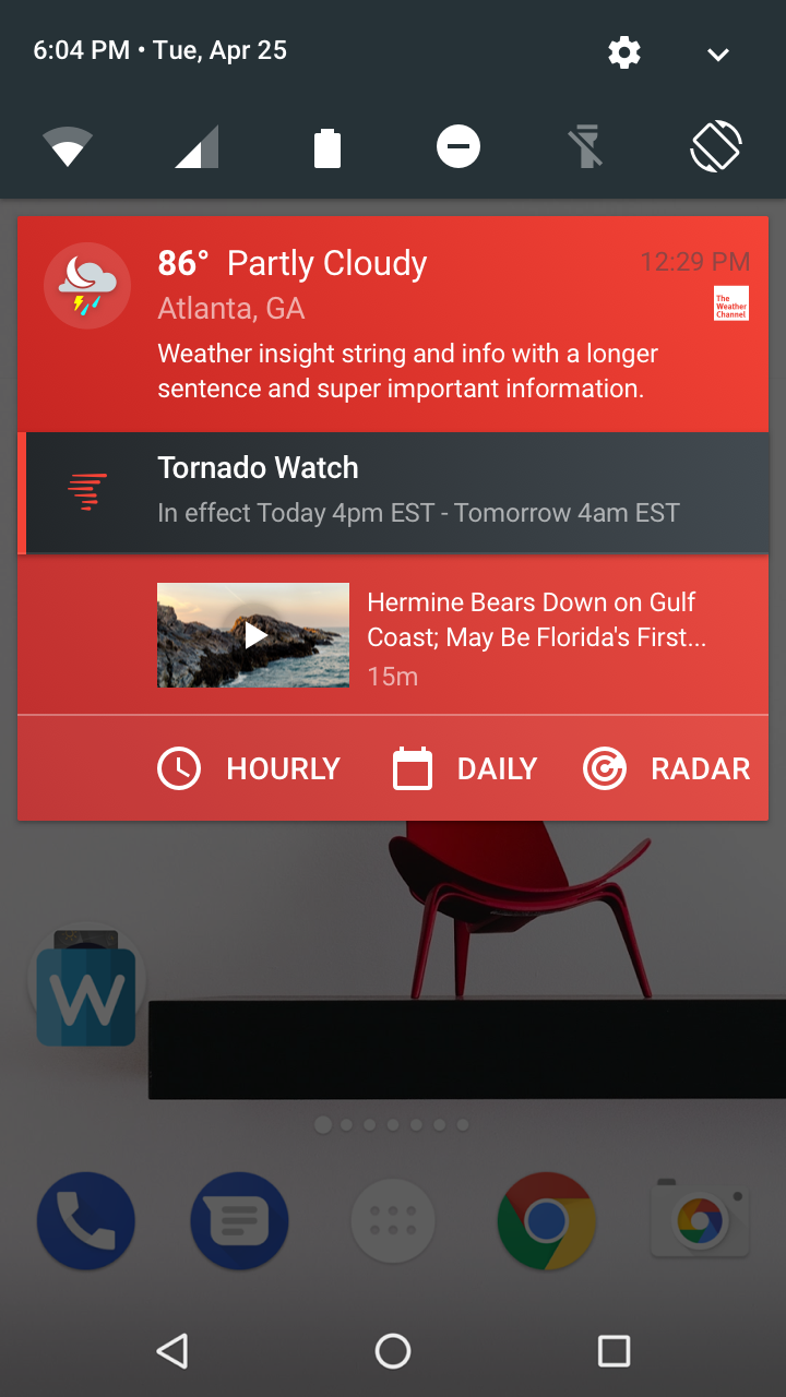
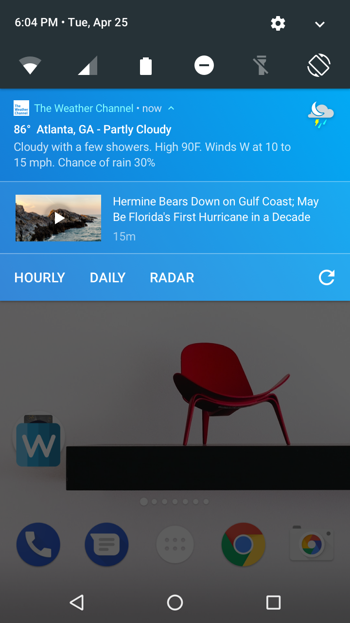
Android M Final Designs
Android N Final Designs
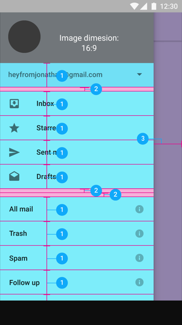
Android Nav Panel
Android Video Content
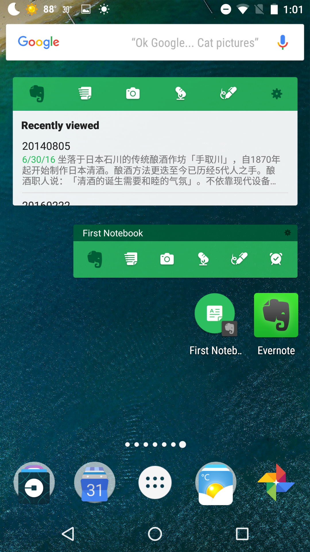
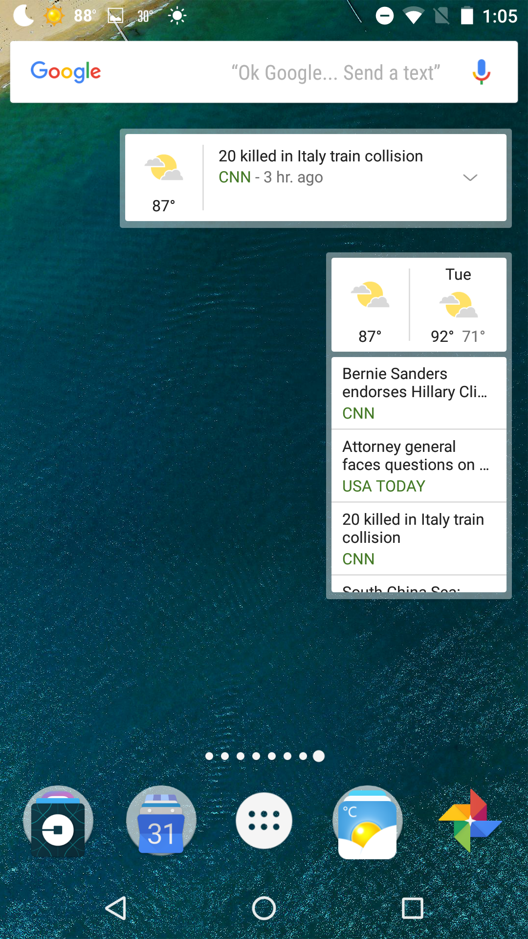
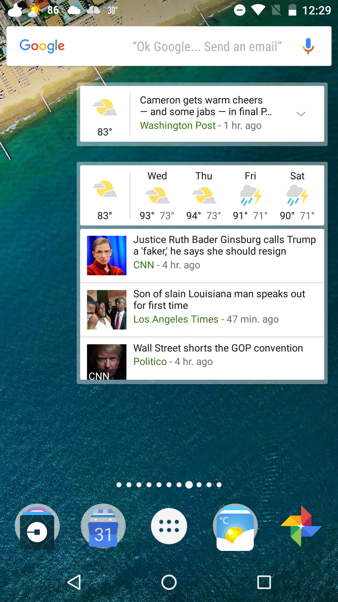
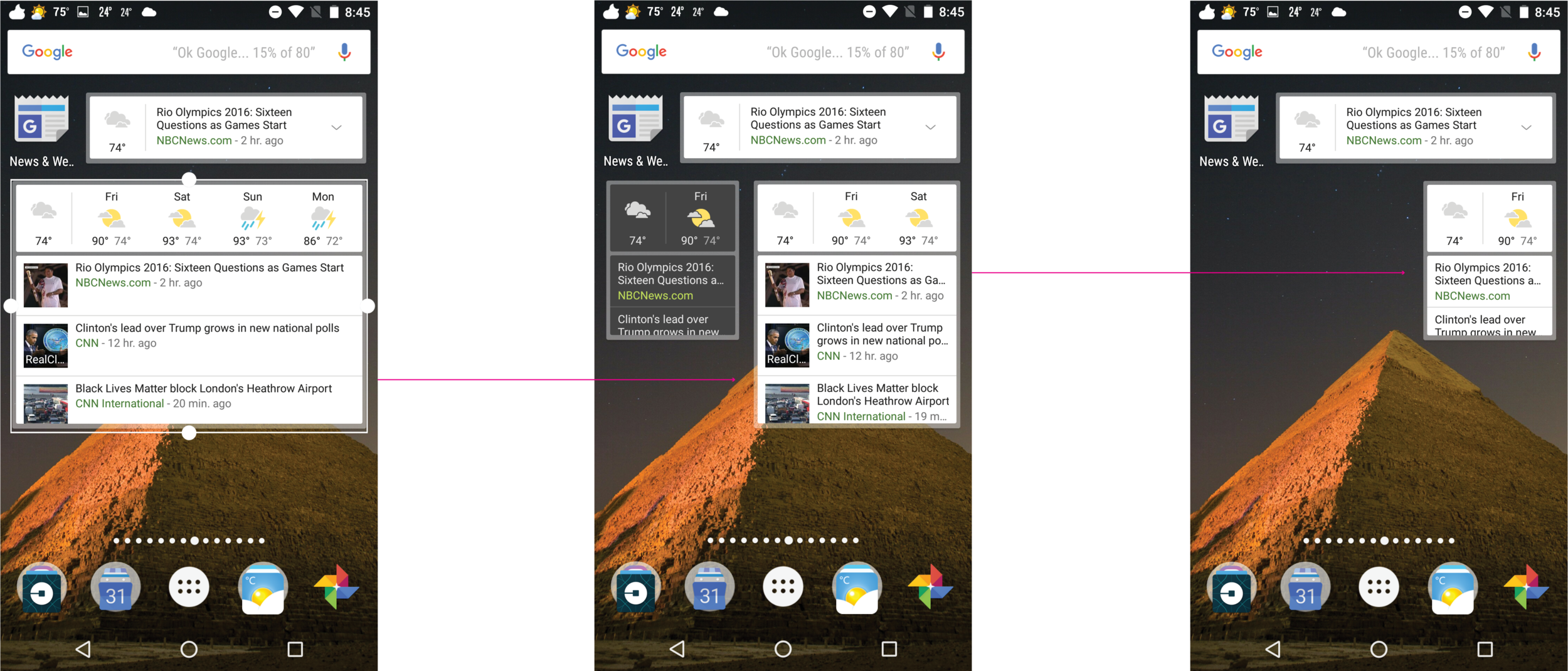
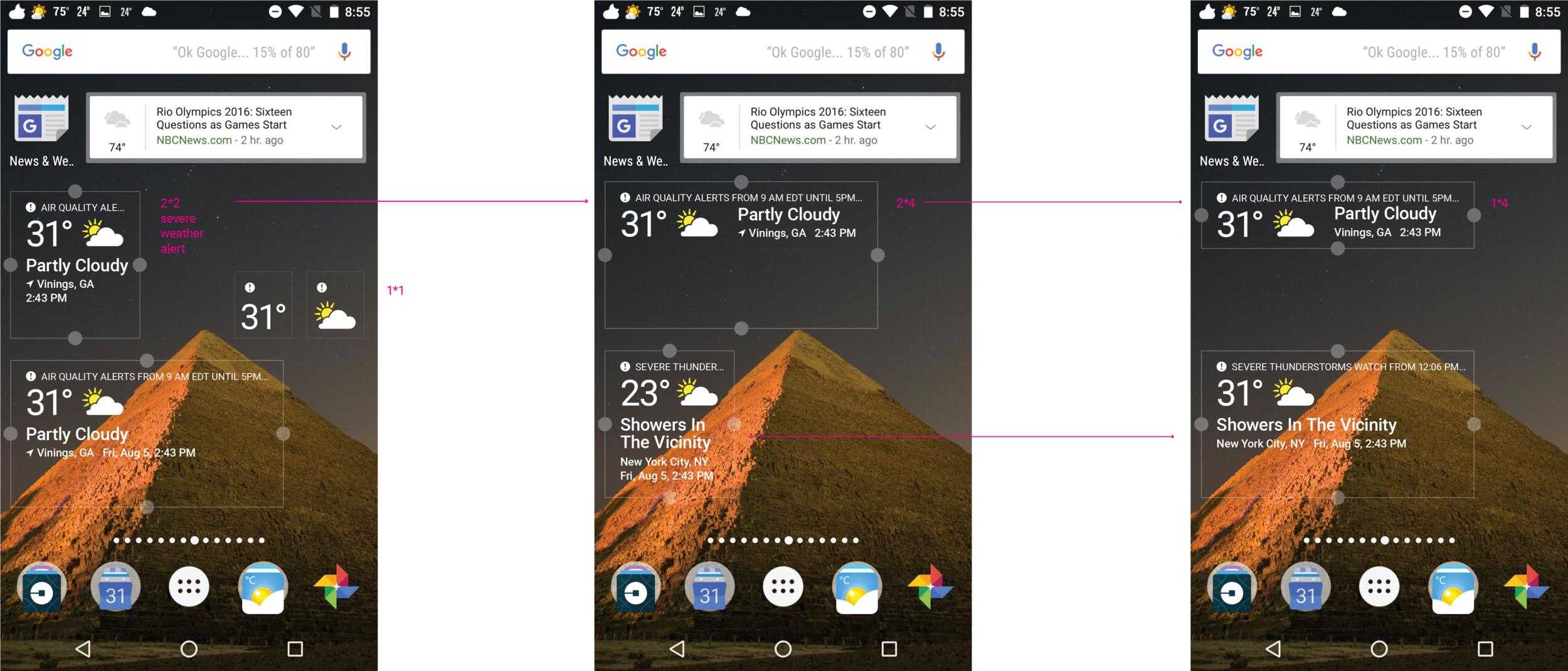
Android Resizable Widget
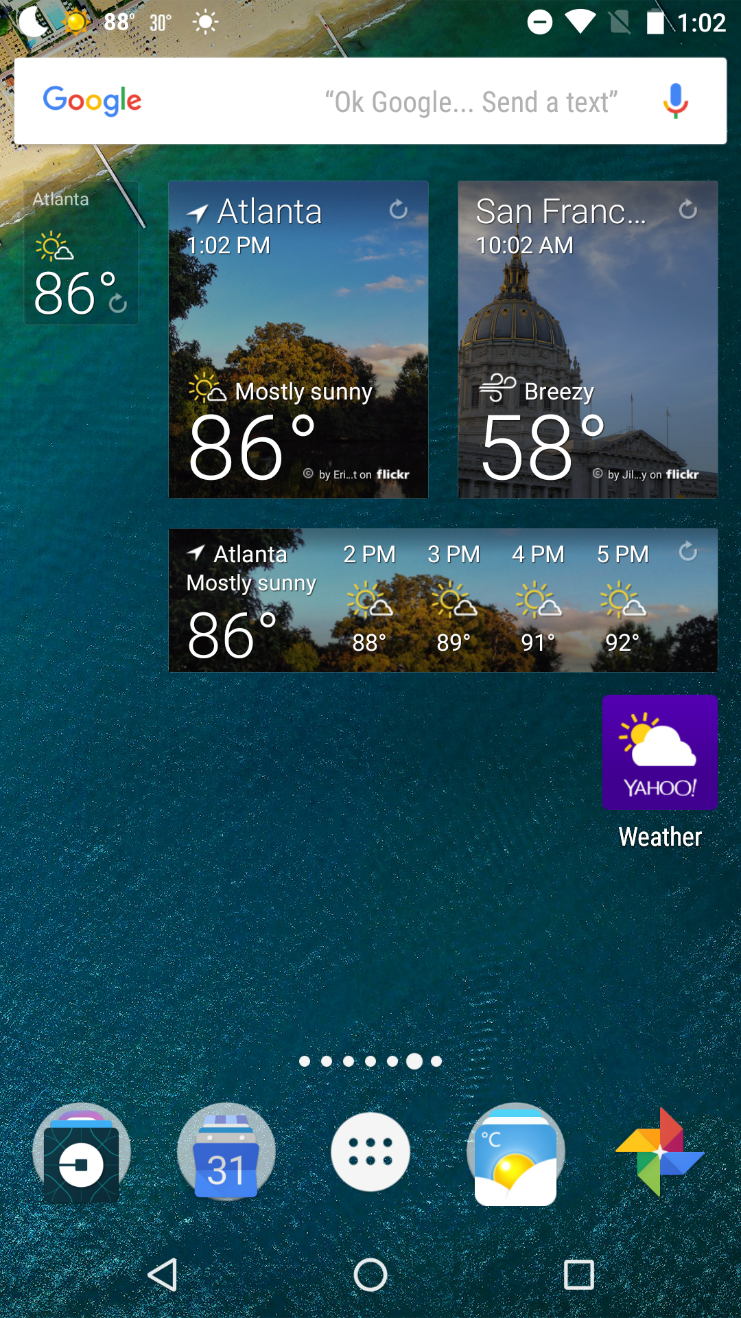
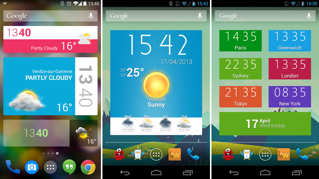
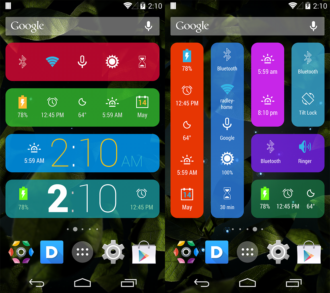
Competitor audit on best practices and standards.
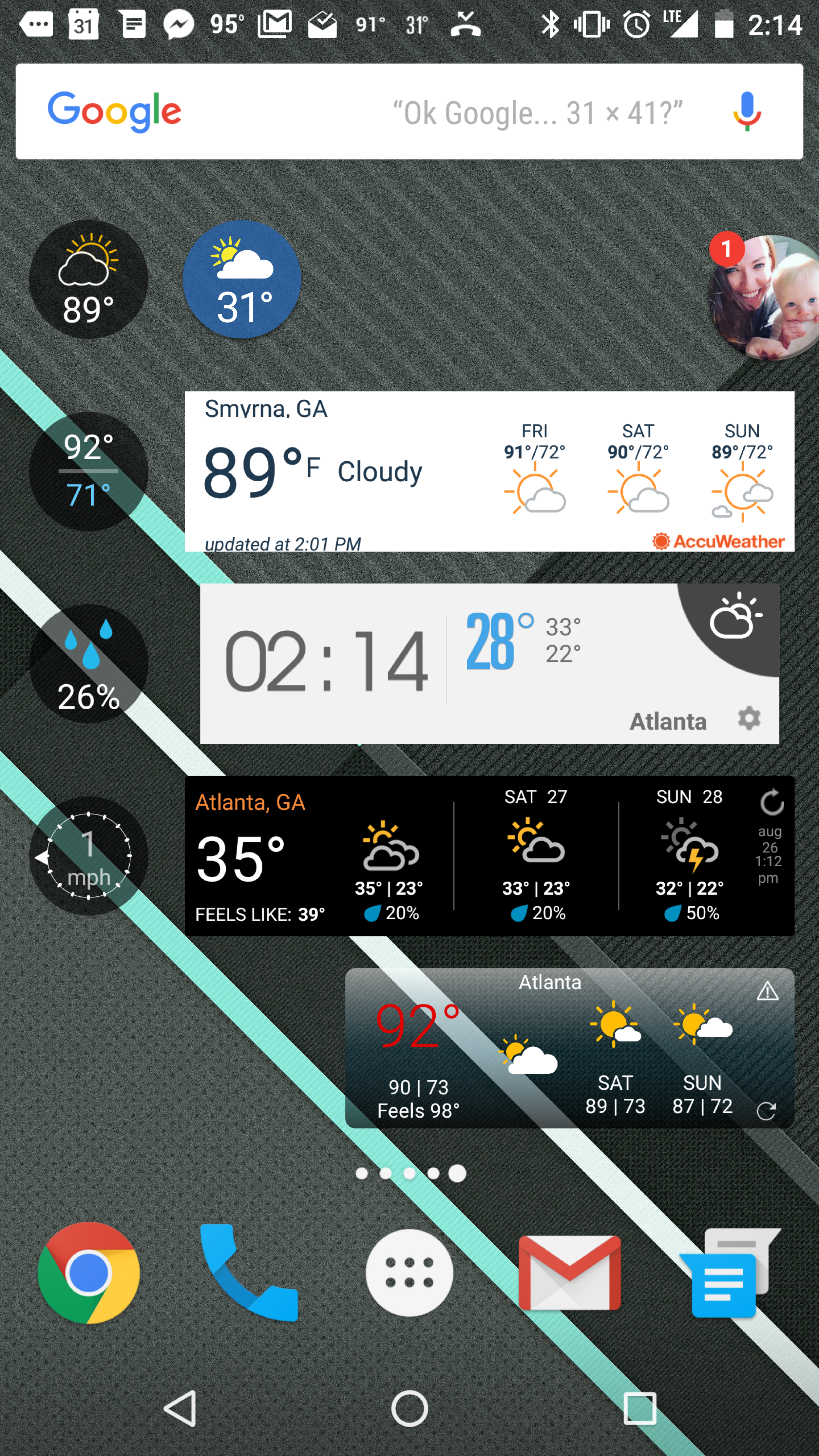
Widget Reference Research
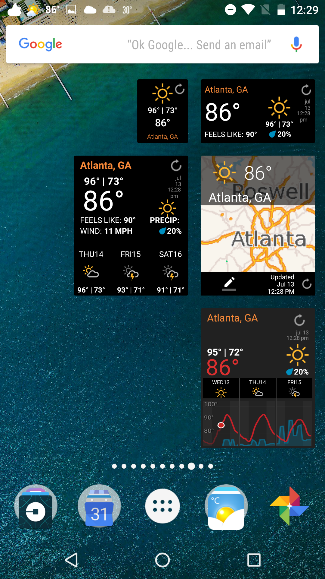
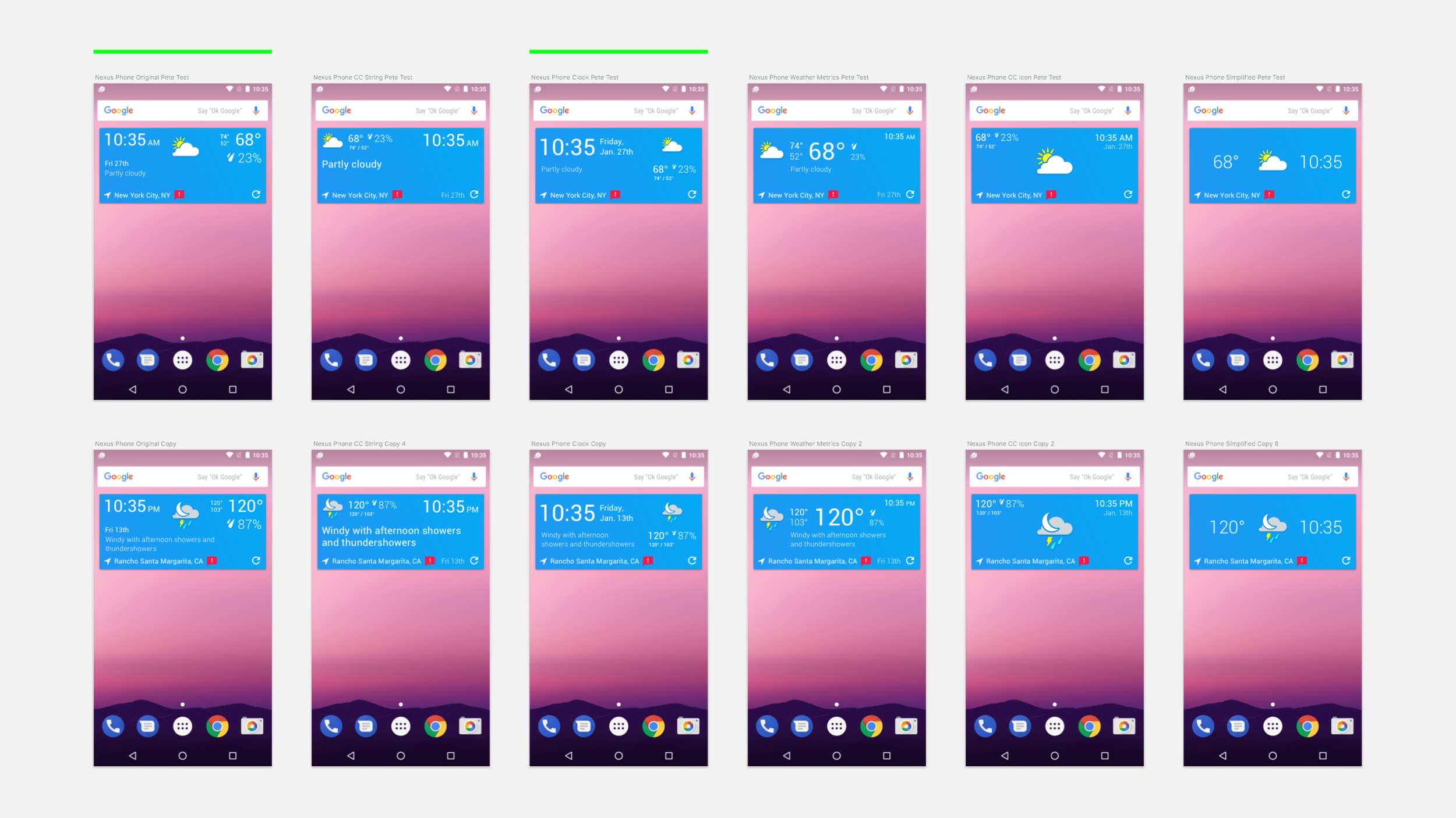
Limitations were set for the formatting of information.
And a deprecated list was made for information hierarchy.
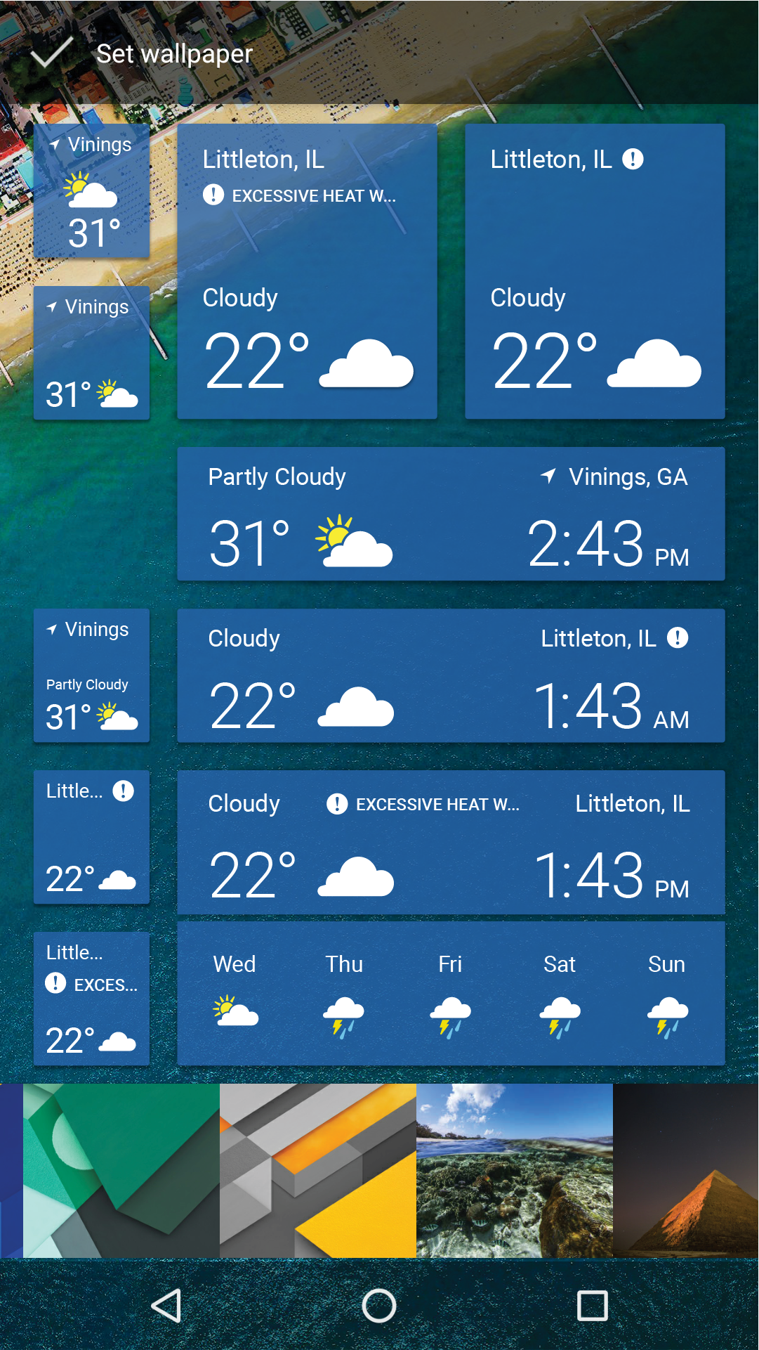
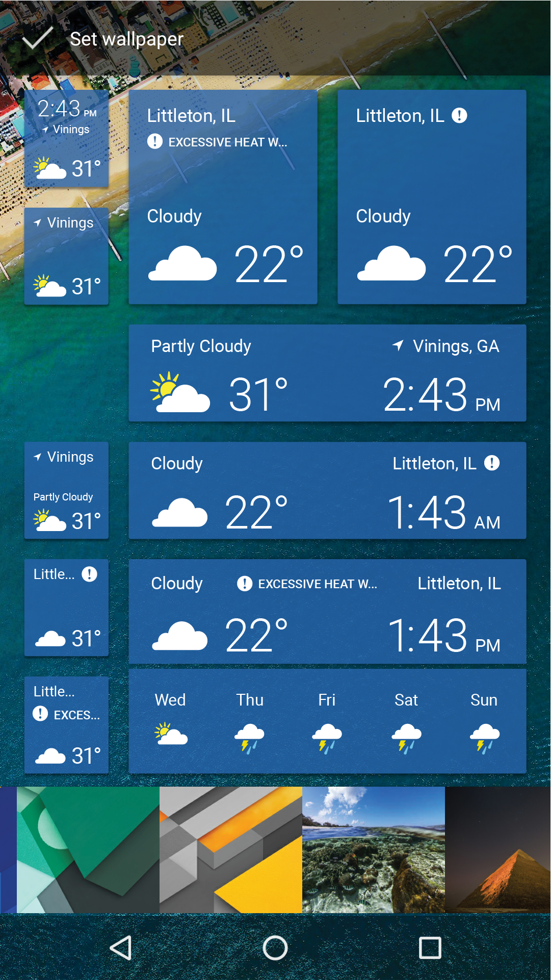
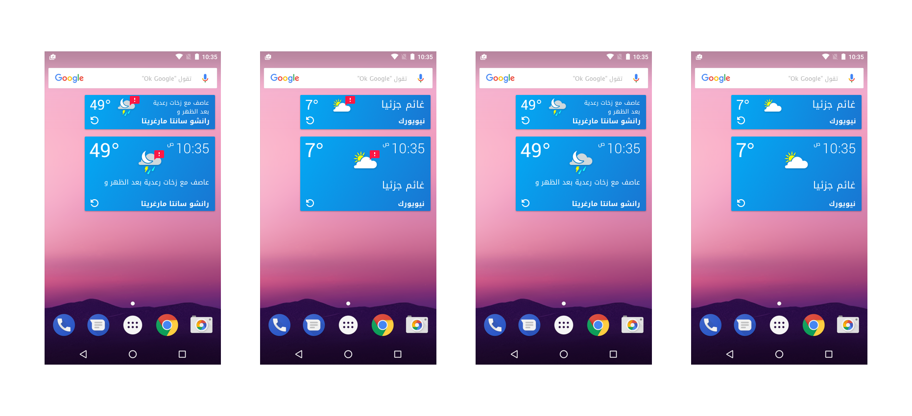
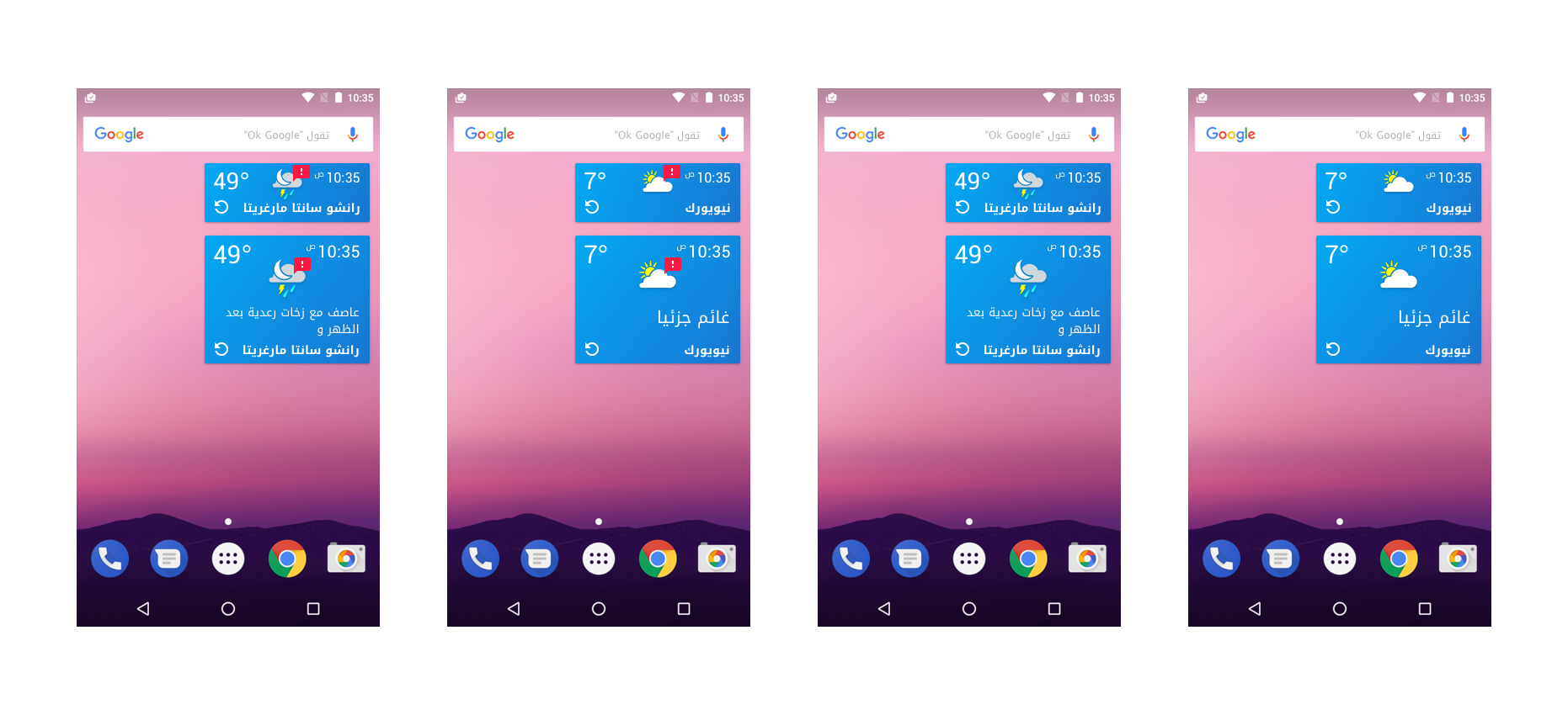
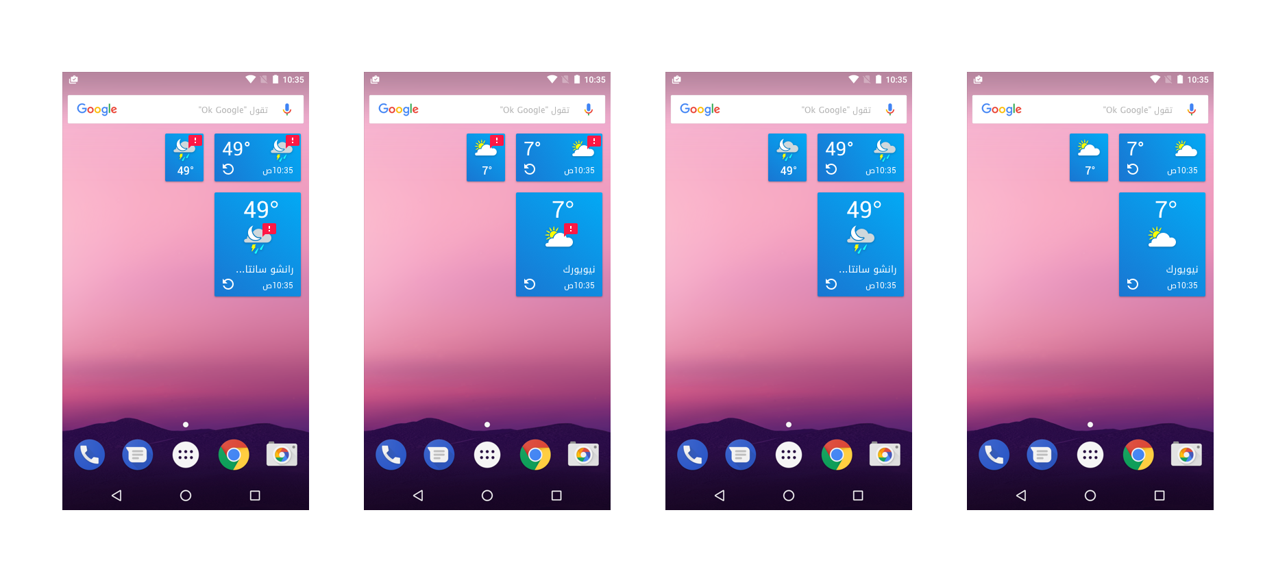
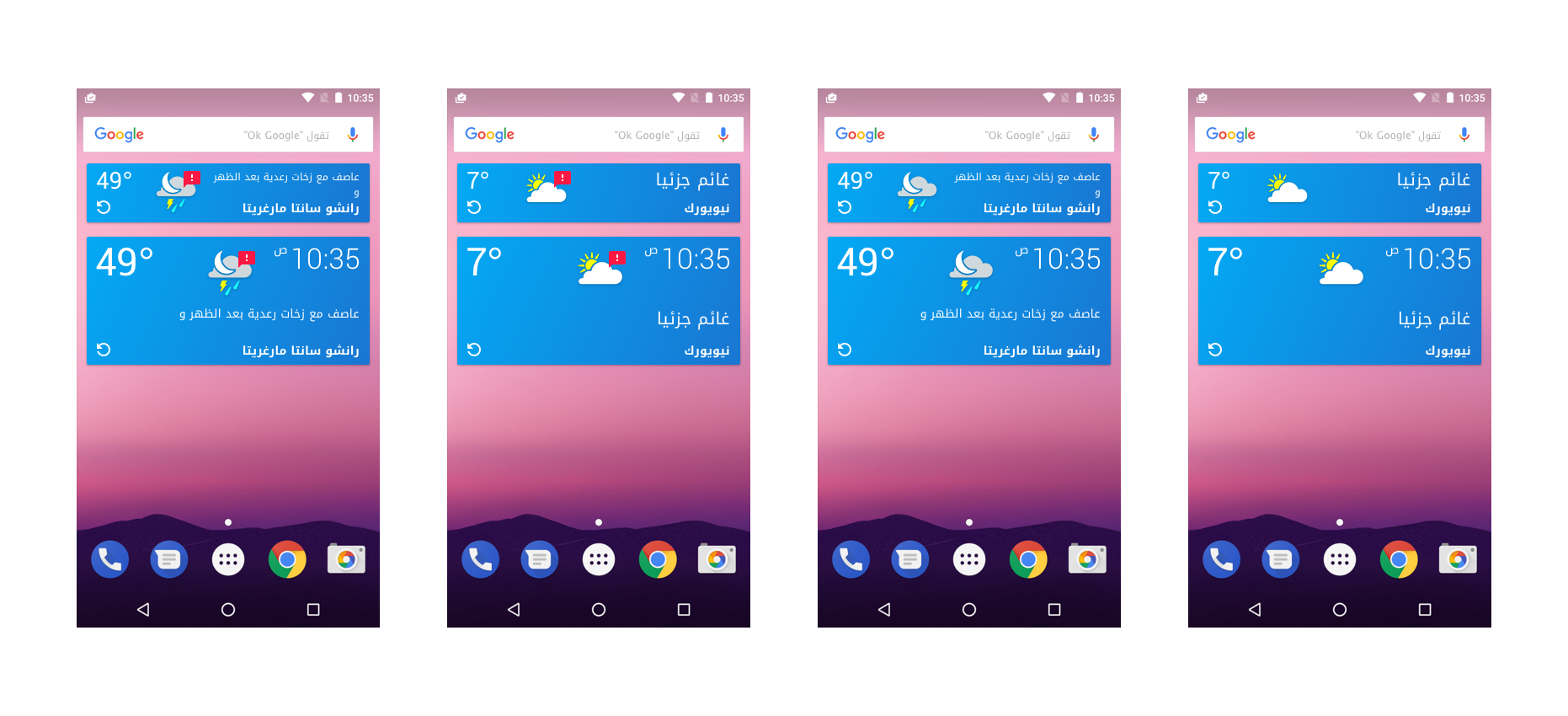
Over 26 Languages needed support and were tested for integration.
Exportations on layout, structure and content positioning
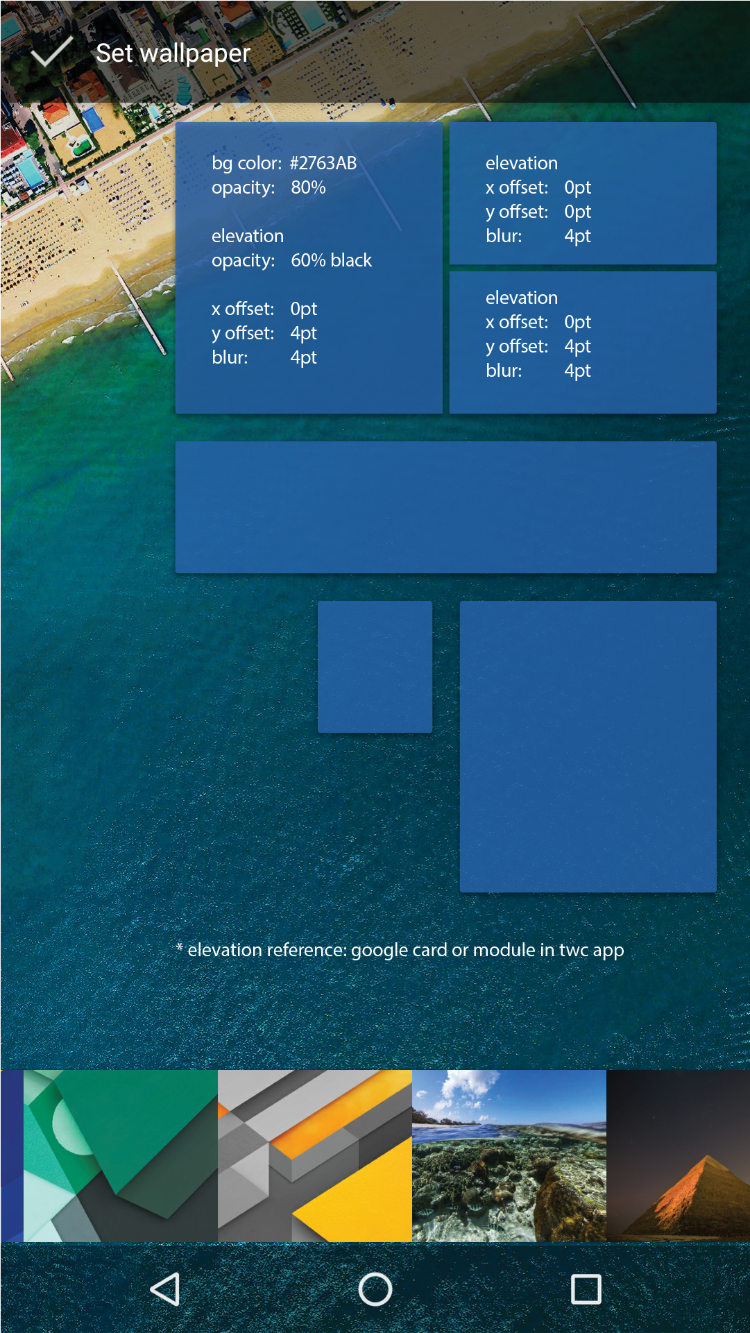
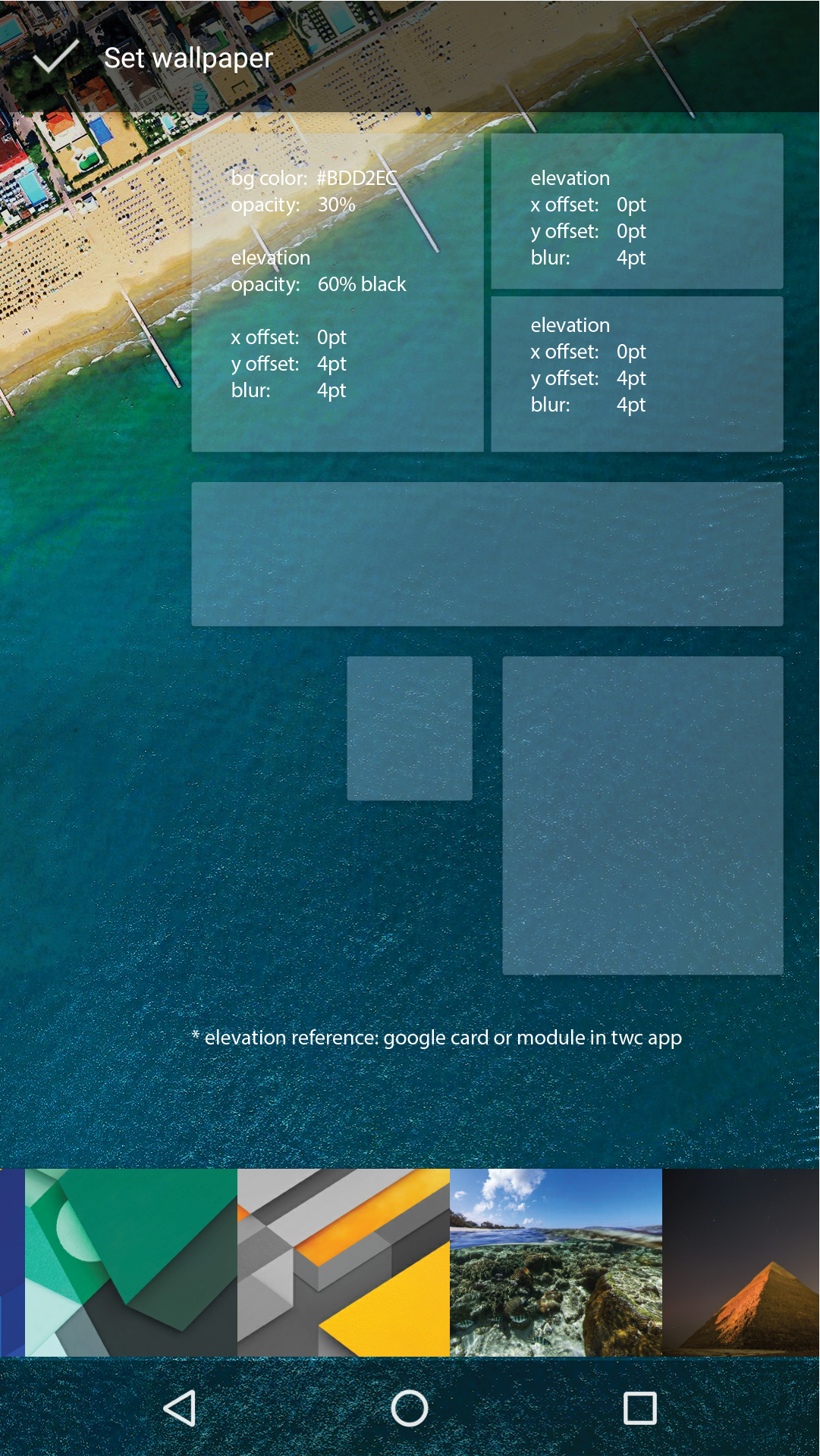
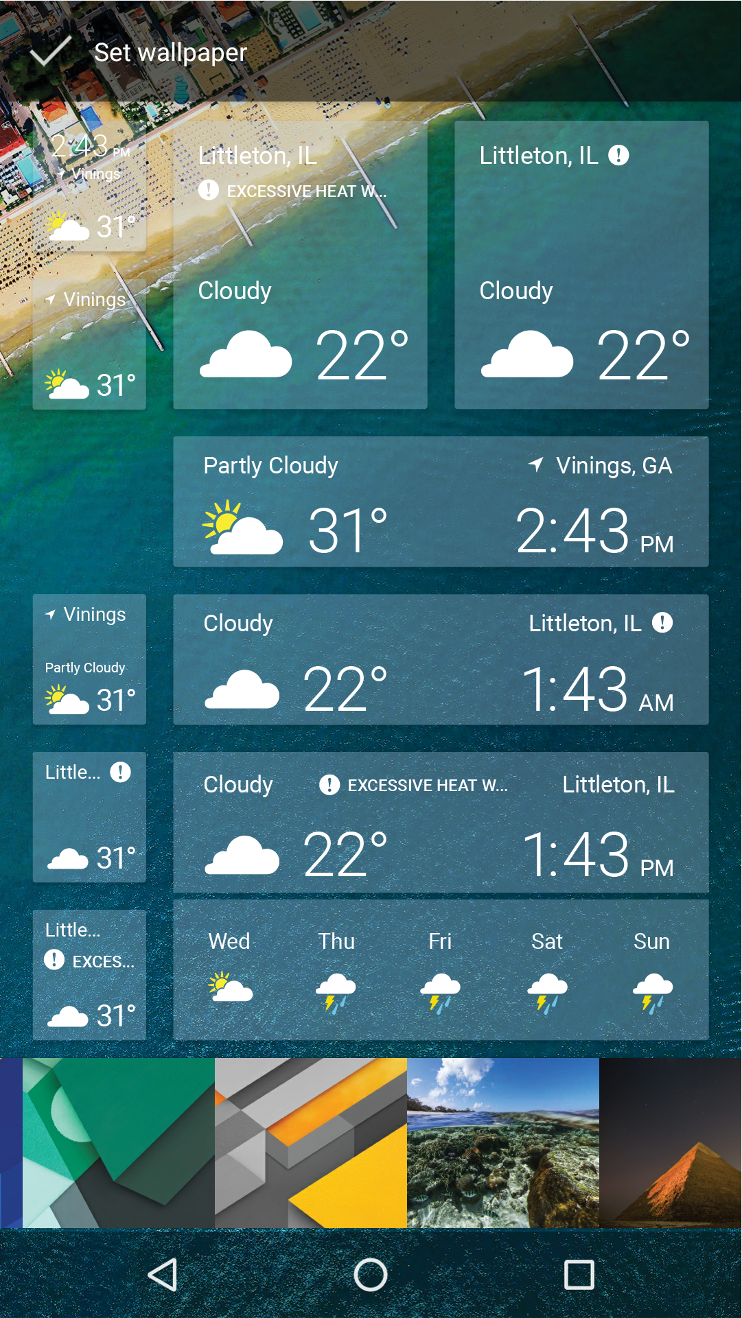
Usability and accessibility testing on dynamic backgrounds.
Widget Future/Full Experience Concept
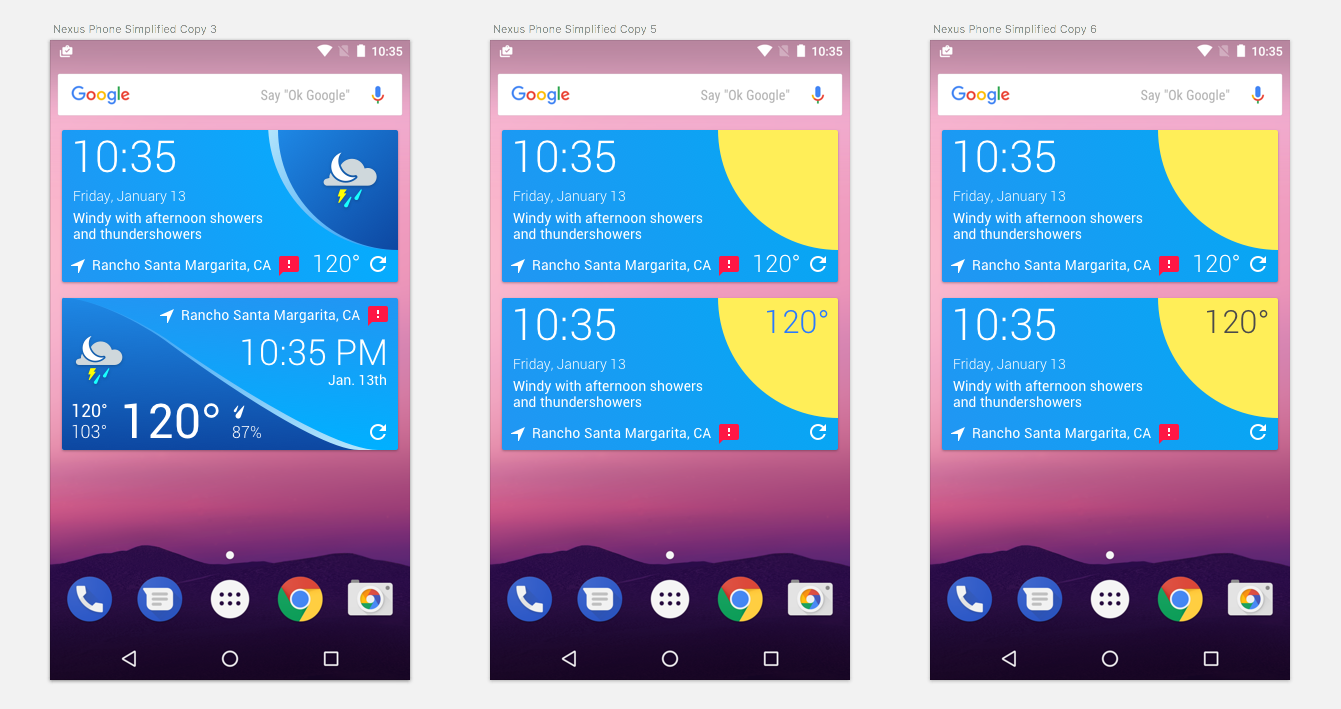
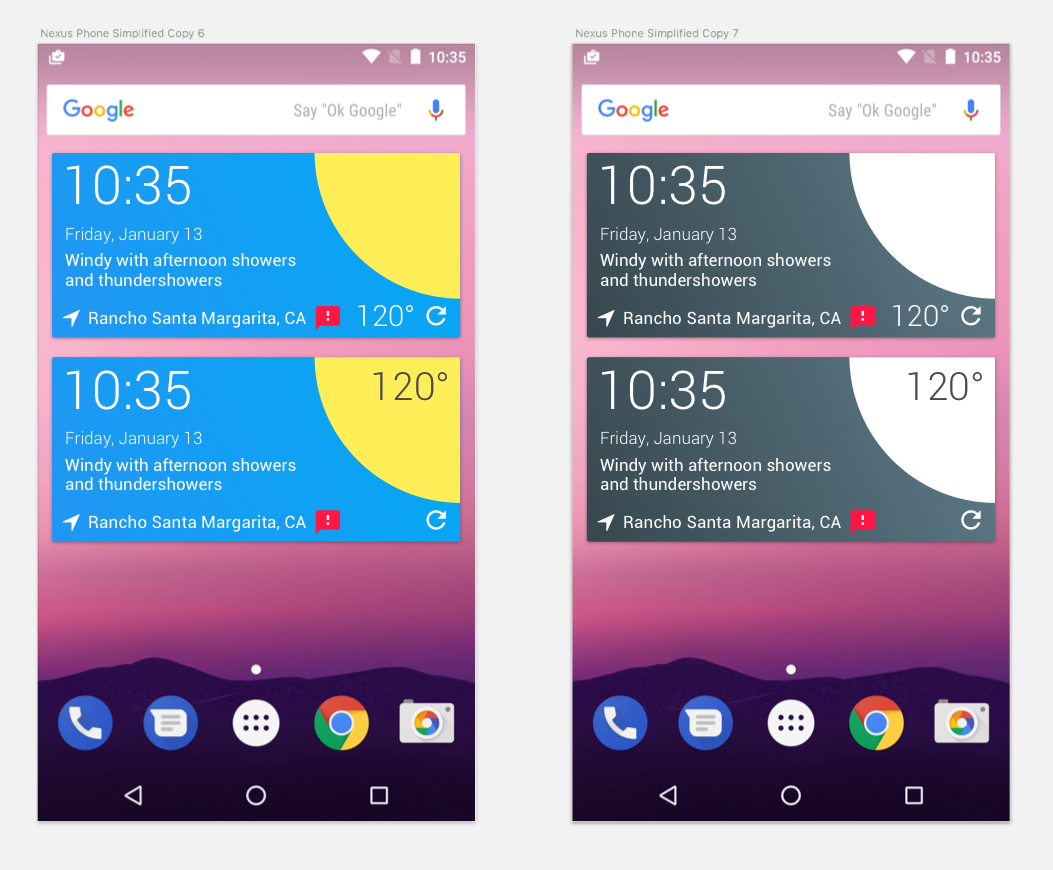
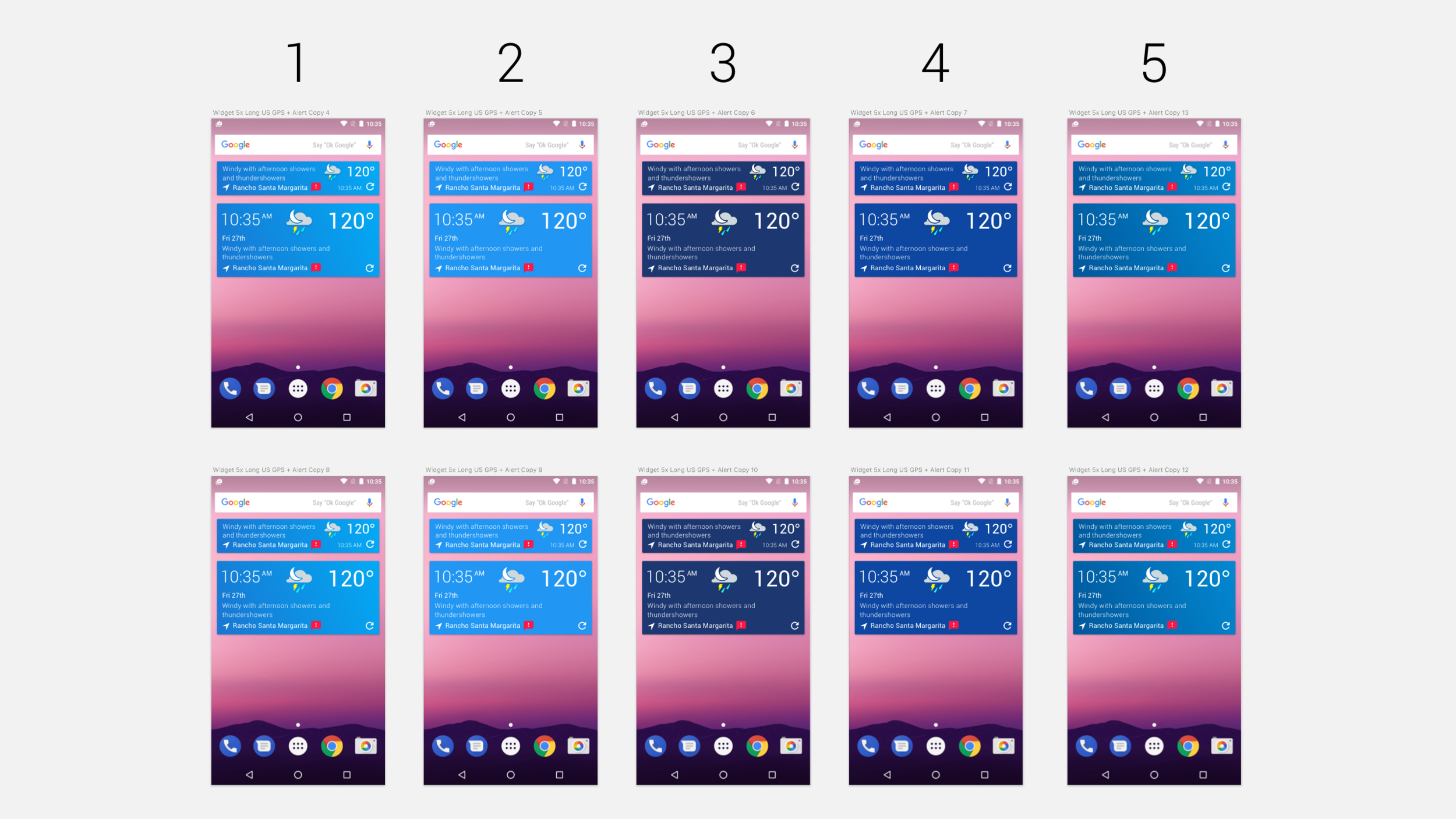
Refinements were made and measured.
New Android Lite App style adjustments were taken into consideration.
Widget Color & Information Density Variations
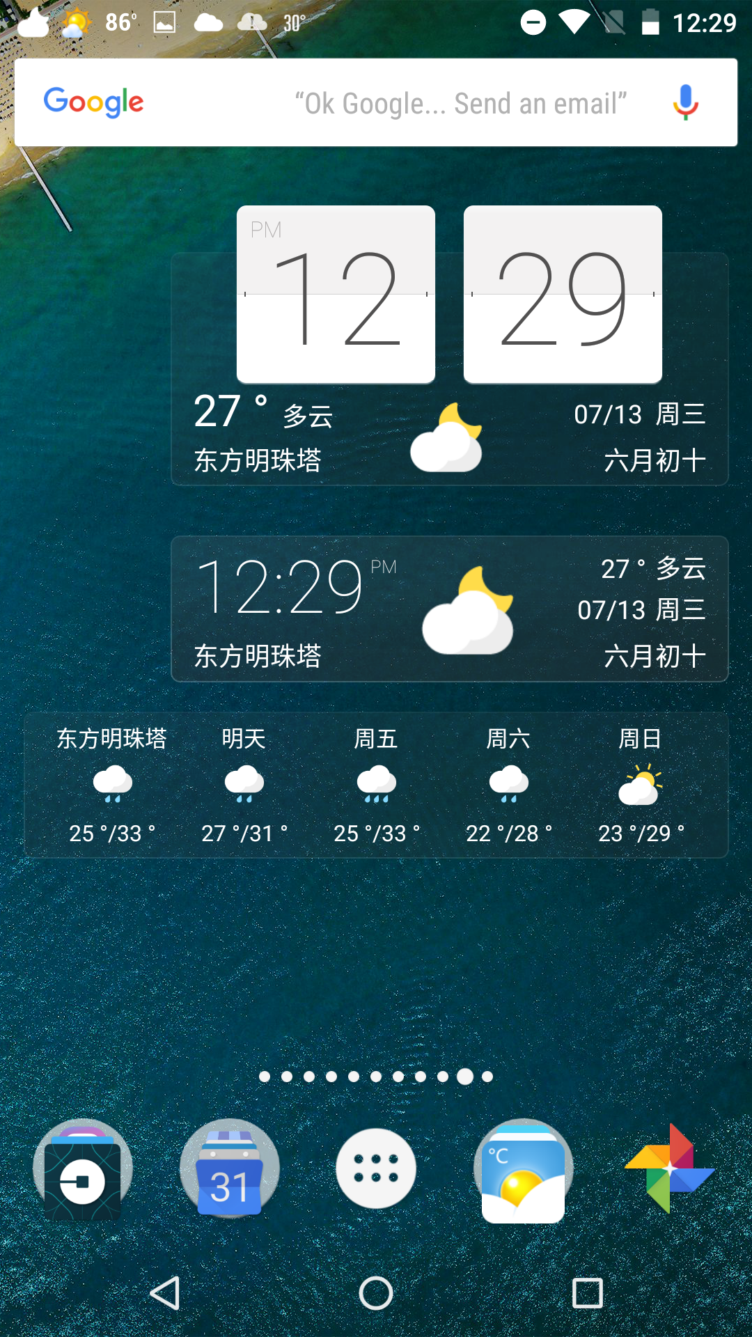
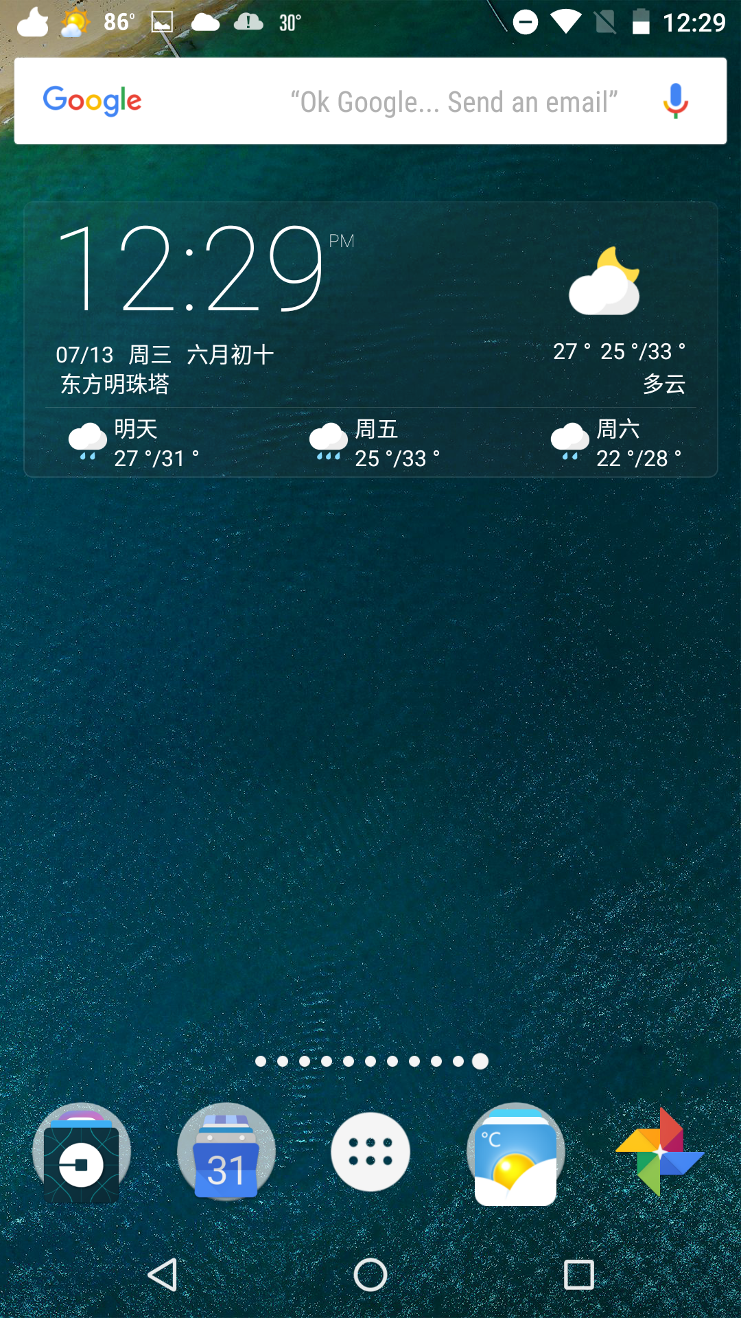
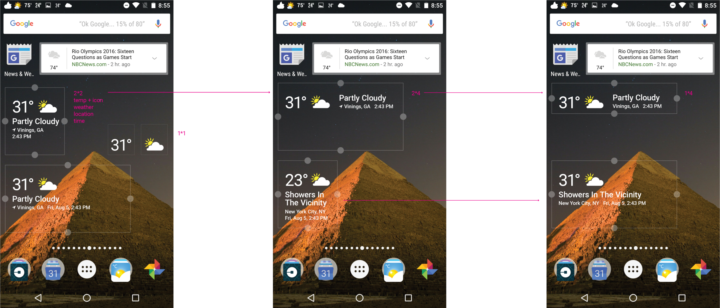
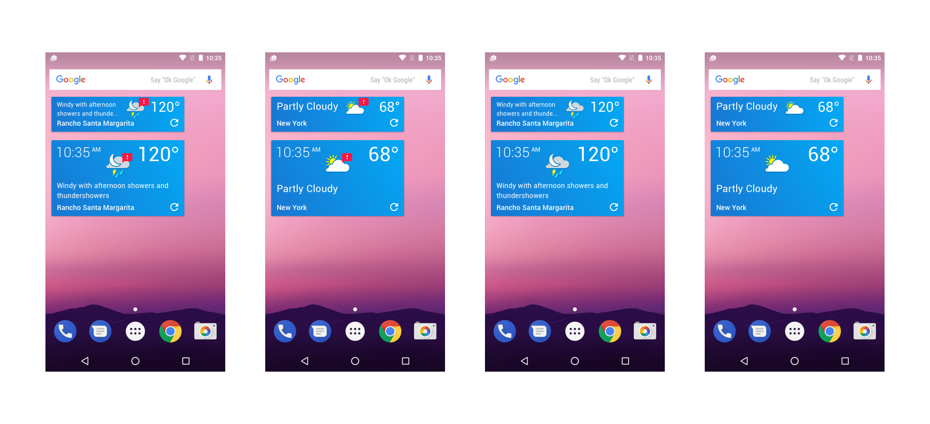
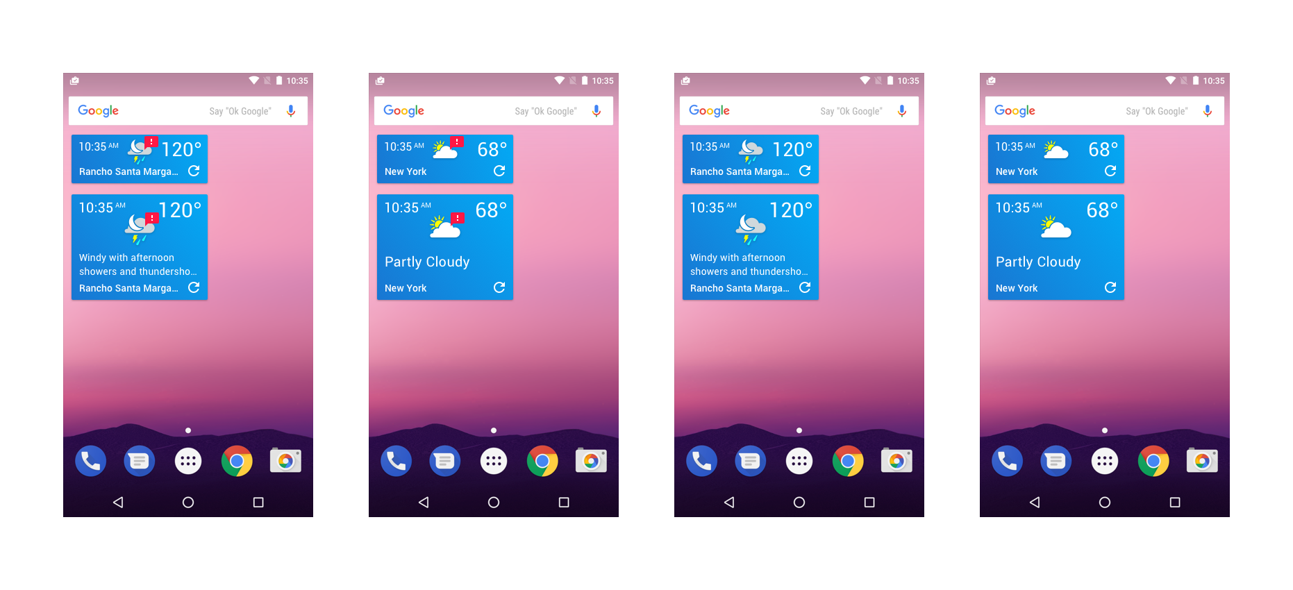
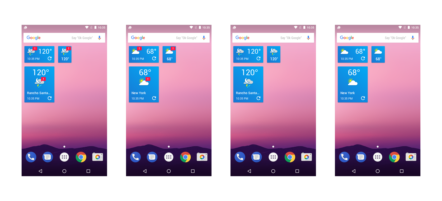
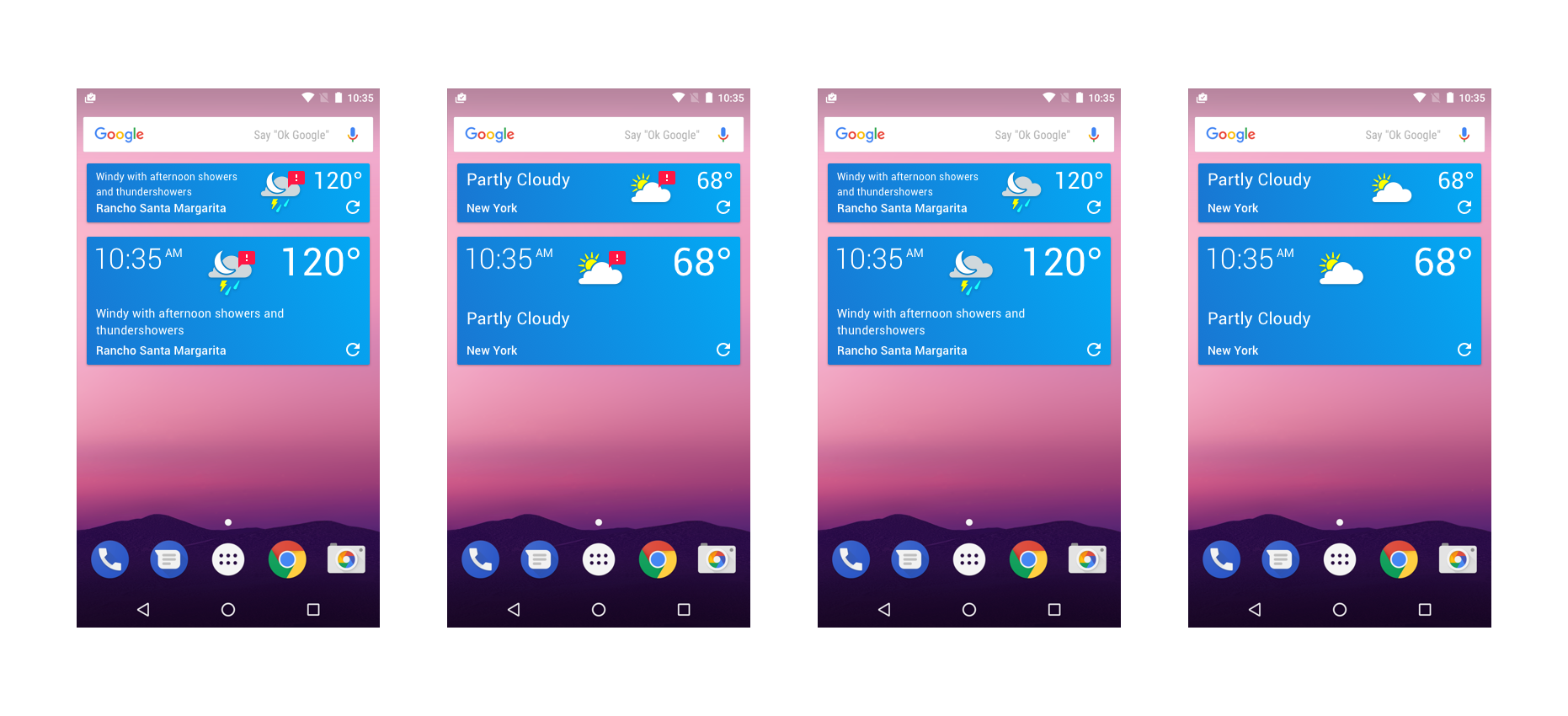
The final widget design consisted of dynamic styling for L>R and R>L content.
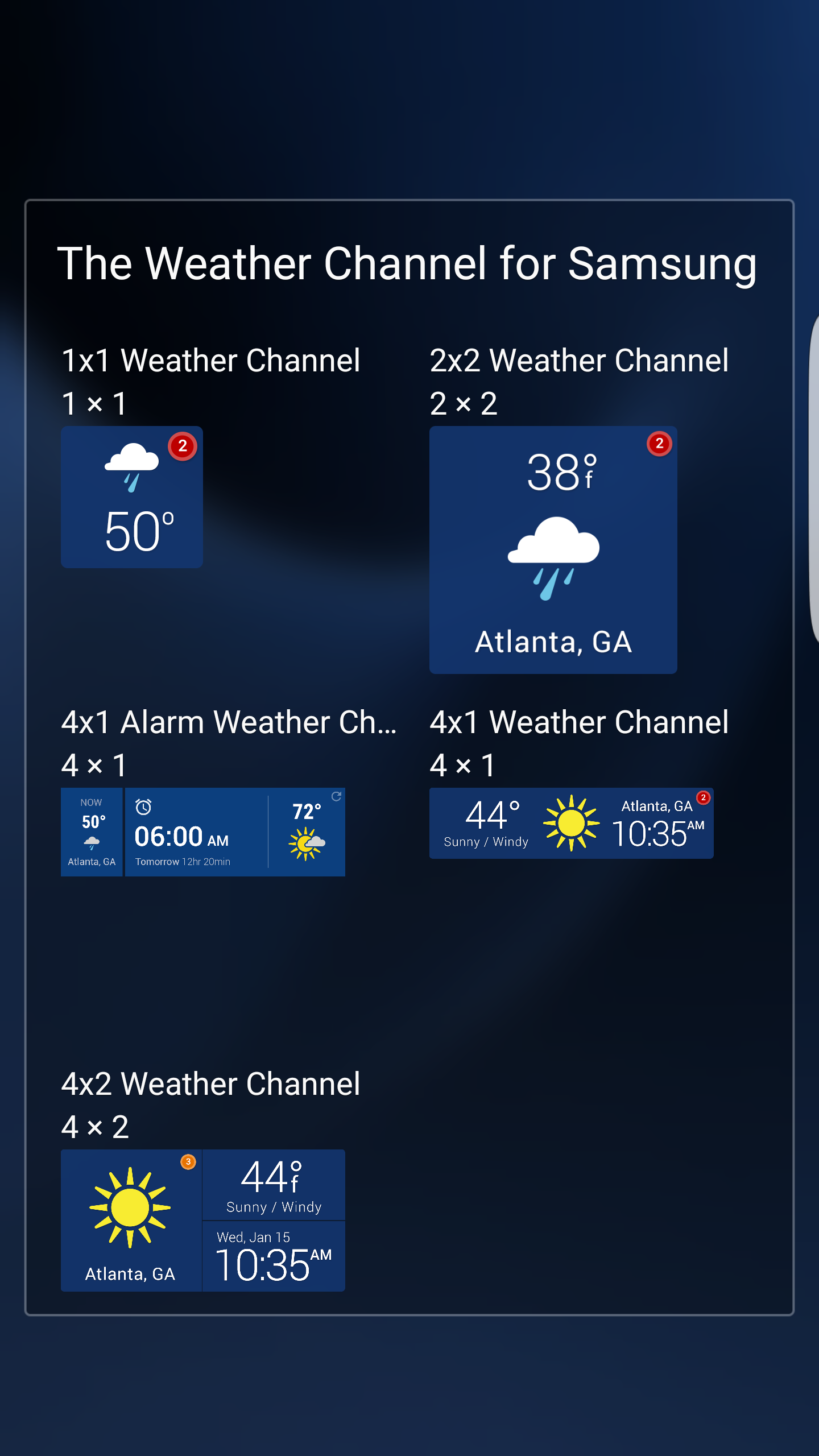
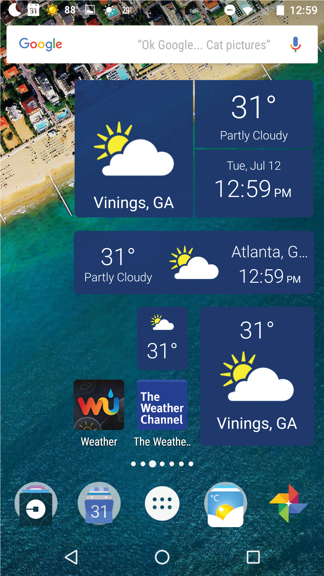
Each module was designed between 1x1 up to 2x4 layouts for the user home-screen experience.

